( Loading, please wait.. )

513.ooo ©2026

( Loading, please wait.. )

513.ooo ©2026

PrintUP

Branding

PrintUp is a comprehensive rebranding and digital redesign project executed for a modern express commercial printing house. The goal was to transform an established printing service into a contemporary visual brand, replacing cluttered marketing collateral and an outdated website with a cohesive visual identity system, dynamic motion graphics, and a streamlined digital UX/UI ecosystem.

Agency513

/Year

2020

/Client

Freelance

Tools Used

RoleCreative Lead

StatusCompleted

Launch Date2020

LocationRussia

PrintUP

RoleCreative Lead

StatusCompleted

Launch Date2020

LocationRussia

Branding

Agency513

/Year

2020

/Client

Freelance

Tools Used

PrintUp is a comprehensive rebranding and digital redesign project executed for a modern express commercial printing house. The goal was to transform an established printing service into a contemporary visual brand, replacing cluttered marketing collateral and an outdated website with a cohesive visual identity system, dynamic motion graphics, and a streamlined digital UX/UI ecosystem.

PrintUP Visual Identity & Brandbook

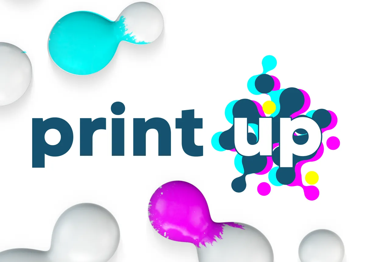
The brand identity concept revolves around the core fundamentals of commercial printing: the CMYK color model. By replacing traditional key black with a custom, trend-forward "Atlantic Blue" (Pantone 5473 C), the design unifies all color spectra under a single corporate shade. Fluid liquid paint droplets act as the primary graphic motif, abstracting traditional printing halftone grids. The identity scales seamlessly from flat 2D vector graphics on stationery to high-end 3D animated fluid dynamics across digital platforms.

PrintUP The Visual Identity & Brandbook

logo

CMYK Color Model Integration

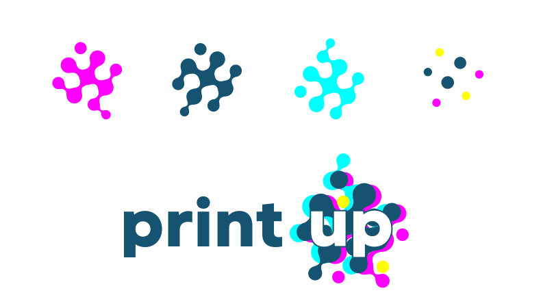
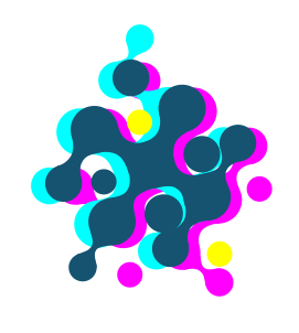
  • Core Color Identity: The logo architecture directly incorporates the standard CMYK (Cyan, Magenta, Yellow, Key) print palette, translating technical offset printing standards into an accessible visual system. Replacing traditional black with the primary corporate "Atlantic Blue" unifies the entire color spectrum into a cohesive identity mark.

logo

Fluid Paint Dynamics & Textures

  • Dynamic Ink Physics: Liquid ink serves as the conceptual foundation of commercial printing. The visual identity utilizes stylized fluid paint droplets that interact dynamically, blending into CMYK tones to represent precision ink application on physical paper.
  • Halftone Pattern Reinterpretation: Interconnected vector fluid shapes form the foundational backdrop of the logotype, paying homage to vintage halftone printing screens. Layering primary corporate colors above the CMYK base visually embodies the "UP" suffix—symbolizing continuous growth, elevated quality, and expansive capabilities.

logo

Multi-Dimensional Graphics Hierarchy (2D to 3D)

  • Scalable Graphic Hierarchy: The identity employs a dual-tier asset system: clean 2D flat vector graphics for offset print collateral and high-definition 3D fluid animations for web UI, video production, and corporate digital branding.

color

Corporate Palette Specifications (Atlantic Color)

  • Primary Palette Optimization: Refined the legacy blue shade into a clean, precise Pantone color match (Pantone 5473 C / "Atlantic Blue"), eliminating color contamination and alignment issues across digital and physical substrates.

Print Collateral & Brand Touchpoints

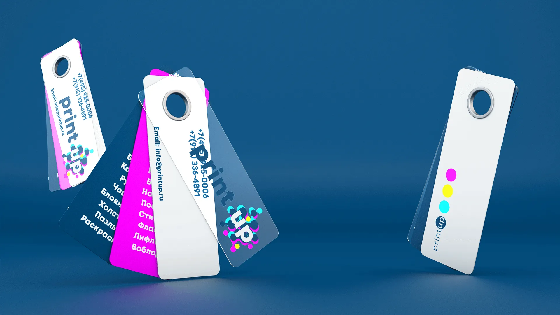
  • Interactive Pantone-Fan Business Cards An innovative business card system styled after professional Pantone color fan decks. Features a transparent front overlay with the corporate mark, while individual color leaves showcase exact shade codes and categorized printing services on the reverse side.
  • Adaptive Packaging & Sub-Branding A compact version of the logo engineered specifically for narrow print formats, ribbons, packaging tapes, seals, and secondary digital badging where full visual assets cannot be accommodated.
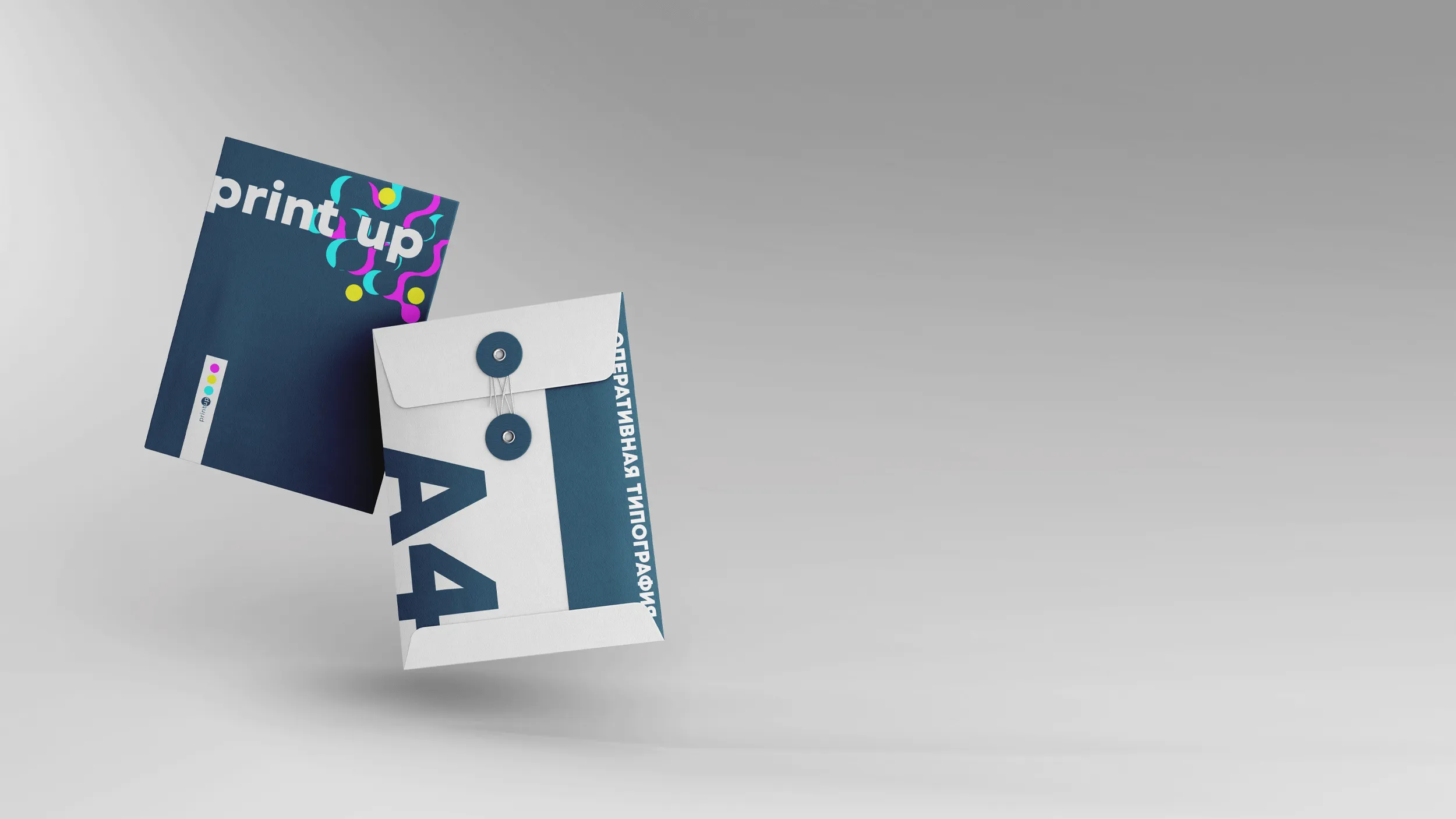
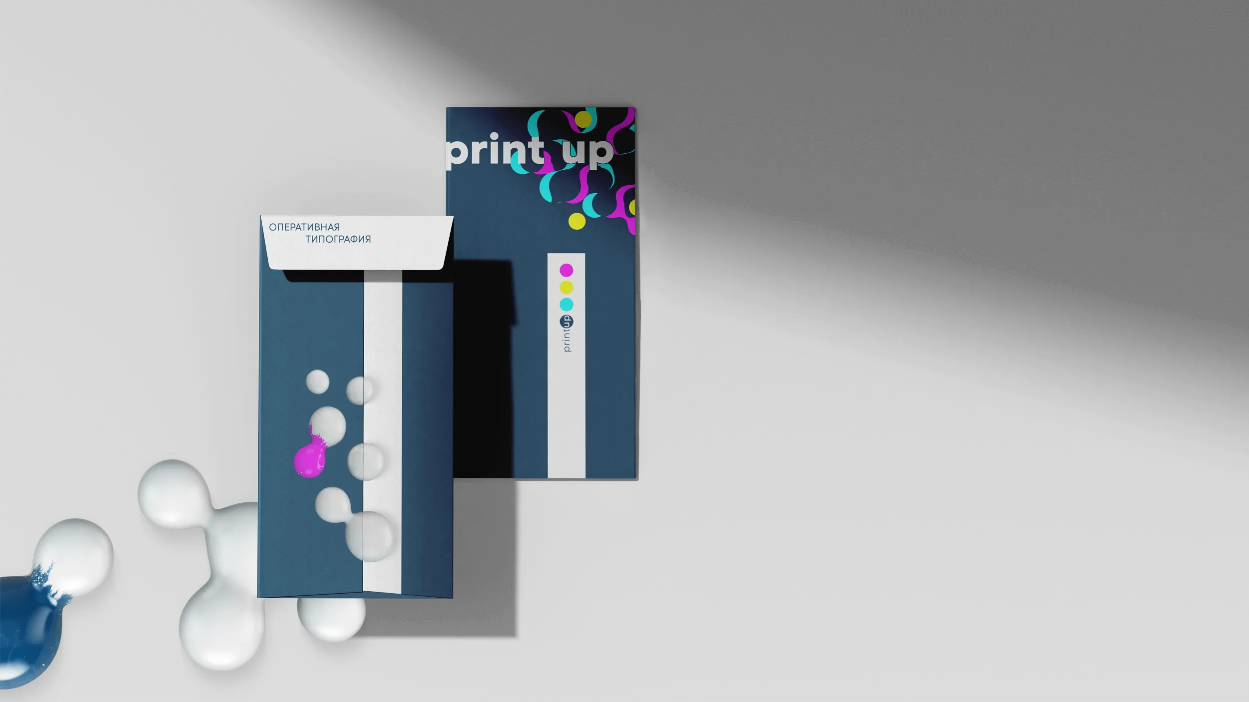
  • Corporate Print & Marketing Assets Unified design layouts across standard stationery, branded envelopes, promotional folders, photo books, calendars, and large-format printing collateral using high-precision Atlantic Blue identity guidelines.

Digital Experience & Web Architecture

  • 1
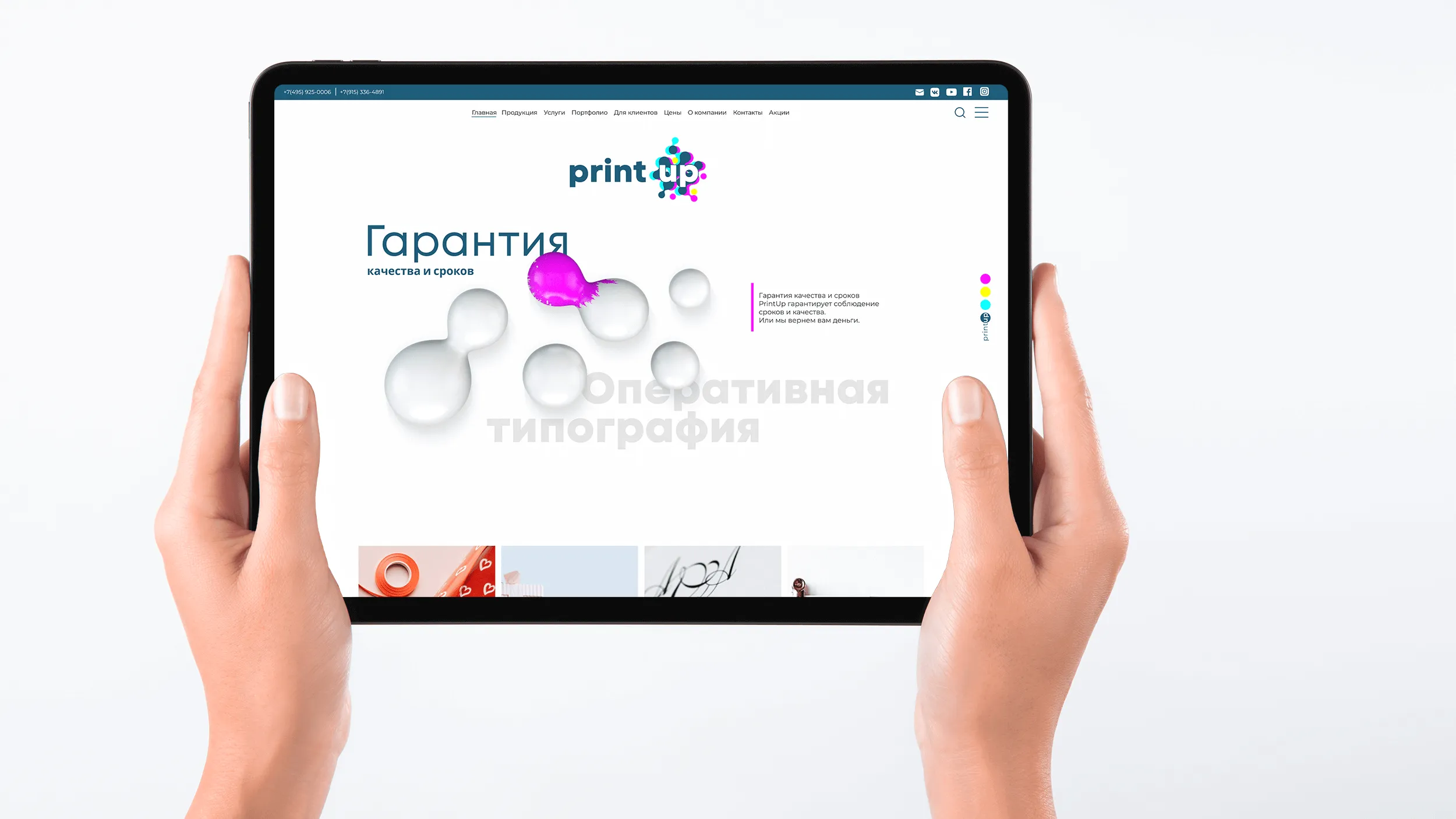
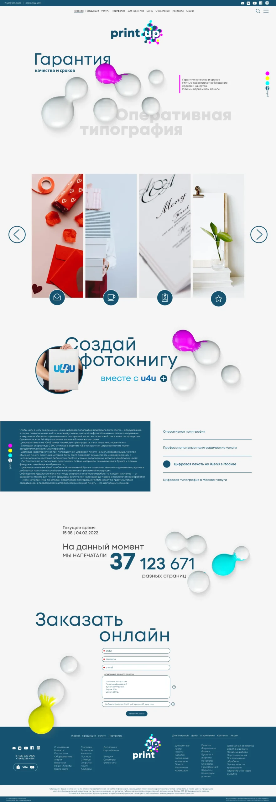
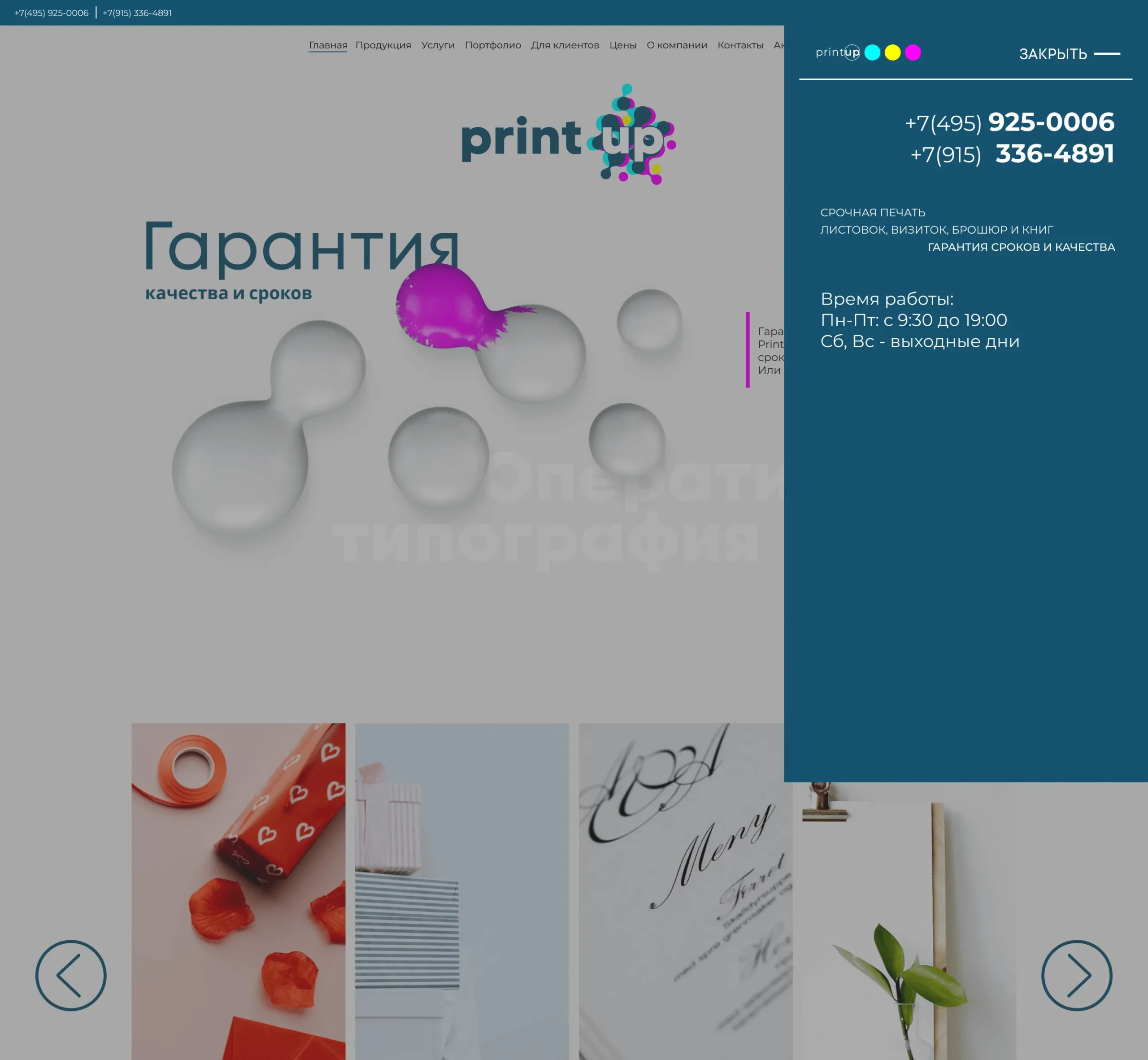
    Modular Interactive Service Sliders Replaced a dense, cluttered 8-block grid with dynamic vertical accordion sliders that reveal categorized service listings on hover, reducing visual noise and improving content scannability.
  • 2
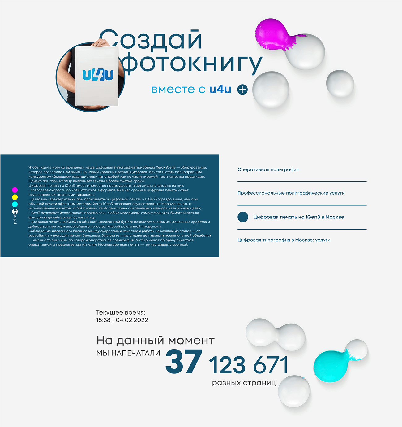
    Fluid Scroll Motion Dynamics Integrated lightweight, scroll-triggered 3D paint droplet physics that seamlessly merge and split as users navigate pages, providing an engaging visual connection to digital printing technology without distracting from content readability.
  • 2
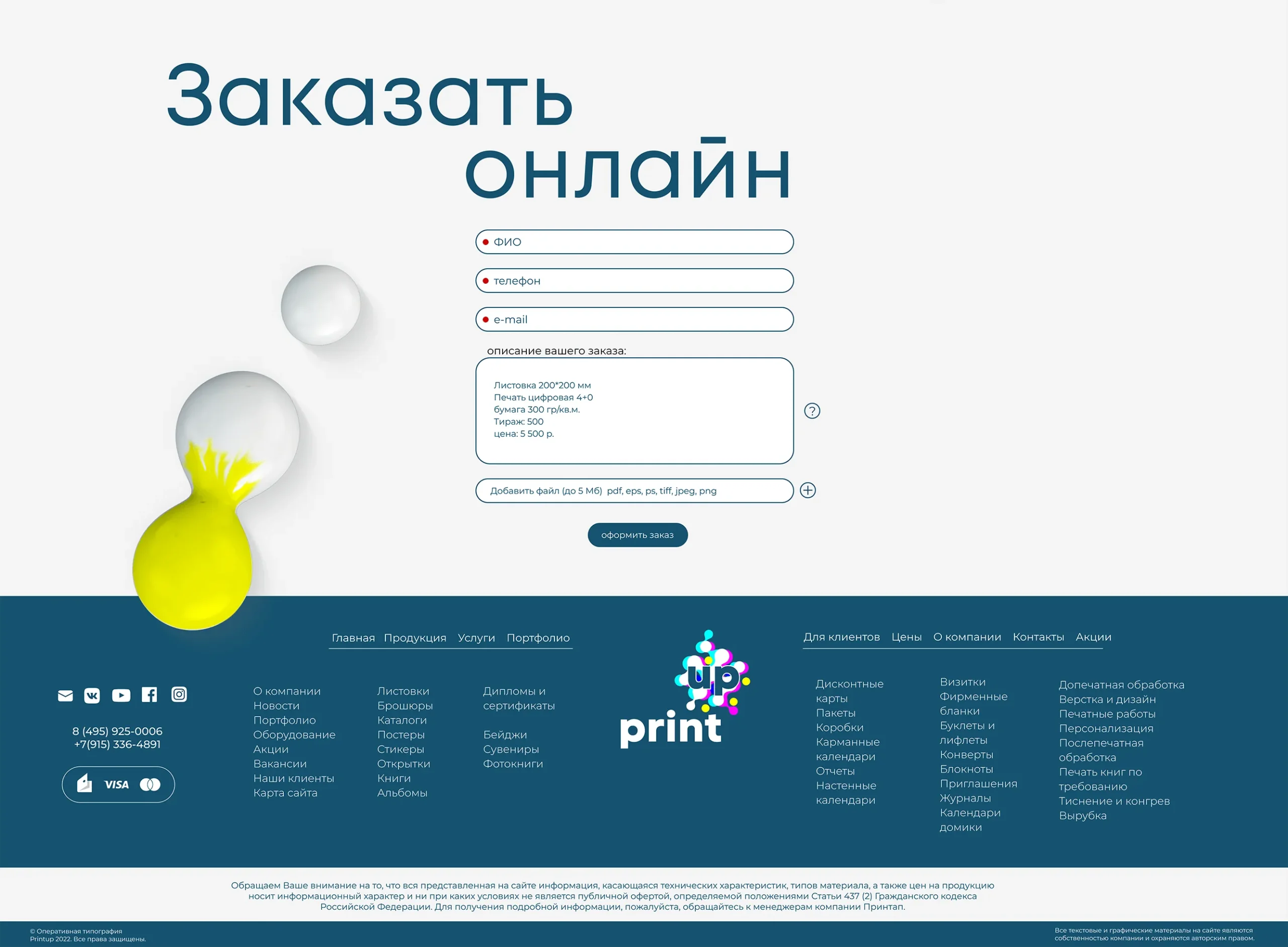
    High-Conversion Quick-Order Interface Engineered a streamlined online order submission drawer and quick-calculator workflow, paired with an animated live counter showcasing total printed pages in real time to reinforce client trust.
  • 2
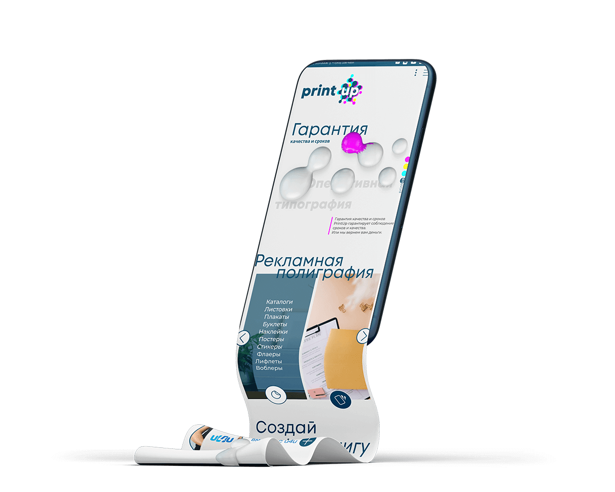
    Fully Adaptive Responsive Layouts Designed dedicated, high-density viewports tailored across desktop, tablet, and mobile platforms to maintain structural clarity and quick navigation for clients ordering prints on the go.

RELATED WORKS

View more case studies that showcase my expertise in building high-impact integrated campaigns.