OpusDeco Brandbook
The brandbook serves as the ultimate design guide, detailing the visual ecosystem developed to mirror the premium, artistic nature of the brand's interior products. It outlines a cohesive brand identity system consisting of four foundational blocks: logotype construction, typography, pattern execution, and color theory. Every asset is engineered to maintain a strict balance between luxurious classic motifs and modern minimalist principles.
OpusDeco branding project
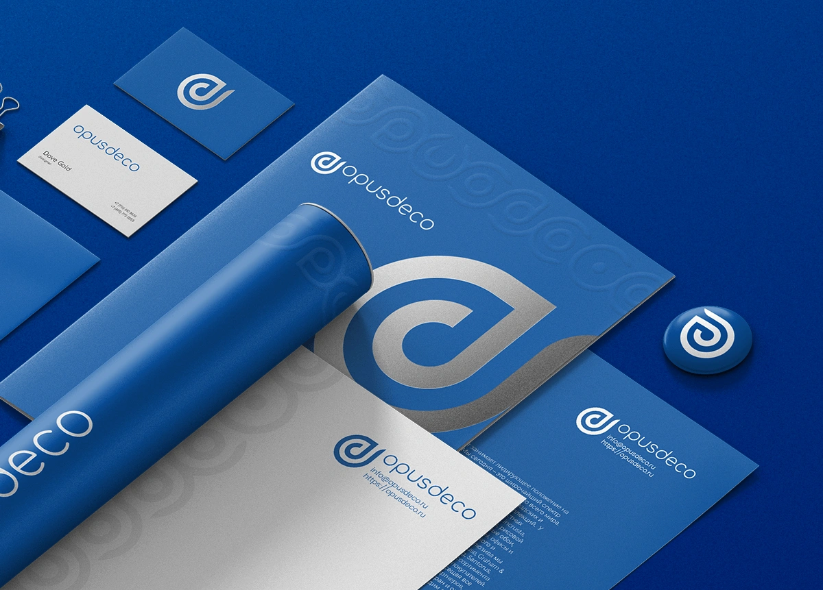
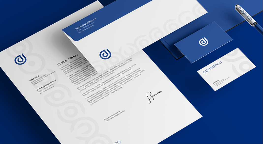
This 360-degree branding project elevates OpusDeco’s presence across all physical and digital touchpoints, including stationery, marketing collateral, promotional merchandise, and web interfaces.
Logo
Overview
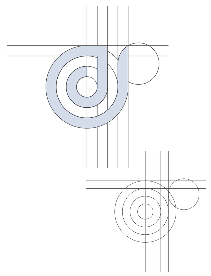
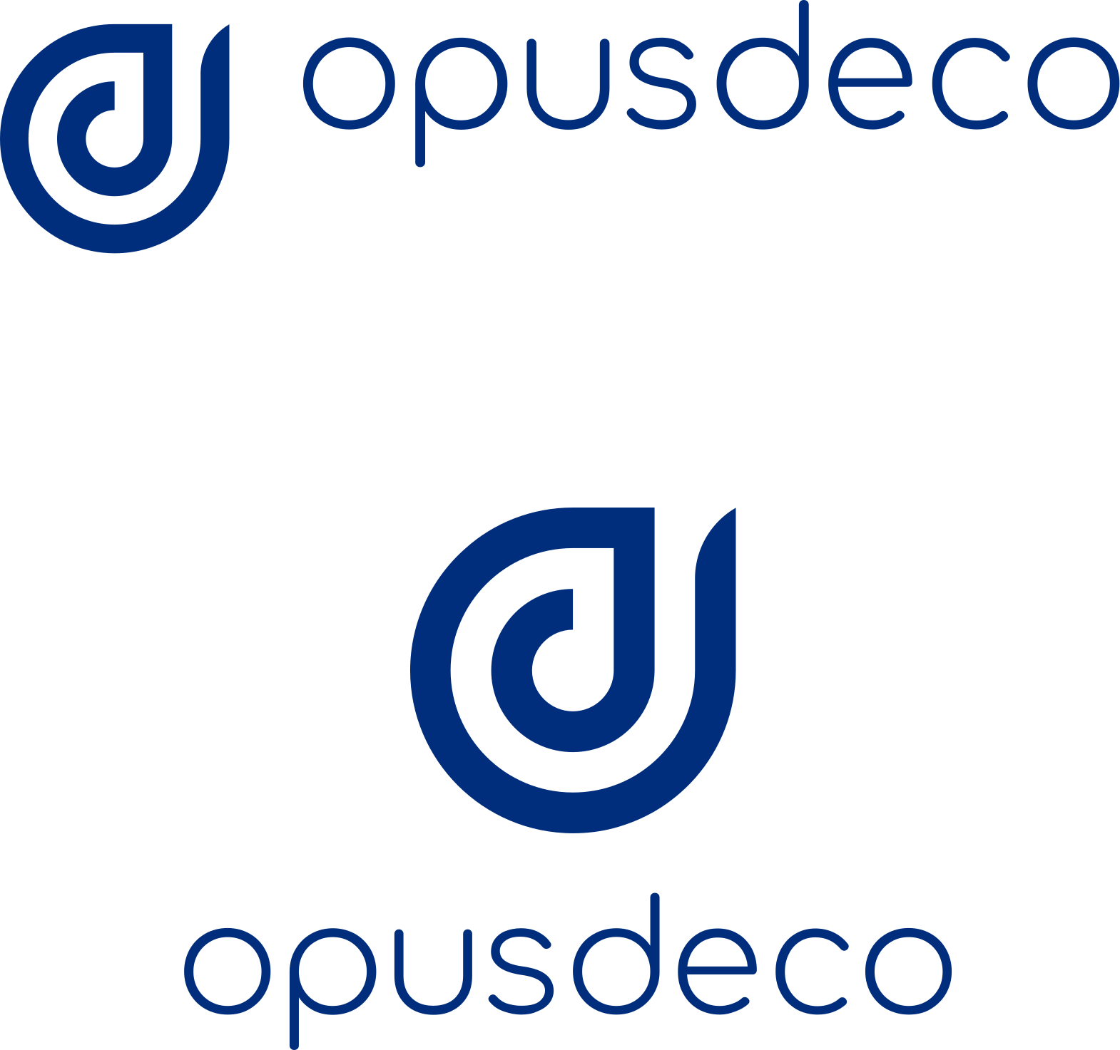
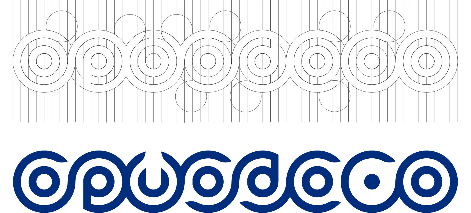
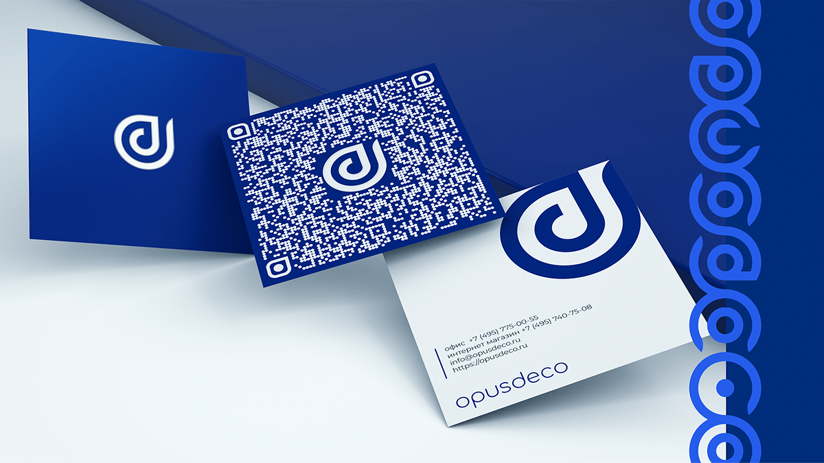
The logotype is meticulously constructed on a precise modular geometric grid to achieve perfect structural harmony. These grid lines serve as guiding trajectories that seamlessly merge form and function. The core emblem is a fluid synthesis of the letters "o" and "d", mirroring the brand name, OpusDeco. Inspired by the organic, flowing lines of Art Nouveau—which defines many of the company’s signature wallpapers—the logo integrates soft contours, branches, and leaf elements directly into its geometry.
Logo
Overview
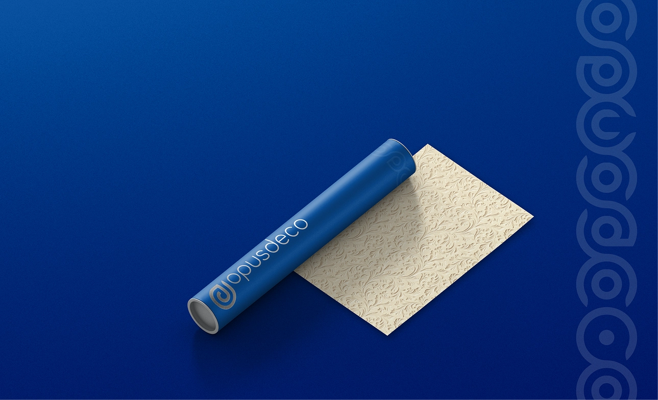
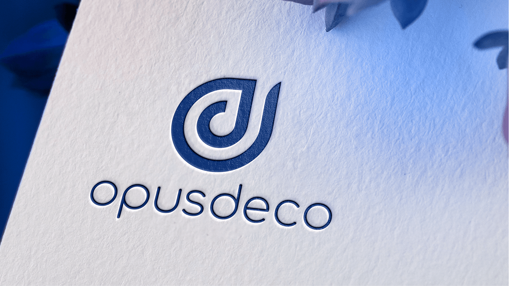
The final circular shape represents a holistic and minimalist design statement that adapts beautifully to any material. As a subtle nod to the industry, the cross-section of the emblem also evokes the image of a rolled wallpaper product. A complementary typographic lockup echoes the same dynamic curvature and soft lines, offered in horizontal configurations to accommodate diverse compositional demands.
Font
Overview
The typography strategy employs a strict two-font system to maintain visual clarity and editorial elegance across all layouts:
-
Comfortaa: Selected exclusively for primary headings to inject a modern, approachable, and softly rounded aesthetic into titles.
-
Montserrat: Deployed for body text and descriptive blocks to provide clean, high-readability geometric sans-serif structuring.
pattern
Overview
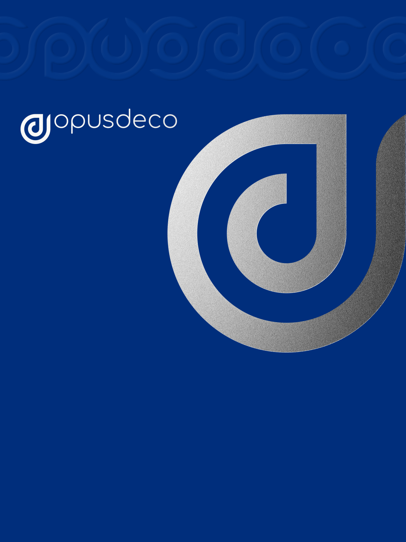
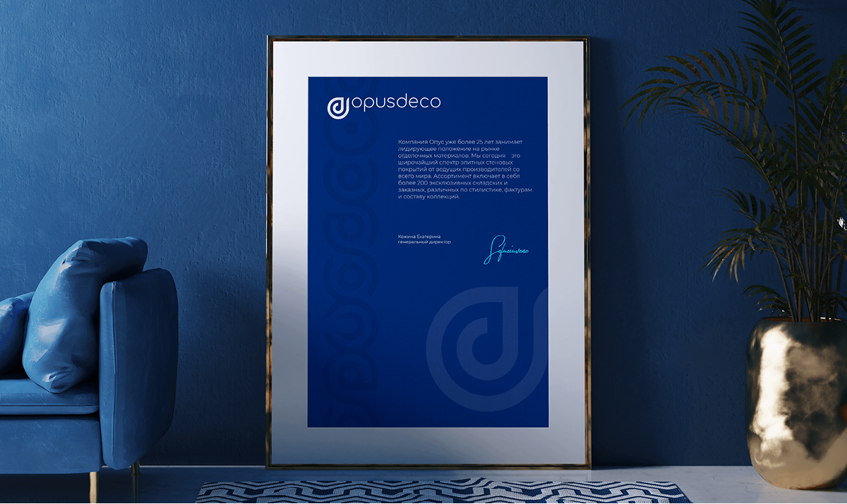
The corporate pattern functions as a neutral, stabilizing anchor within the broader brand identity. Rather than overwhelming the composition, it is applied in subtle, understated tones. It is ideally executed through premium finishing techniques such as blind embossing, spot UV varnishing, or clear transparent overlays. This approach adds tactile depth and structural balance to corporate documents, letterheads, and packaging without creating unnecessary visual noise.
colors
Overview
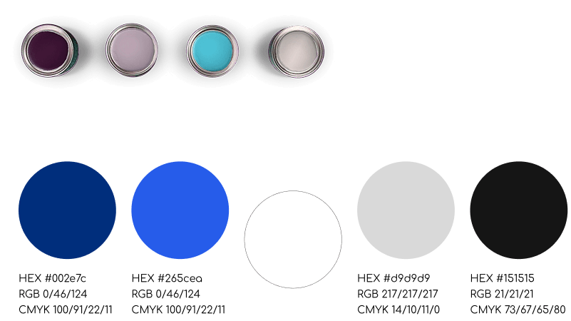
The color palette uses deep, sophisticated tones paired with stark neutrals to reflect luxury and reliable craftsmanship. The primary brand palette is composed of the following technical specifications:
colors
Overview
-
Deep Blue (#002e7c): CMYK 100 / 91 / 22 / 11 | RGB 0 / 46 / 124.
-
Vivid Blue (#265cea): CMYK 100 / 91 / 22 / 11 | RGB 0 / 46 / 124.
-
Light Gray (#d9d9d9): CMYK 14 / 10 / 11 / 0 | RGB 217 / 217 / 217.
-
Dark Charcoal (#151515): CMYK 73 / 67 / 65 / 80 | RGB 21 / 21 / 21.
( Web site design )
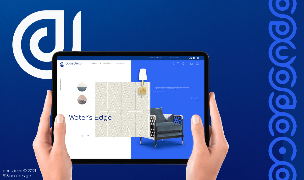
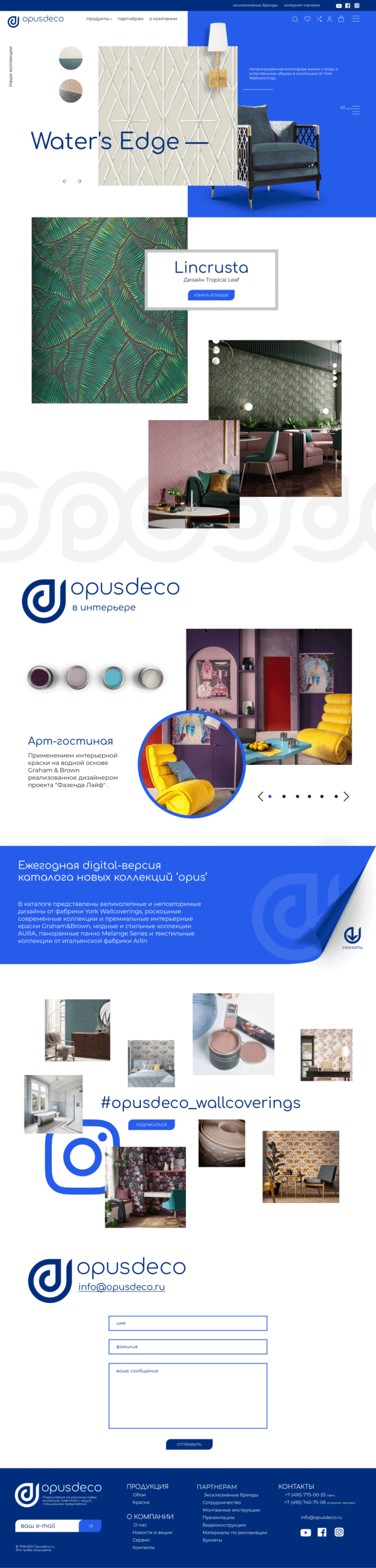
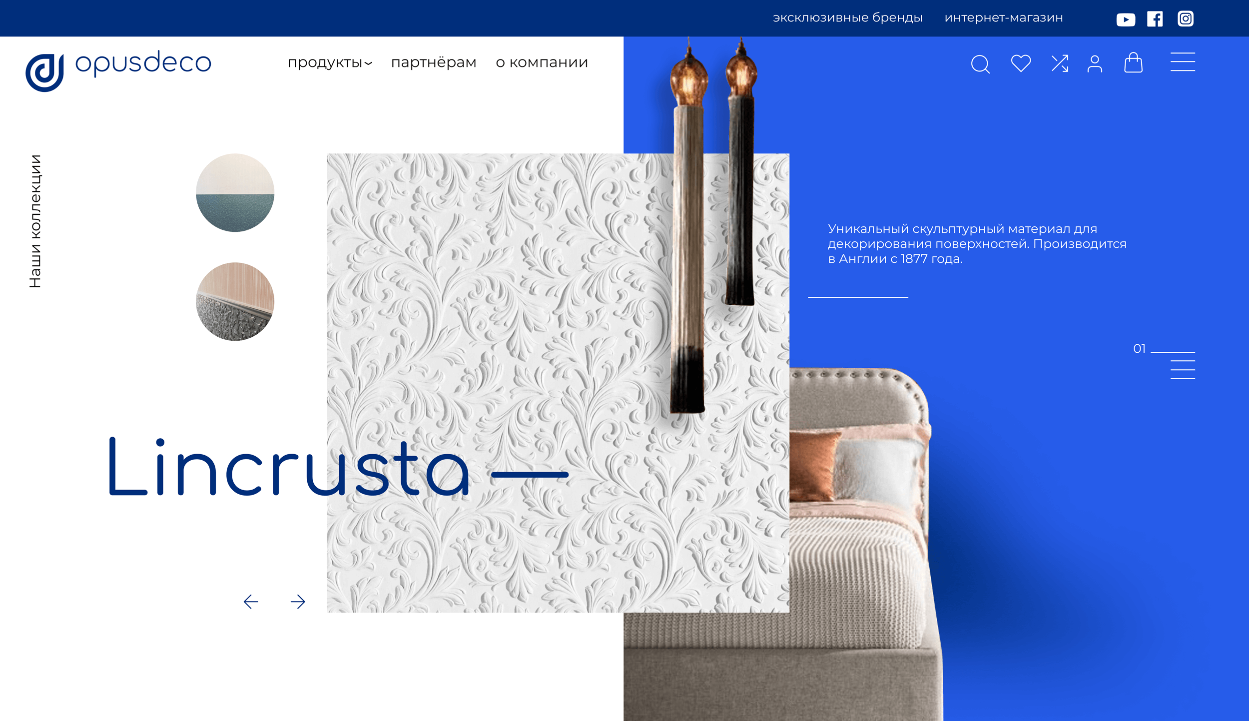
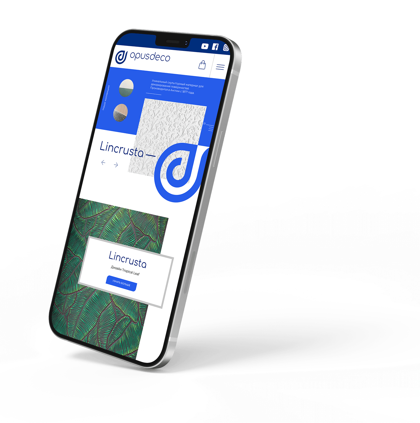
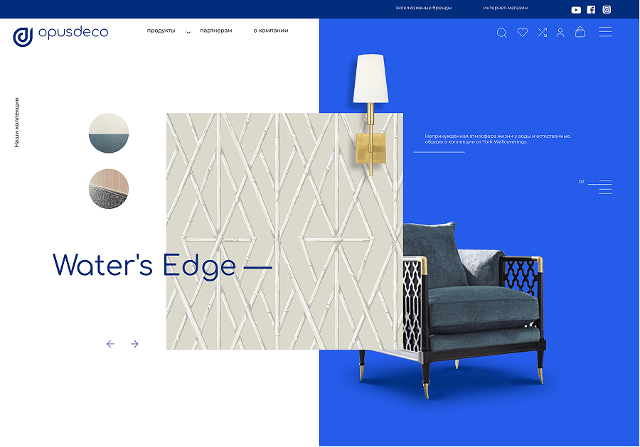
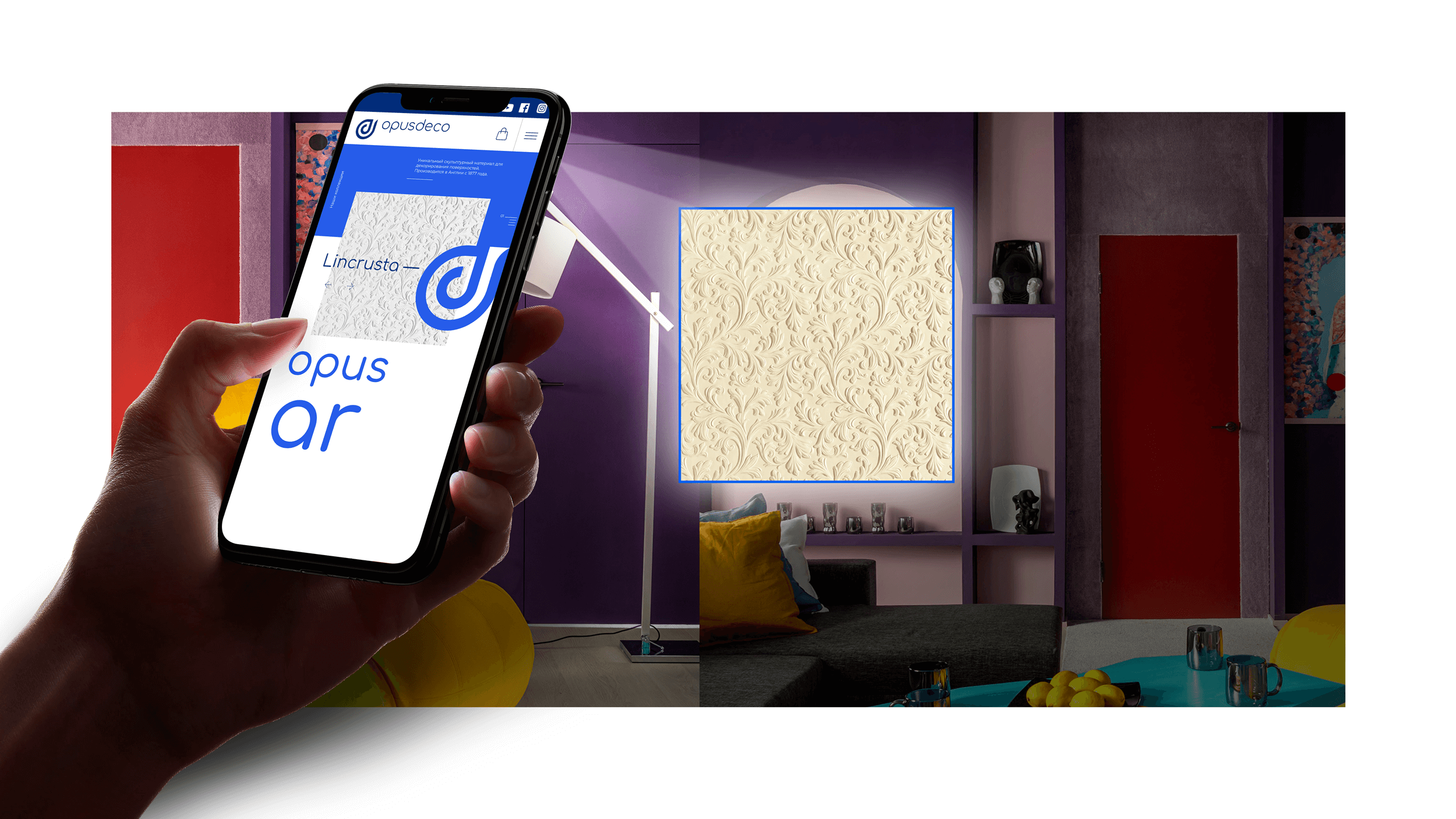
The digital showcase for OpusDeco is engineered as a seamless extension of its high-end physical editorial assets. Adhering to contemporary web design paradigms, the layout utilizes an asymmetric, non-standard grid inspired by premium magazine typography. Elements overlap elegantly, and large typographic blocks are superimposed directly onto high-resolution graphics to create an immersive, artistic composition. The interface employs a clean, flat design language enhanced with subtle neomorphism to add depth and tactile realism, mirroring the physical texture of luxury wall coverings.
Promotional merchandise & POSM
-
1The geometric, versatile form of the emblem allows for seamless application across diverse branding mediums, making it highly adaptable for production in high-end materials like molded plastic, cut metal, or physical blind embossing.
-
2Everyday operational items, such as showroom mugs and promotional merchandise, are treated with minimalist graphic restraint to establish a premium and cohesive corporate environment.
Print marketing & brochures
-
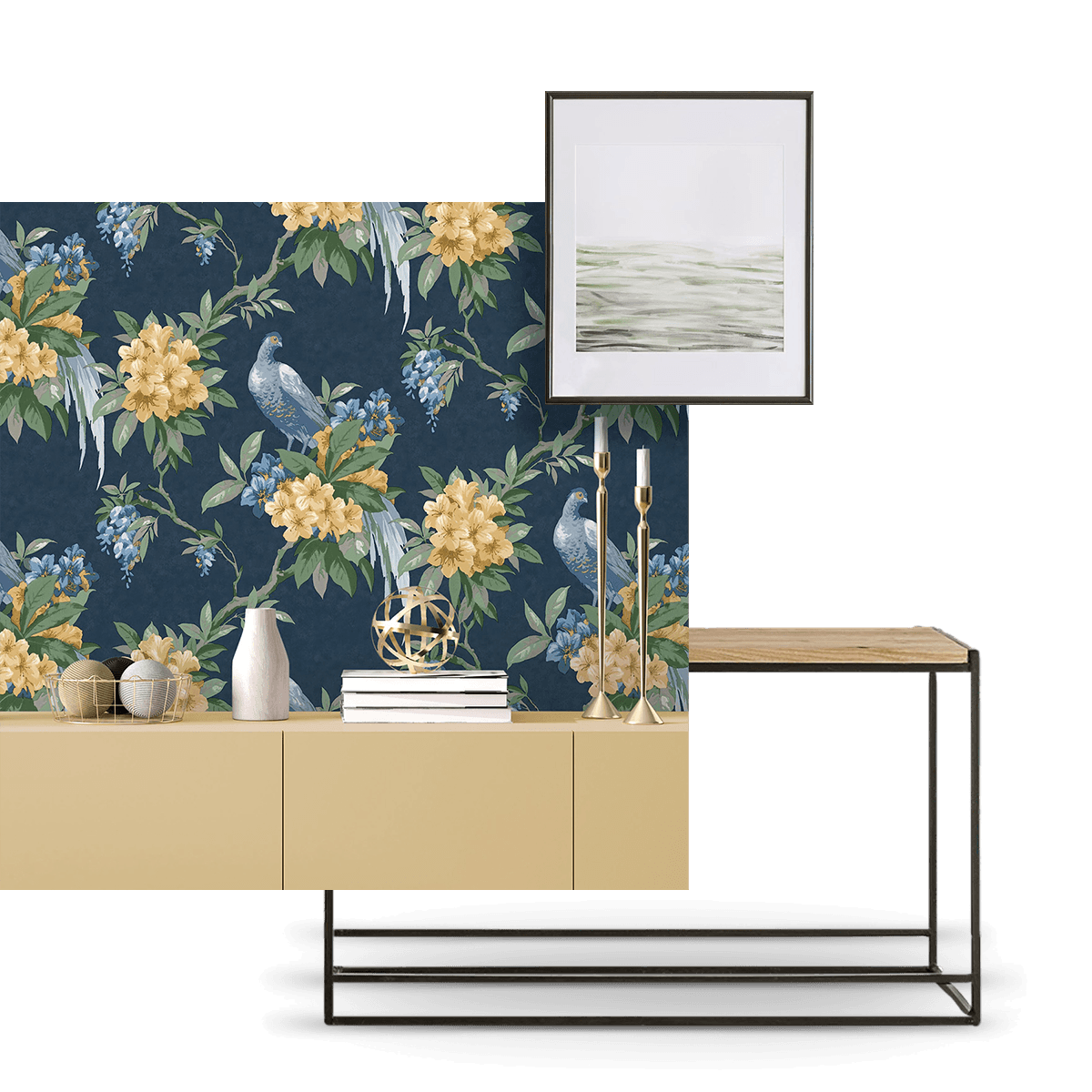
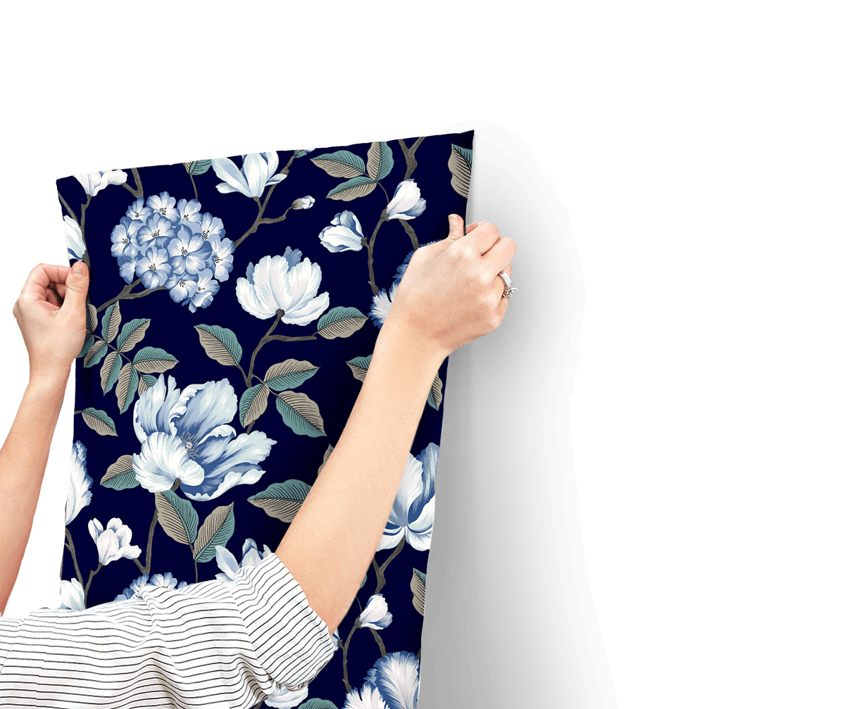
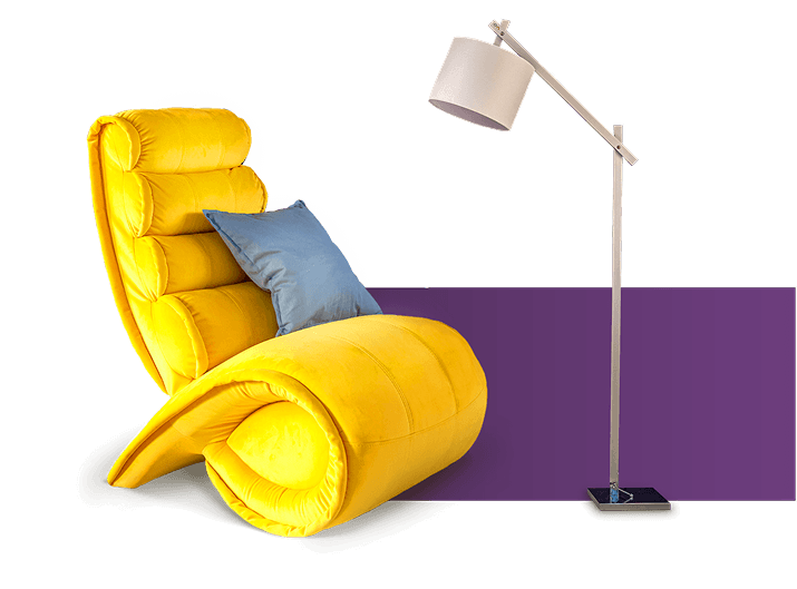
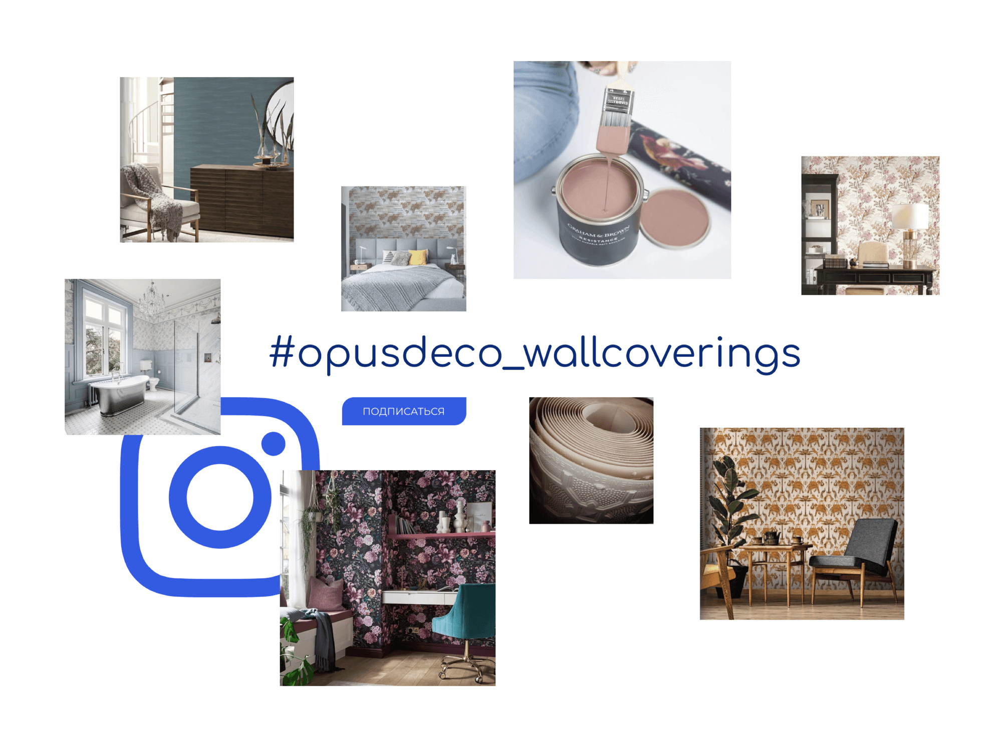
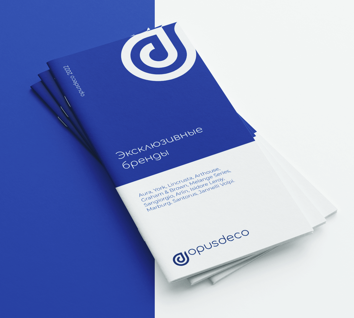
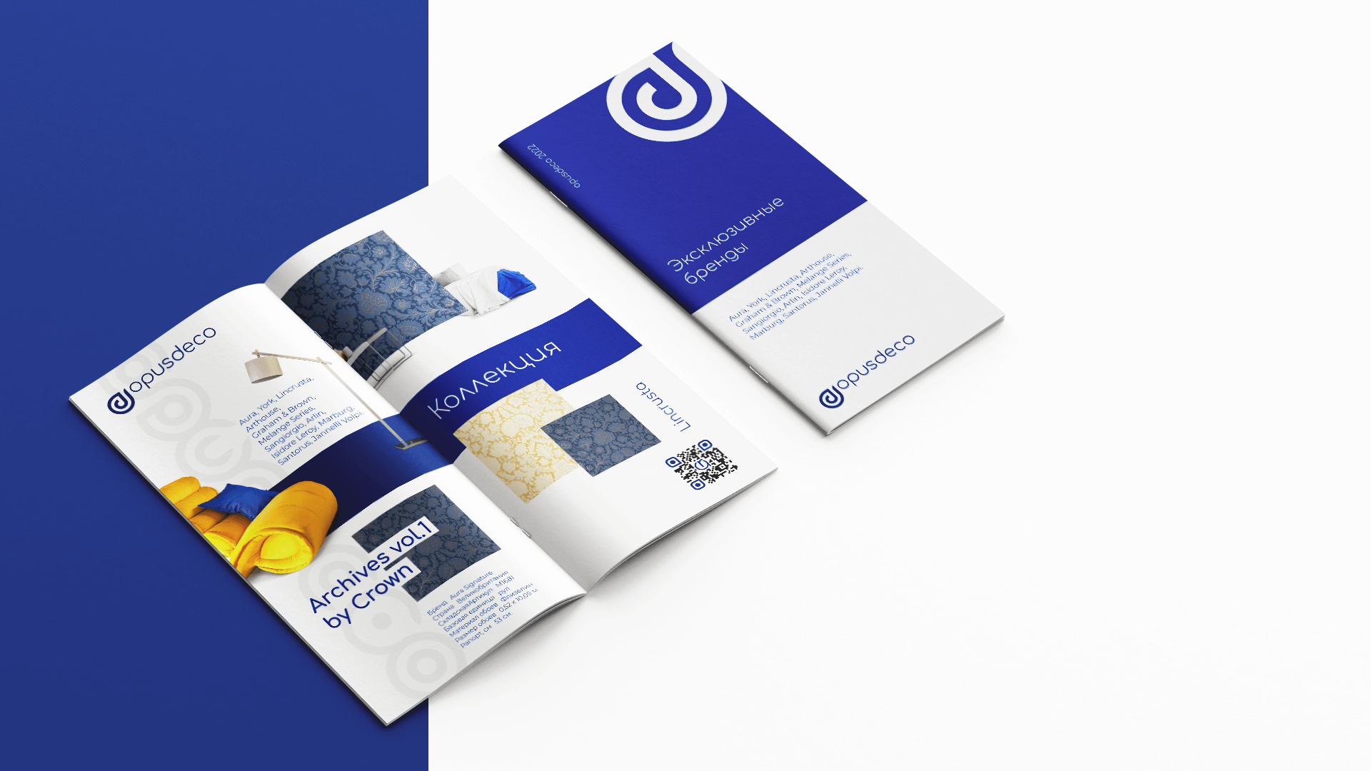
1In print layouts and brochures, the interior products are always treated as the absolute heroic focal point of the composition.
-
2Background environments and surrounding furniture are visually understated and secondary, ensuring the customer's attention remains fixed directly on the texture, color, and premium quality of the wall coverings.