( Loading, please wait.. )

513.ooo ©2026

( Loading, please wait.. )

513.ooo ©2026

LuckyDuck

BrandingWEB

Lucky Duck is a premium, modern Asian supermarket destination that bridges authentic Eastern flavors with global internet culture. The objective was to build a cohesive, highly engaging visual ecosystem that transforms everyday grocery shopping into an immersive, joyful lifestyle experience. This end-to-end creative direction encompasses a robust brand identity system, physical store design, sensory wayfinding, experiential packaging, a digital commerce platform, and a vibrant social media strategy.

AgencyClient Side

/Year

2026

/Client

Dubai

Tools Used

RoleCreative Lead

StatusCompleted

Launch Date2026

LocationDubai

LuckyDuck

RoleCreative Lead

StatusCompleted

Launch Date2026

LocationDubai

BrandingWEB

AgencyClient Side

/Year

2026

/Client

Dubai

Tools Used

Lucky Duck is a premium, modern Asian supermarket destination that bridges authentic Eastern flavors with global internet culture. The objective was to build a cohesive, highly engaging visual ecosystem that transforms everyday grocery shopping into an immersive, joyful lifestyle experience. This end-to-end creative direction encompasses a robust brand identity system, physical store design, sensory wayfinding, experiential packaging, a digital commerce platform, and a vibrant social media strategy.

Lucky Duck Supermarket — Comprehensive Brand Identity & Retail Experience

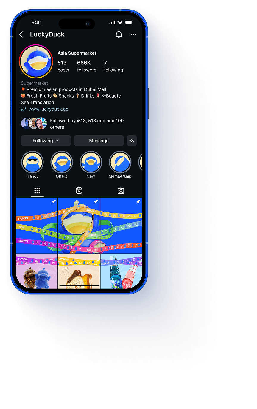
This premium Asian supermarket concept bridges authentic Eastern flavors with global internet culture. Developed via a comprehensive brandbook and full creative direction, the project transforms routine grocery shopping into an immersive lifestyle experience. The scope encompasses a vibrant shop design with architectural wayfinding pylons, experiential merchandising with interactive mascot cups, hyper-realistic packaging, high-impact print materials, a user-centric e-commerce website, and a trend-driven SMM strategy designed to maximize product conversion and foster community engagement.

Brand Identity & Visual System

The visual identity for Lucky Duck bridges premium retail aesthetics with the vibrant energy of global internet culture. Built upon a dynamic 60-30-10 color rule and an engaging, modular layout system, the identity brings the brand’s playful essence into a structured, professional framework. This system ensures seamless adaptability across physical environments and digital touchpoints while maintaining a bold, recognizable presence.

Logo

Overview

The logo serves as the central anchor of the entire visual system, blending structured typography with playful internet culture elements to establish an instant and memorable brand presence.

  • Dual-Layer Typography: Blends structured, clean letterforms with dynamic geometric accents to convey both premium quality and a welcoming, friendly atmosphere.
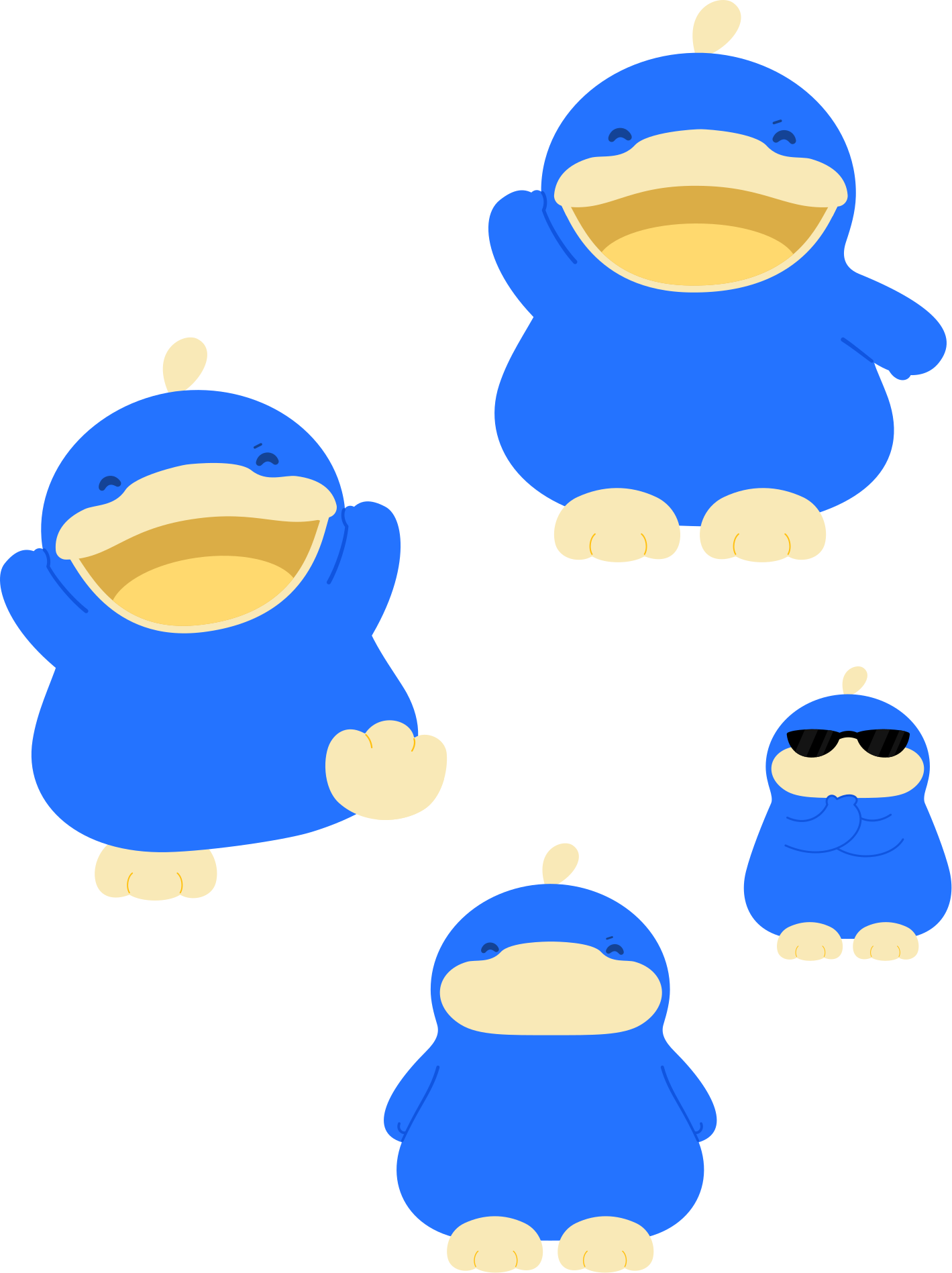
  • Mascot Integration: Seamlessly incorporates the signature "Kawaii" duck character, allowing the mark to function as both a formal corporate logo and a flexible lifestyle asset.
  • Aperture Design Language: Utilizes proprietary circular and curved frames that anchor the logo and create a repeatable visual motif across all physical and digital layouts.
  • Modular Configurations: Optimized in horizontal, vertical, and stacked lockups to ensure maximum readability from large-scale exterior store signage to small digital screens.
  • Flexible Styling Systems: Engineered in full 3D renders, flat 2D vector forms, and minimalist outlines for adaptive deployment across diverse production materials.
  • Chromatic Adaptability: Strictly adheres to the 60-30-10 color rule, ensuring high visual contrast and perfect background separation in both print and digital environments.

Logo guides

Logotype Configurations & Layout Variations

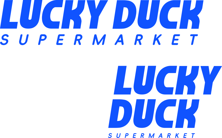
the brand identity features two primary typographic lockups designed to maximize layout flexibility across different spaces while maintaining absolute brand recognition.

  • Composition: Aligns the words "LUCKY DUCK" on a single horizontal plane, neatly anchored by the tracked, uppercase descriptor "SUPERMARKET" underneath.
  • Application: Optimized for wide architectural layouts, including primary supermarket storefront facades, digital banner ads, website headers, and physical aisle shelf strips.
  • Visual Impact: Provides immediate, high-speed scannability from a distance, emphasizing the bold weight and structured rhythm of the primary typography.

Stacked Logotype Layout

  • Composition: Compresses the brand name into a robust two-line vertical stack ("LUCKY" over "DUCK"), utilizing the "SUPERMARKET" tagline as a solid foundational anchor.

  • Application: Specifically engineered for restricted or vertically oriented spaces, such as shopping bags, social media icons, square product stickers, and in-store structural pillars.
  • Visual Impact: Creates a punchy, compact graphic block that concentrates visual weight, delivering an intense and memorable impact within limited design real estate.

Logo

Logotype Configurations & Layout Variations

Logo Flexibility and Logomark Placement


  • The "Lucky Duck" logo is designed with modular flexibility in mind, allowing the 3D or 2D character logomark to be seamlessly integrated directly between the words "LUCKY" and "DUCK".
  • This inline configuration serves as a dynamic visual anchor, drawing immediate attention to the brand mascot while creating a cohesive, unified lockup.
  • By embedding the character within the typography, this layout maximizes space efficiency, making it an ideal solution for horizontal applications, digital banners, and packaging where vertical real estate is limited.

Logo

Logotype Configurations & Layout Variations

Stacked Logo Lockup (Character Overlap)

  • Character and Typography Integration: In this stacked configuration, the 3D character is positioned to the right of the two-line text block, purposefully overlapping the letters "Y" and "K."
  • Depth and Dimension: Allowing the mascot to partially cover the typography creates a dynamic multi-layered effect. The character breaks the visual plane and steps into the foreground, injecting energy, depth, and a playful personality into the identity.

  • Compositional Unity: The deliberate intersection of the logomark and the bold typography binds the graphic and textual elements into a single, cohesive block, preventing the layout from feeling fragmented.

Color Palette

The Lucky Duck Brand Spectrum

The brand’s color universe is engineered to balance a high-energy Asian "Kawaii" aesthetic with a sophisticated, professional retail experience, splitting the palette into distinct functional zones.

  • Core Brand Identity Blues: Built upon a deep, premium navy (#06307B) and a pitch dark tone (#021028) for structural depth, paired with electric, highly saturated shades (#1053FF, #2473FF) that give the main brand mascot its signature vibrant body.
  • Warm Character Accents: Combines bright, inviting tones of energetic yellow (#F5DA6A) and pop-art orange (#FFB931) for the mascot’s features, supported by a soft cream (#F9E9B7) that adds premium contrast.
  • Harmonious Pastel Canvas: Employs a specific range of soft pastel fills—such as light sky blue, blush pink, and pale mint—to act as a calming backdrop that reduces consumer stress and keeps the colorful product packaging as the main focal point.

color

Color Palette

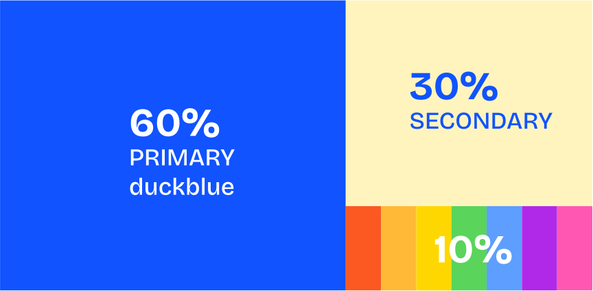
The 60-30-10 Color Rule

  • 60% Dominant (Primary Duck Blue): Forms the visual foundation of the brand. Used for major backdrops, large layout blocks, and core identity assets to establish instant recognition.
  • 30% Structural (Secondary Cream/Yellow): Provides a balancing contrast. Applied to supporting elements, background cards, and secondary surfaces to create layout structure and visual breathing room.
  • 10% Intentional (Accent Palette): Reserved strictly for key highlights, promotions, categories, and calls to action. These vibrant strokes draw immediate focus without overwhelming the design.

color

Color Palette

"Kawaii" Psychology

  • Visual Consistency
All selected colors share similar saturation and brightness. This means they can harmoniously coexist within the same space without causing visual distractions, giving the supermarket a well-designed, artistic gallery feel.
  • "Kawaii" Psychology
In Asian brand design, pastel tones effectively reduce consumer stress.
  • Using pastel background colors for category identification acts as a "canvas," allowing the contrast to make the products themselves the focal point, thereby increasing purchase conversion rates.

color

Color - Accents

  • The Power of Accents
Our updated vibrant color palette is designed to bring energy, clarity, and life to the brand.
  • Usage Restrictions
These pure, intense shades are strictly prohibited from being used as background fills or for large-scale graphic elements.
  • They are meant to guide the user's eye, highlight key call-to-actions (CTAs), define micro-interactions, or add subtle pops of personality to icons and small UI components.

color

Background and Contrast Application

  • Soft Pastels for Backdrops: Expansive background areas utilize muted, soft tones to provide a clean, calm canvas that keeps the primary product imagery at the center of attention.
  • Punchy Accents for Small Details: High-contrast, fully saturated brand colors are strictly applied to micro-elements, patterns, and badges to ensure sharp visibility.

  • Legibility at a Glance: The high contrast on smaller typography and graphic indicators guarantees that crucial details stay readable and crisp, even at a distance.

font

primary & secondary fonts

  • Primary: typewalk 1915 uppercase
  • Secondary: Bricolage Grotesque

tone of voice

Brand Voice Pillars

  • Playful & Kawaii (Cute): We bring pure joy and cuteness into the everyday grocery routine. We treat our customers like close friends, using warm expressions, lighthearted food puns, and expressive emojis to spark an immediate smile.
  • Modern & Trendy: We are the ultimate cultural curators. We actively blend traditional Asian hospitality with global internet culture, Gen-Z trends, and aesthetic pop-art vibes.
  • Vibrant & Energetic: Our language is high-energy, colorful, and full of life. We don’t just list ingredients; we loudly celebrate the bold flavors, textures, and exciting experience of Asian snacks and street food.

Duck ip

Mascot Adaptability & Multi-Format Usage

  • 3D Render Style (Primary Media): The full 3D glossy model is the core brand asset. It is reserved for high-fidelity applications—such as primary digital signage, hero website banners, premium packaging, and main promotional posters—where maximum depth, volume, and visual impact are needed.

  • Linear Outline Style (Micro-Scale & Monochromatic): The bold line-art version provides ultimate layout flexibility. It is designed strictly for small-scale micro-elements, subtle background patterns, receipt printing, monochrome packaging, or as a minimal icon badge where complex colors are not permitted.

Duck ip

Mascot Adaptability & Multi-Format Usage

  • 2D Flat Style (Secondary Media): The simplified flat-color vector version is optimized for high-speed scannability and standard reproduction. It is ideal for digital applications (mobile UI, app icons, website menus) and cost-effective print layouts where 3D gradients might lose clarity.


stripes

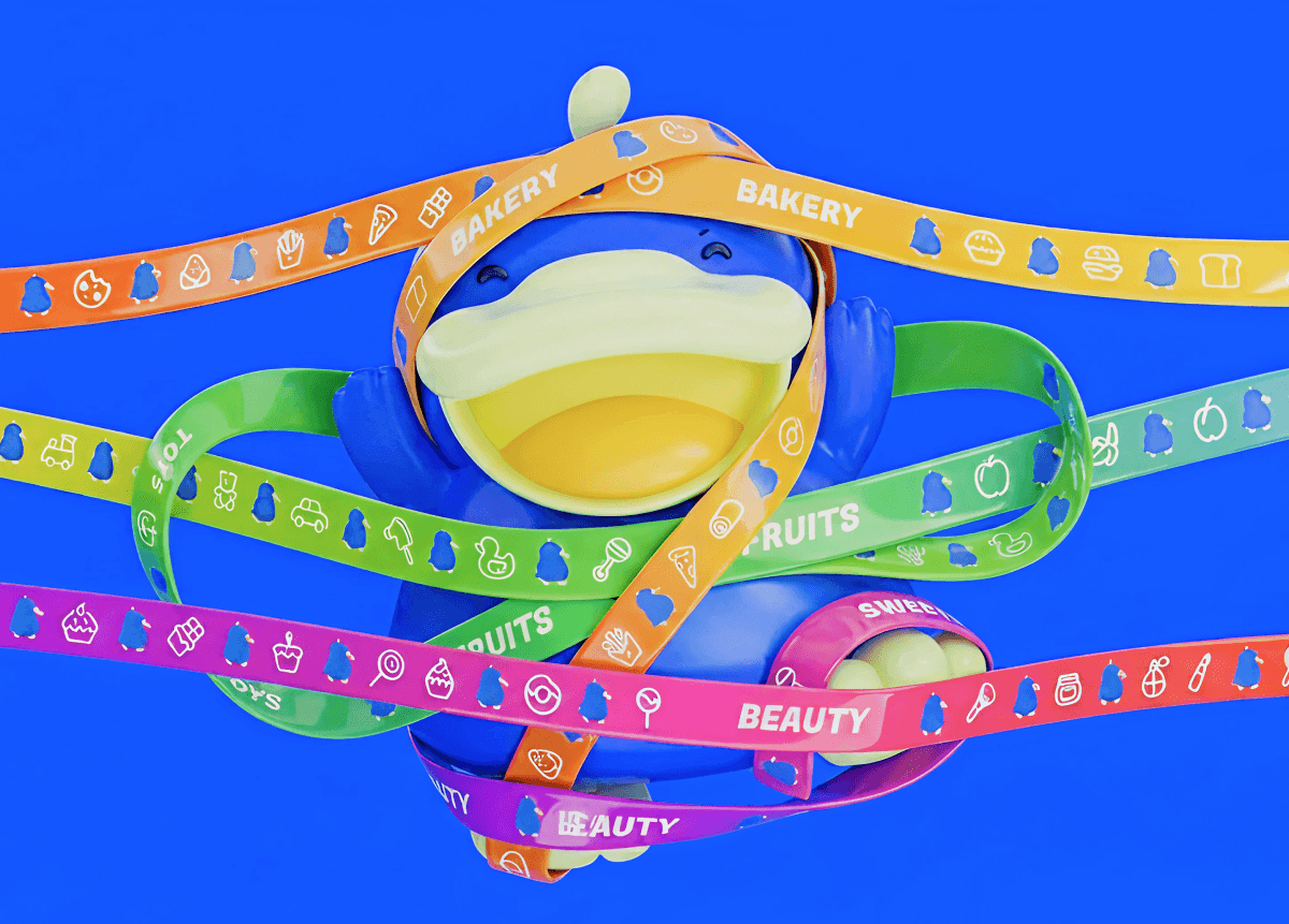
Category Icon Ribbons

  • Visual Signage Lines: Bright, color-coded ribbons are utilized to visually partition and identify different store categories (e.g., Snacks, Bakery, Fruits).
  • Pattern Rhythm: Each line alternates the blue line-art mascot with simple, high-contrast white product icons to ensure immediate department recognition at a glance.
  • Flexible Navigation: These ribbons serve as a universal styling tool for physical aisle signage, shelf liners, printed flyers, and online app categorization grids.

( Project Scope )

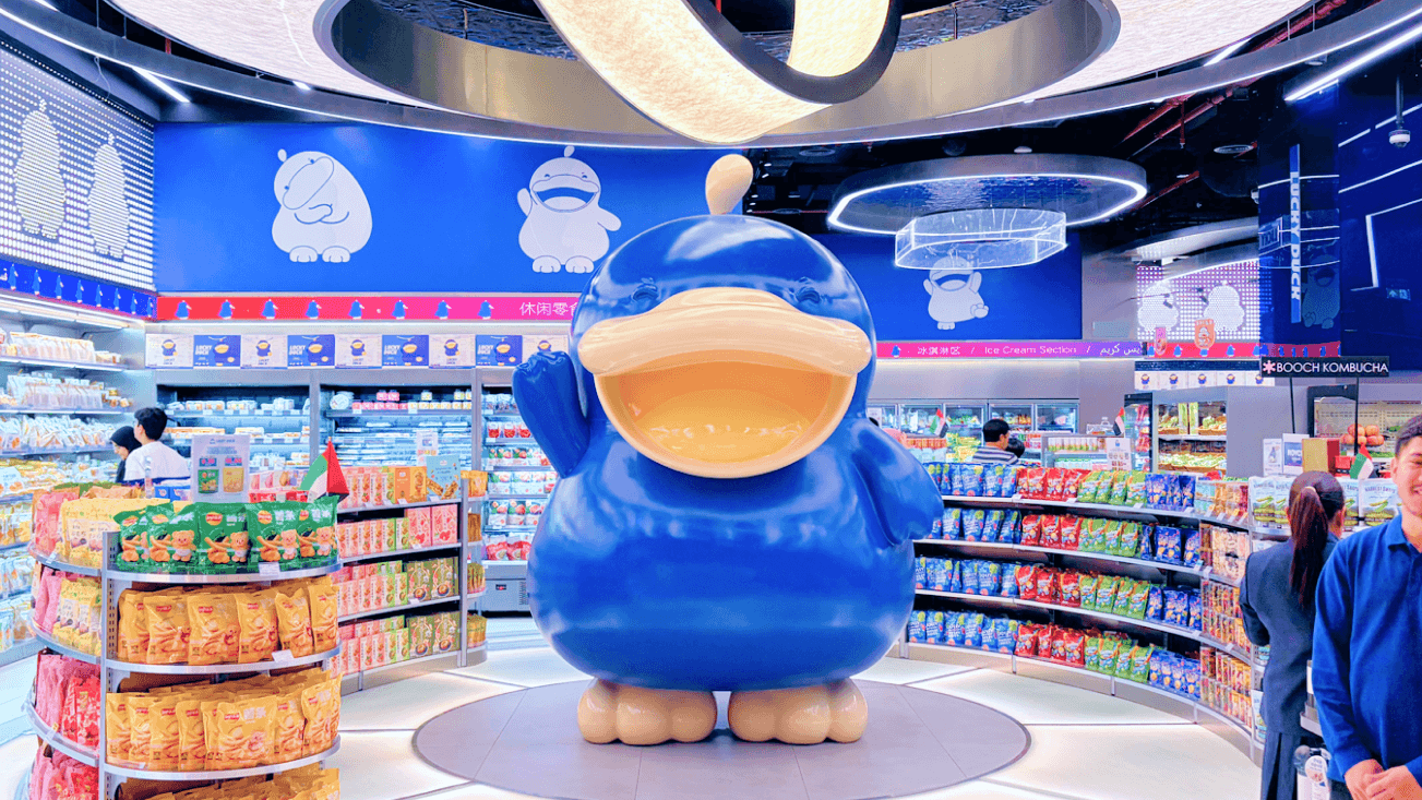
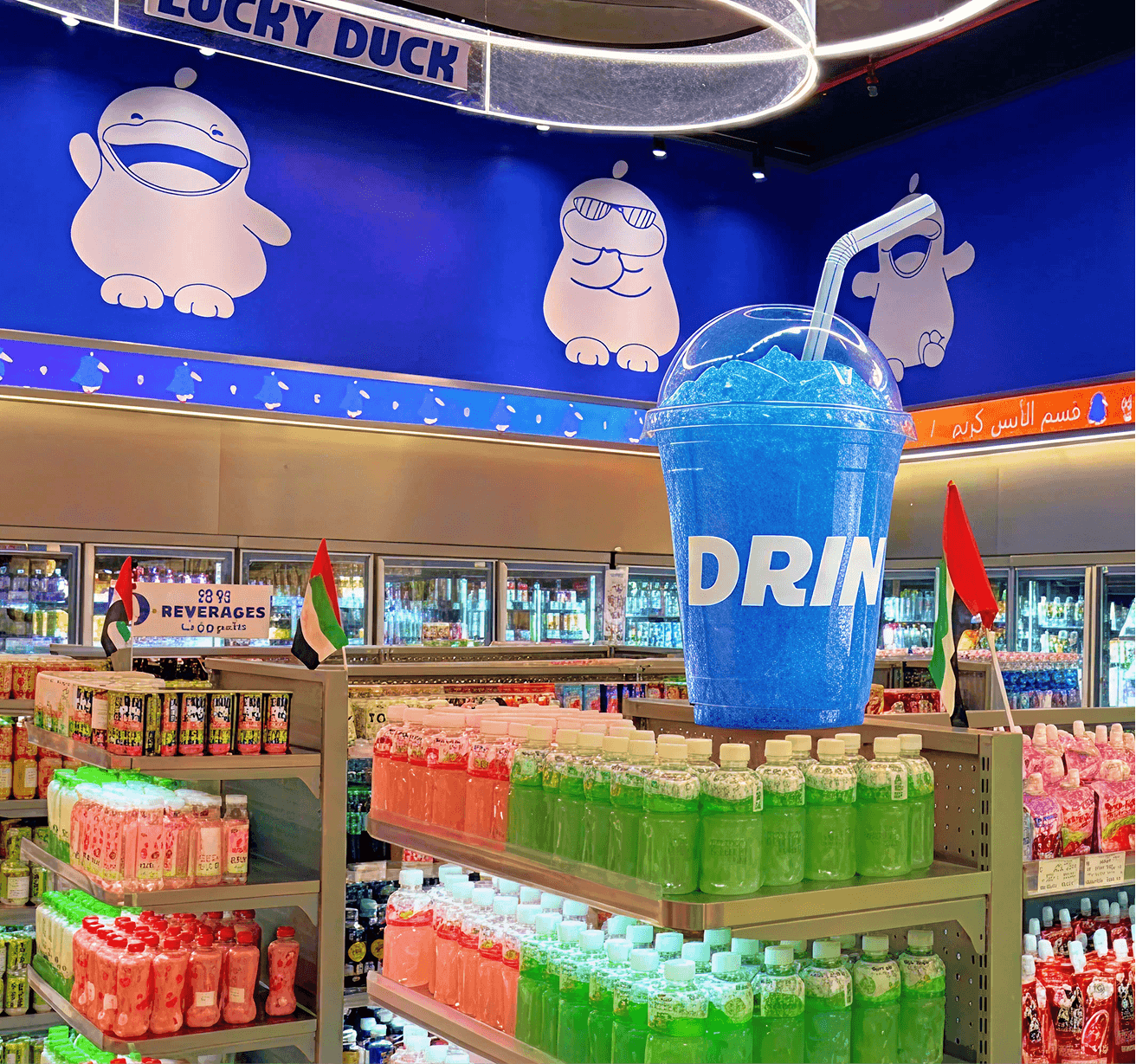
The interior and environmental design of the supermarket translates the digital brand identity into a physical space, transforming routine grocery shopping into an immersive lifestyle experience. Every detail—from large-scale architectural structures to consumer packaging and merchandise—is engineered to spark positive emotions, deliver intuitive navigation, and drive viral social media engagement.

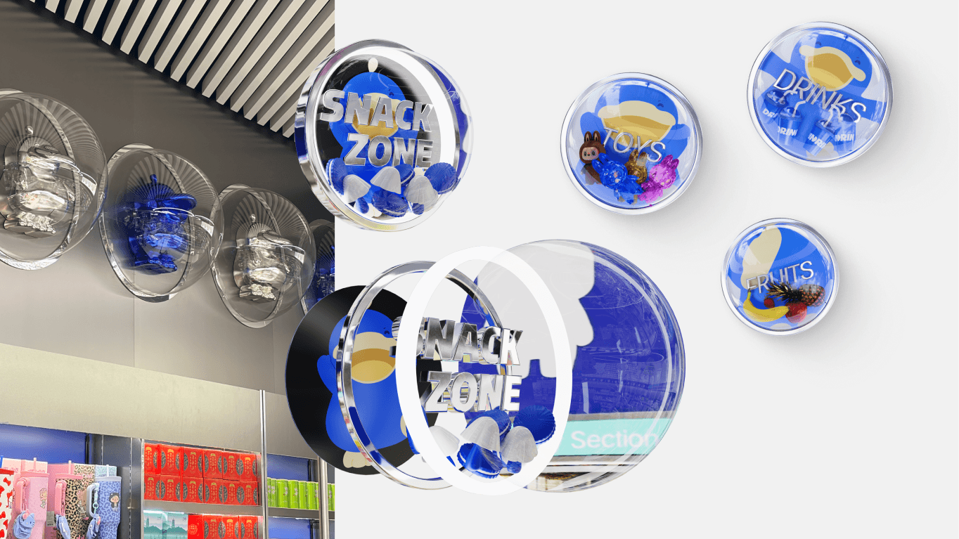
  • Architectural Wayfinding: Features custom 3D Aperture Navigation Pylons with protruding transparent domes that disrupt traditional flat shelving planes to capture eye-level attention and anchor flagship store departments.
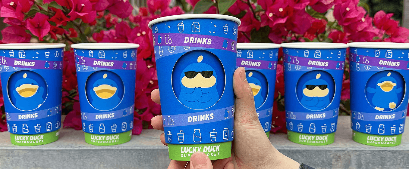
  • Sensory Signage Ribbon: Employs vibrant, category-coded directional ribbons that cross-alternate line-art mascots with high-contrast icons to partition Drinks, Bakery, and Snacks for immediate scannability.
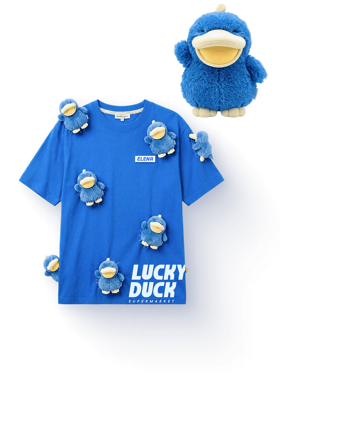
  • Collectible Merchandise & Apparel: Integrates trendy staff uniforms with gamified consumer touchpoints, including collectible toy-topped cups, secret blind-box base compartments, and interactive rotating emotion sleeves.
  • Viral Optical Illusion Packaging: Explores a hyper-realistic "bag-in-a-bag" printed graphic that creates the convincing illusion of a clear plastic bag packed with fresh fruits, turning everyday packaging into a walking advertisement.
  • Adaptive Promotional Labeling: Utilizes a modular system of vibrant vinyl stickers, custom character seals, and color-coded pricing badges to instantly highlight special offers and membership loyalty tiers across retail shelves.

( Print Assets & Out-of-Home Campaigns )

The brand’s print ecosystem translates high-energy digital identity assets into tangible, high-impact retail touchpoints. From in-store price categorization to massive contextual advertising in premier retail locations, every print asset is designed to maximize visual rhythm, readability, and consumer conversion.

  • 1
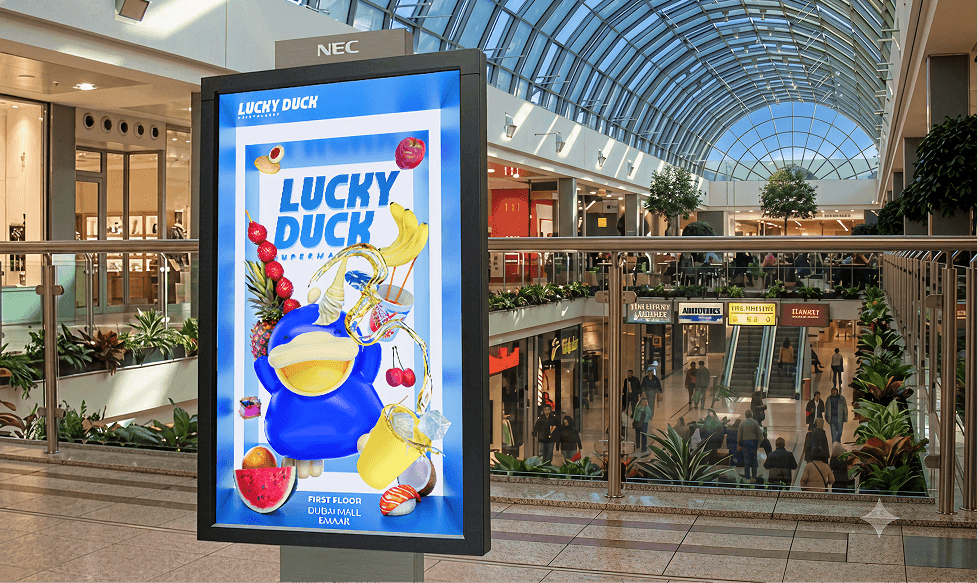
    Dubai Mall OOH Advertising: Large-scale digital and print billboards deployed across flagship zones like the Emaar Dubai Mall feature hyper-realistic 3D mascot renders paired with dynamic food elements, bridging bilingual Arabic and English typography to anchor the brand as a premium local destination.
  • 2
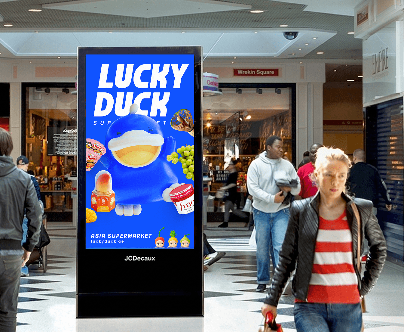
    High-Impact Promotional Posters: Tactical street billboards and JCDecaux transit posters utilize bold, linear typography setups paired with stark, striped corporate blue backdrops to spotlight global viral products and trending Asian imports with maximum contrast.
  • 3
    Color-Coded Price Tag System: In-store price tags function as a dynamic scannability framework, shifting background colors between standard white, promotional orange, and member-tier yellow to help consumers immediately identify pricing tiers and special offers from a distance.

RELATED WORKS

View more case studies that showcase my expertise in building high-impact integrated campaigns.