Brandbook and visual strategy
As a solo creator, I drove the entire lifecycle of this massive product launch, executing everything from early product strategy to the final post-production assets. The complete scope of work delivers a comprehensive, launch-ready gaming experience across all touchpoints.
Free To Play Poker /
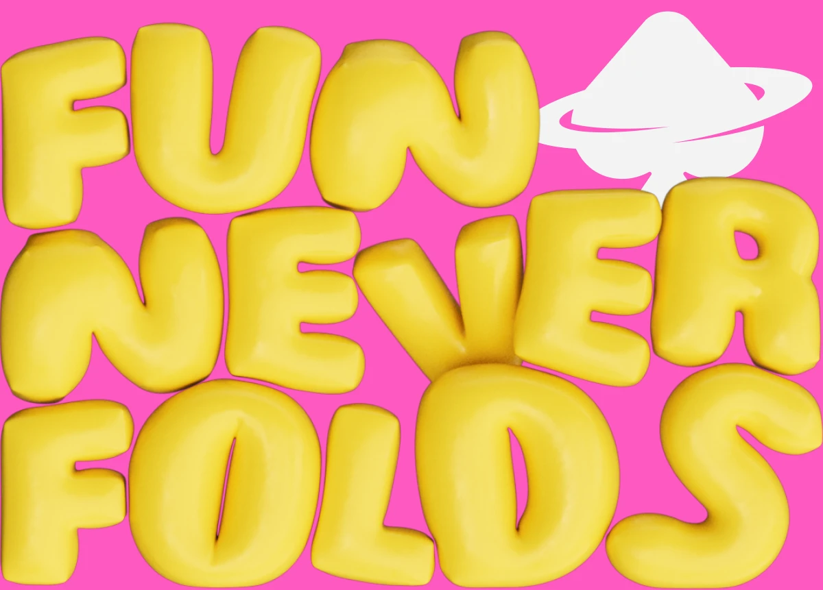
The visual core of the game is rooted in a bold, expressive design system created to disrupt the mobile gaming market. Built around the driving philosophy "Fun Never Folds," the comprehensive brandbook establishes a cohesive design language that seamlessly fuses contemporary streetwear aesthetics with bleeding-edge technology features. The strategy focuses heavily on tactile, inflated 3D typography and interactive environments that make the game feel alive, tactile, and instantly recognizable.
Brandbook
Short version
The strategy focuses heavily on tactile, inflated 3D typography and interactive environments that make the game feel alive, tactile, and instantly recognizable.
-
LOGO
-
Colors
-
Elements
-
Merch
-
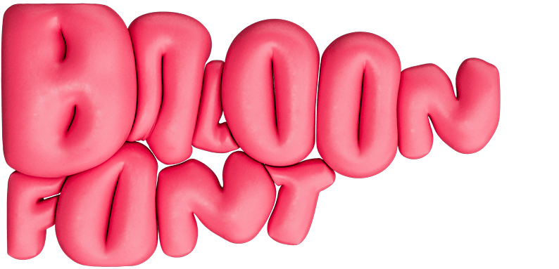
Baloon Font
Logo
Logo design and core identity
The core logomark serves as the visual anchor of the "NEW POKER" brand, meticulously designed to bridge traditional card gaming symbols with a futuristic, space-age aesthetic tailored for Gen Z players. By subverting the classic spade icon, the visual identity immediately establishes that this is a complete departure from traditional poker.
Logo
Logo design and core identity
-
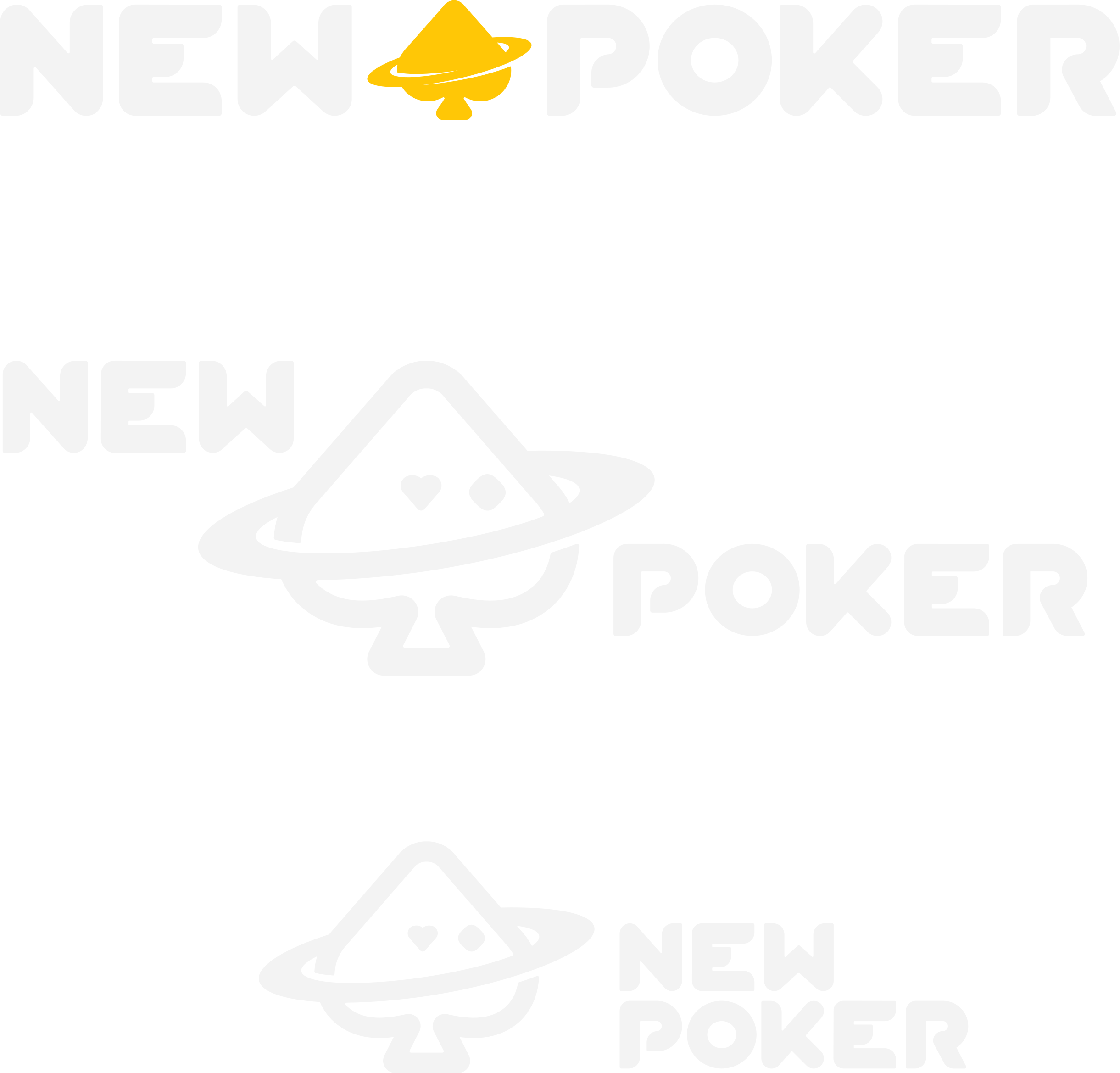
Responsive configuration matrix: The identity system defines multiple flexible lockups—including inline horizontal, staggered, block-stacked, and centered combinations—ensuring perfect visual balance whether applied to a tiny mobile header or a massive splash screen.
-
The cosmic spade logomark: The standalone icon is presented in two core stylistic variations: a playful line-art version featuring asymmetric character eyes (one circle, one heart) wrapped in a planetary orbital ring, and a bold, solid silhouette version built for high-impact minimalist execution.
-
Custom geometric typography: The bespoke "NEW POKER" wordmark utilizes ultra-heavy, rounded geometric letterforms with clean cutouts and stylized terminal angles, providing a powerful, modern typographic weight that anchors the entire visual system.
Logotype
Logotype anatomy and typographic construction
The custom wordmark is built on a strict geometric framework, balancing futuristic minimalism with high-impact readability. The design process deconstructs traditional typography into its core primitive elements, creating a bespoke visual signature tailored for a modern digital ecosystem.
Logomark
Core logomark geometry
The central emblem serves as the ultimate visual synthesis of the brand, re-engineering classic playing card iconography through a strict geometric grid. By transforming standard symbols into a celestial identity, the logomark functions simultaneously as a sharp graphic asset, a cosmic token, and a living mascot tailored for a digital-native audience.
colors
Color system and brand palette
The color ecosystem represents a hyper-saturated, expressive visual foundation engineered exclusively for a digital-native audience. This palette maximizes visual energy, ensuring high contrast, playful engagement, and seamless cross-platform consistency across all 3D environments, mobile interfaces, and lifestyle merchandise.
elements
Core branding elements and visual assets
The visual identity system relies on a hyper-expressive design language engineered to capture the attention of a digital-native Gen Z audience. By blending high-gloss 3D assets with vibrant streetwear tropes, the branding transforms a traditional card game into an immersive casual ecosystem. The entire visual framework was systematically developed to ensure seamless consistency across the application interface, video promotional assets, and physical lifestyle extensions.
elements
Core branding elements and visual assets
-
Vibrant color canvas: A signature palette constructed from electric pinks, intense neon yellows, and deep cobalt blues. This color strategy deliberately moves away from traditional dark casino felt, optimizing the visual experience for high-energy mobile screen entertainment.
-
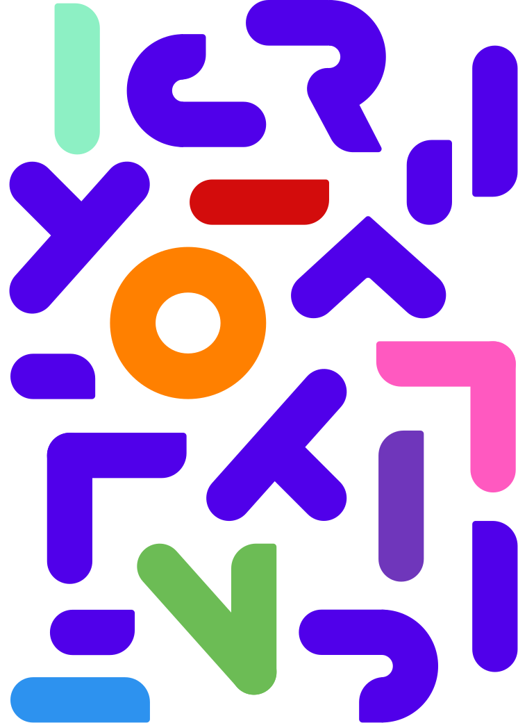
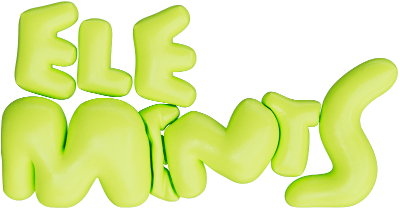
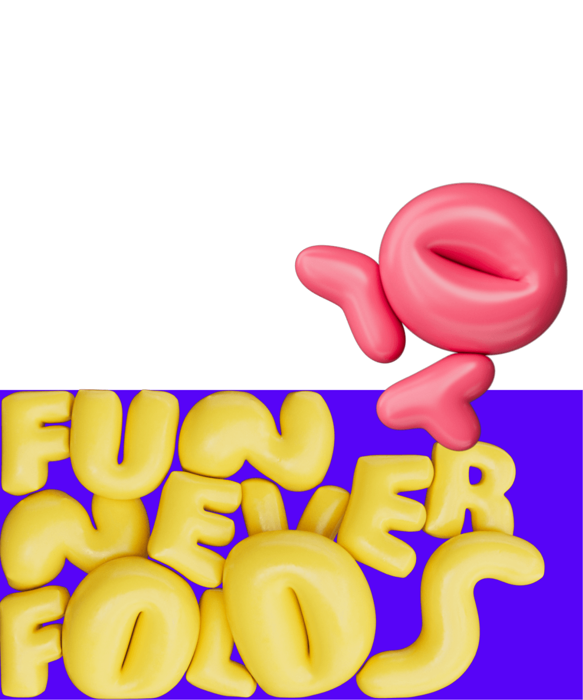
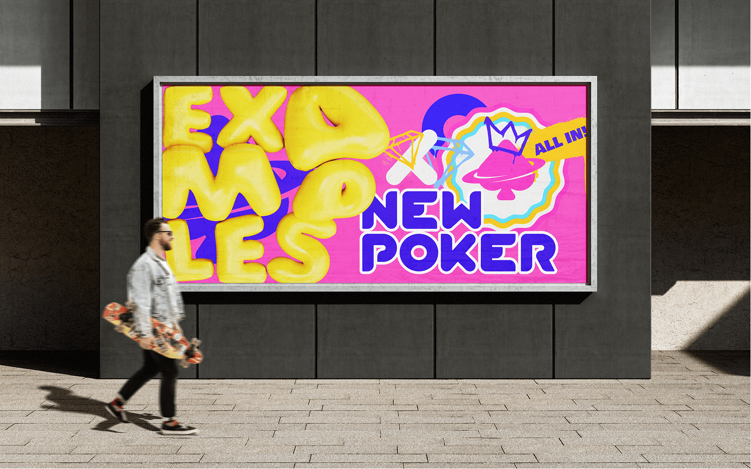
Tactile inflation typography: Custom-designed 3D soft-body typefaces used for high-impact game alerts such as "WAIT!", "JOIN!", and "BOMB POT" as seen in the promotional video rebrand_all_6_c.mov. These letters feature a high-gloss, liquid-plastic finish that makes the text feel physical, playful, and responsive.
-
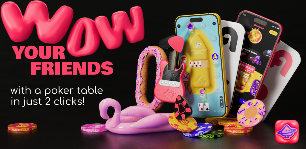
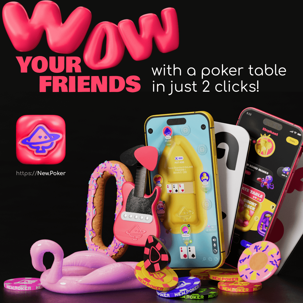
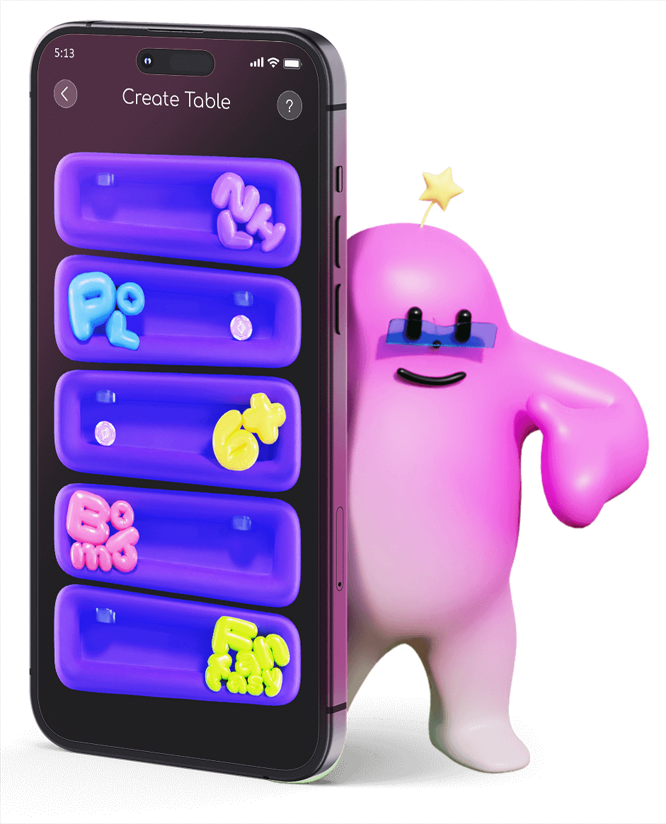
Interactive thematic spaces: A collection of unconventional poker environments replacing traditional tables. Players interact on inflated pool floats, giant frosted donuts with custom sprinkles, neon surfboards, and acoustic guitars, turning every hand into a casual hangout session rather than a high-stakes gamble.
-
Animated emoji ecosystem: A massive library of expressive, oversized 3D emojis and pop-up chat stickers designed to erupt across the interface. These assets replace standard text chats, providing players with immediate, high-energy visual communication tools.
elements
Core branding elements and visual assets
-
Animated cartoon mascots: A cast of low-poly, urban-inspired 3D characters was built to anchor the marketing materials and in-game interactions. These elements include a walking tomato with legs, a round blue creature, a purple donut monster, and a stylized yellow elephant.
-
Playful character design: Stylized 3D characters, avatars, and animated mascots designed with an urban, cartoon-inspired aesthetic. These figures populate the game world and promotional media, acting as interactive elements that react in real-time to gameplay milestones.
merch
Core branding elements and visual assets
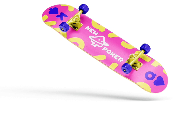
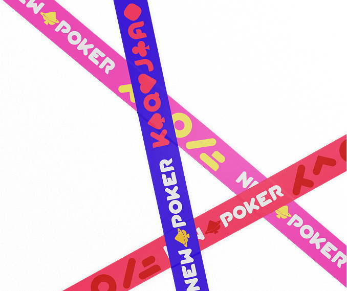
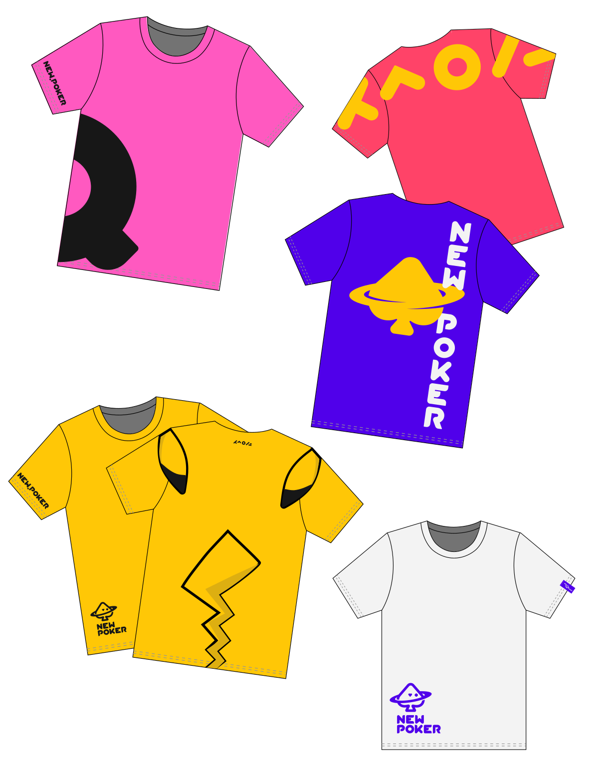
To transform the project from a digital mobile application into a genuine lifestyle brand, a comprehensive apparel line was developed as an ecosystem extension. This collection bridges the gap between virtual gaming and contemporary youth culture, translating digital assets directly into real-world fashion statements.
merch
Core branding elements and visual assets
-
Premium headwear design: Branded caps developed with clean structural paneling and high-density embroidery, featuring the official cosmic logo. These pieces serve as a highly recognizable real-world asset, extending brand visibility far beyond the digital screen.
-
Streetwear-focused design logic: Every physical piece applies contemporary urban fashion principles—utilizing asymmetric graphics, bold contrast palettes, and minimalist branding tags to ensure the merchandise feels like authentic premium streetwear rather than standard promotional corporate gear.
Baloon font
Kinetic 3D balloon typography
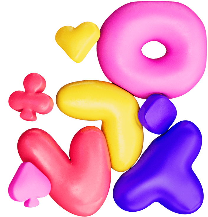
The definitive voice for high-impact messaging across the visual identity. This bespoke, soft-body typographic system rejects traditional, rigid layout boundaries, replacing static text with an organic, hyper-dynamic energy engineered specifically to resonate with digital-native audiences.
Baloon font
Kinetic 3D balloon typography
-
Interlocking soft-body dynamics: Each character behaves as a living, physical volume filled with internal pressure. Individual letters interact organically in real time—squeezing against one another, compressing edges upon impact, and pushing into surrounding interface elements to form a dense, tactile visual lockup.
-
Perpetual kinetic motion: Designed to never remain entirely static, the typeface operates within a framework of constant fluid motion. The letters gently flex, simulate breathing patterns via subtle inflation changes, and exhibit elastic physics that react directly to gameplay pacing and user touches.
-
Hyper-vibrant headline hierarchy: This expressive font is reserved exclusively for primary headlines, major milestone announcements, and critical game-state updates. Rendered in the brand palette's most saturated, neon-grade colors, these titles instantly command focal dominance across the user interface.
-
Reactive layout collisions: The typography adapts playfully to spatial constraints. Instead of shrinking to fit or clipping past margins, characters dynamically shift their volume and squeeze factor, colliding with adjacent UI components to emphasize a physical, tactile digital environment.
( Web ecosystem and landing page design )
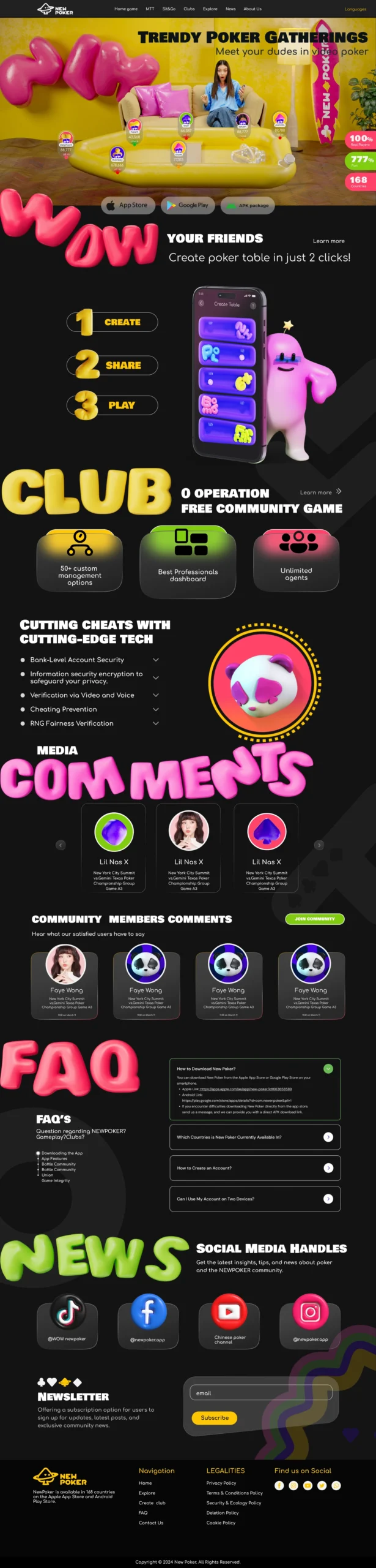
The web landing page serves as the primary acquisition funnel and desktop anchor for the brand ecosystem. Built as a high-conversion, long-scroll digital experience, the layout seamlessly transitions from expressive, high-energy brand storytelling into structural product feature breakdowns. The web interface maintains absolute visual fidelity with the mobile application, utilizing dark, high-contrast backgrounds layered with glowing container modules, hyper-saturated assets, and floating 3D typography elements.
-
Trendy poker gatherings: The main screen instantly establishes the social positioning of the app with the core headline "Trendy Poker Gatherings," supported by a full-width 3D living room environment visualization that showcases live video gameplay mechanics in a casual environment.
-
Gamified performance badges: A dedicated tracking module displays high-visibility performance proof anchors ("100% Real Players," "777% Fun," "168 Countries") rendered in bold, rounded containers to drive instant user validation.
-
Multi-platform conversion hub: Positioned directly below the primary focal area, the download layout features clean, standardized download buttons for the App Store, Google Play, and a direct APK package installer to minimize onboarding friction.
( Mobile Game )
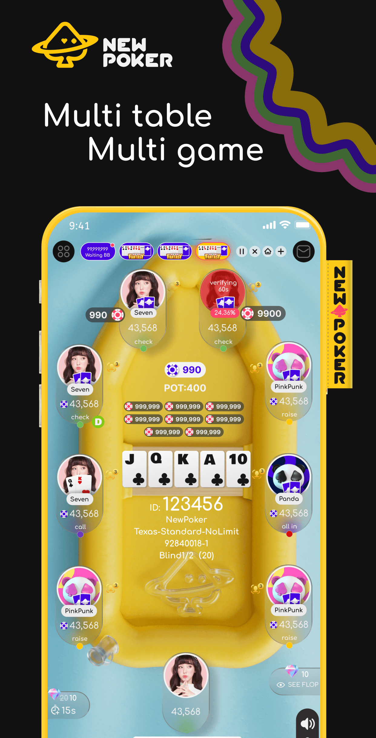
This project represents a radical reconstruction of mobile poker tailored specifically for the iOS and Android platform. The game completely shatters outdated industry design tropes, transforming a comprehensive brandbook into a living, breathing digital product. It stands as a colossal mobile ecosystem where cutting-edge UI/UX architecture directly merges with next-generation youth culture.
-
1Over 800 custom UI screens: A massive product design undertaking covering every single user flow in hyper-detail—from complex multi-tier game lobbies and secure onboarding paths to advanced, tool-rich club management dashboards.
-
2A radical style departure: A complete rejection of traditional, rigid card game aesthetics. The user interface is built on ultra-saturated neon gradients, high-gloss finishes, and clean fluid geometry designed specifically to capture a younger target audience.
-
3Complete brandbook integration: Every visual rule, layout grid, typographic hierarchy, and identity asset functions as a unified organism within the application, ensuring flawless design consistency across all user touchpoints.