About Nauka Publishing House
Nauka operates as a historic Federal State Budgetary Institution ("Publishing House Nauka") that serves as a cornerstone of the academic and scientific literary ecosystem. Established in the 18th century, the institution specializes in preserving structured systems of empirical facts, verified scientific data, and precise academic literature across generations.
NAUKA The Visual Identity & Brandbook
The developed brandbook creates a highly functional design system that merges classic academic documentation with a clean, minimalist aesthetic. By reconstructing historical symbols and enforcing mathematical structural layouts, the brand identity achieves a unified presence across everything from formal stationery and complex book covers to modern corporate apparel and accessories.
color
Identity Color Palette
A highly structured color system engineered to maximize layout balance and reading endurance across corporate assets.
-
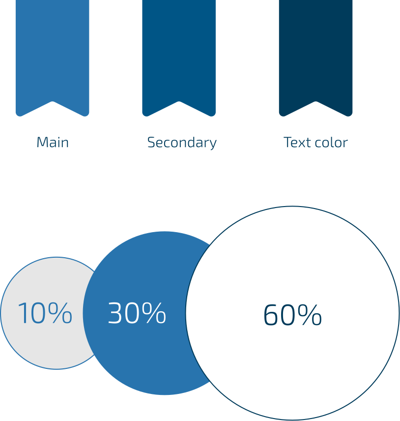
The brand enforces a strict 60-30-10 distribution scheme across all visual assets to guarantee perfect compositional harmony.
-
The dominant primary color is white, explicitly selected to symbolize a clean, unwritten sheet of paper.
-
The secondary corporate color is a vibrant blue (#2874AE), complemented by a deep dark blue (#003B5B) that is strictly reserved for text and fine details.
font
Typography Guidelines
A highly structured color system engineered to maximize layout balance and reading endurance across corporate assets.
-
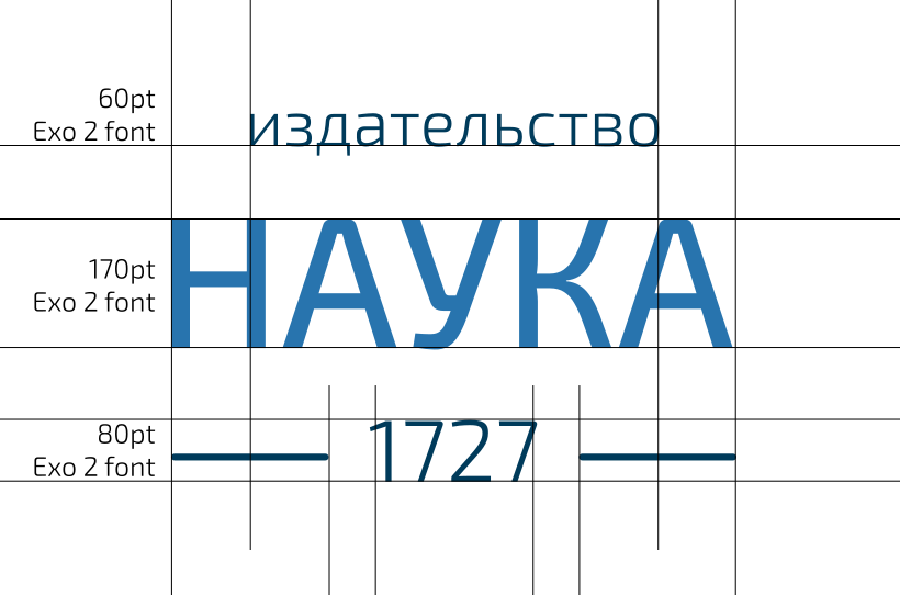
The primary corporate typeface is Exo 2, an optimal, free geometric font fully integrated into Google Fonts.
-
Small text blocks must completely avoid center or justified alignment, relying strictly on clean left- or right-aligned blocks anchored by an accent line.
-
Layouts featuring notable academic quotes use oversized quotation marks or enlarged initial capital letters to provide strong editorial focus.
logotype
Logo System Architecture
A flexible, modular logo system designed to adapt seamlessly across diverse manufacturing techniques and presentation scales.
-
The logo is strictly anchored to a central alignment, serving as the definitive focal point of the entire corporate identity.
-
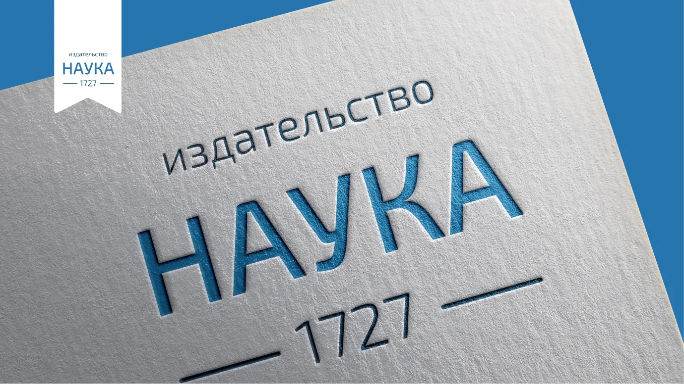
A specialized logo variant with thickened structural lines was developed to guarantee clean, high-precision hot stamping and blind embossing.
-
The descriptive subtitle "publishing house" can be systematically removed based on specific scale restrictions and localized layout media.
Logomark
Logo System Architecture
A contemporary graphic evolution of the publisher’s historic emblem, shifting away from outdated visual metaphors toward a fluid future.
-
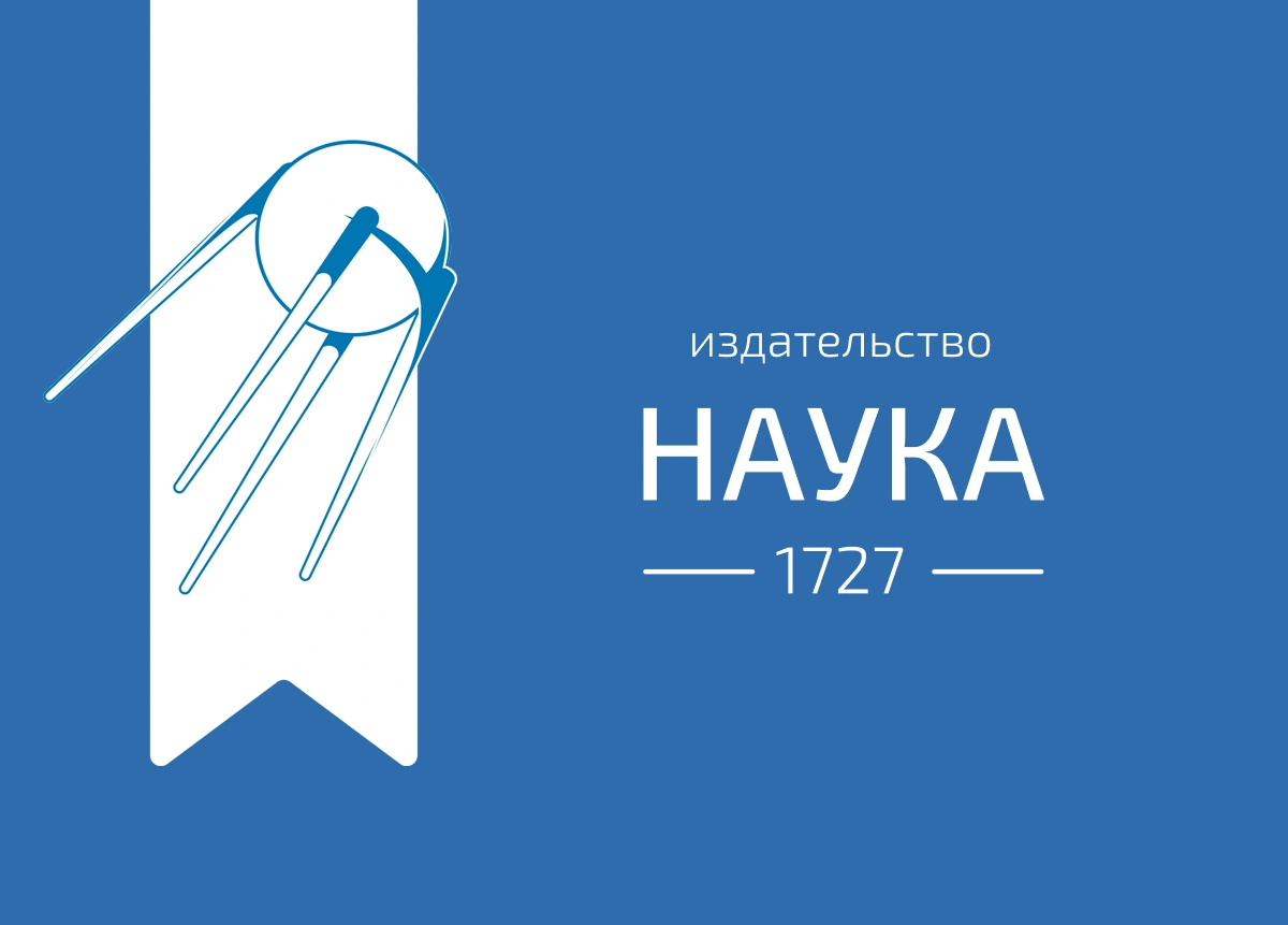
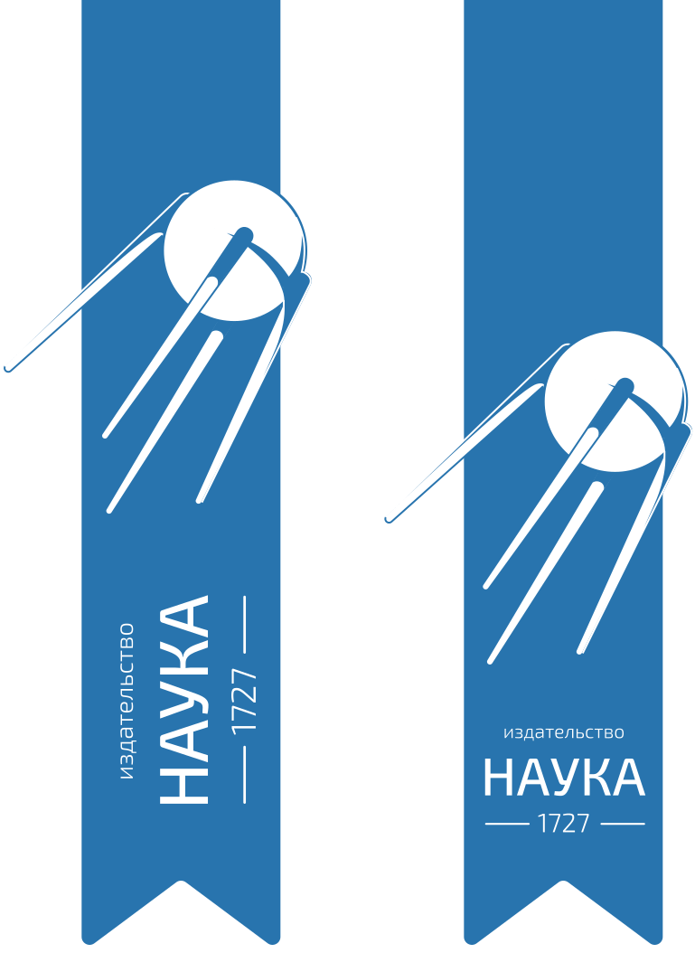
The iconic satellite emblem was redesigned to visually represent the passage of time, the dynamic nature of science, and brand renewal.
-
The literal illustration of a book from the legacy emblem was permanently removed because it was visually and structurally outdated.
-
The satellite can be deployed in an open composition format where its vector lines dynamically bleed past the outer margins of the frame.
Logomark
Logo System Architecture
Sputnik is used in two variants: 1. In an open composition, where some elements extend beyond the edges (for large spaces) 2. On the tab / bookmark (Section 5)
Brand Mark
The Bookmark Ribbon
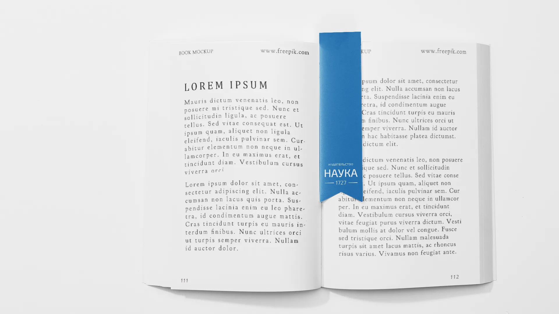
A prominent corporate mark that bridges physical utility with a literal visual nod to literature, journals, and the pursuit of knowledge.
-
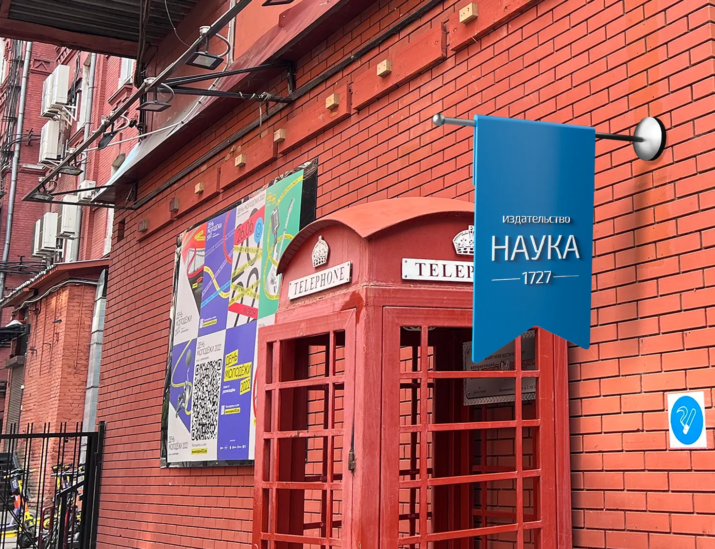
The structural bookmark ribbon is built to transform and scale dynamically depending on the dimensions of the placement area.
-
In layout applications, the ribbon is always aligned precisely to the top-left edge, utilizing mathematically fixed horizontal and vertical offsets.
-
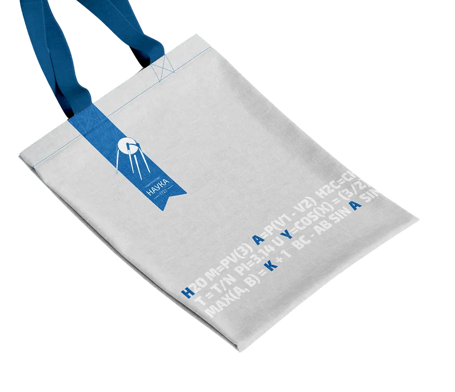
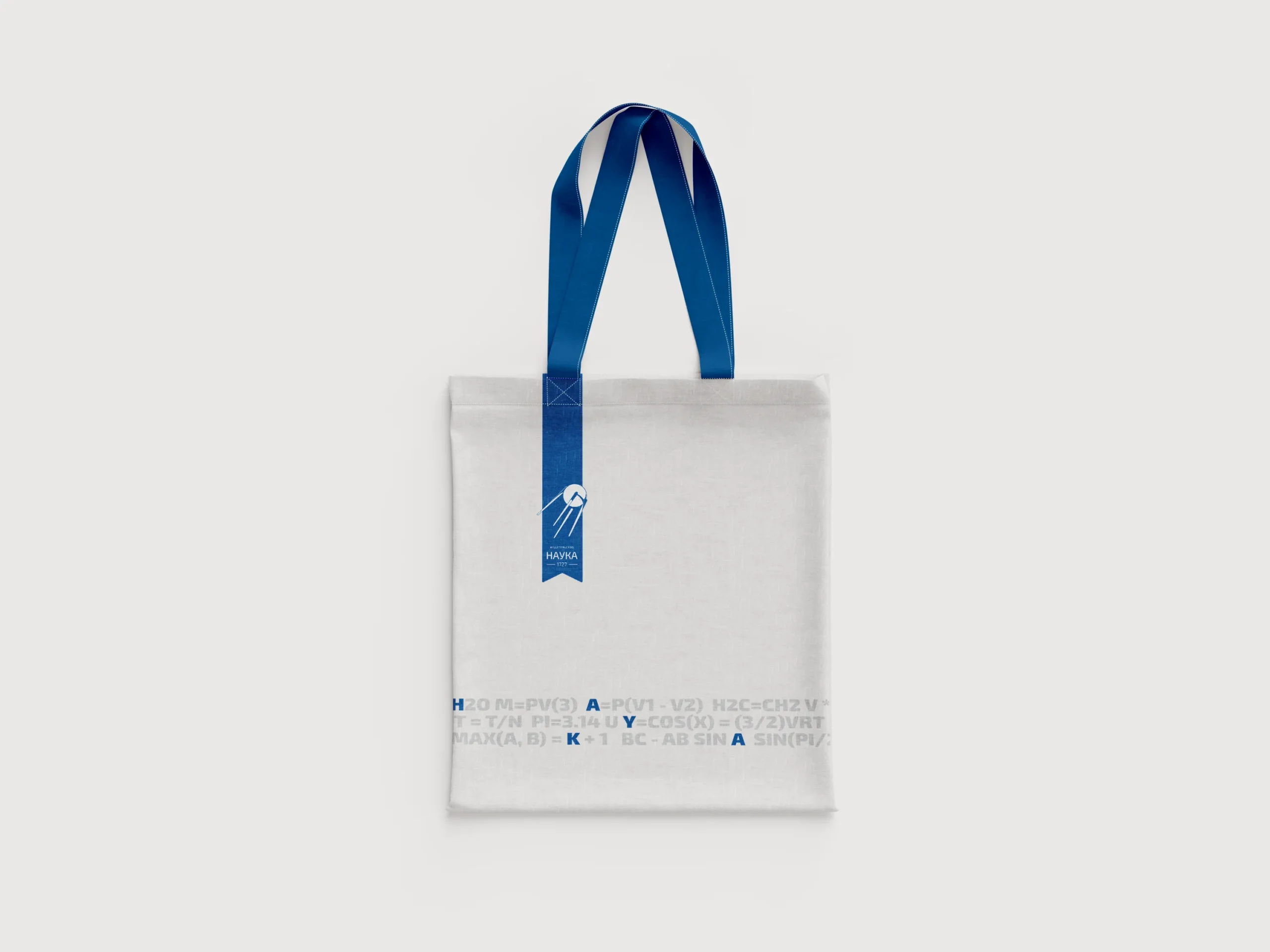
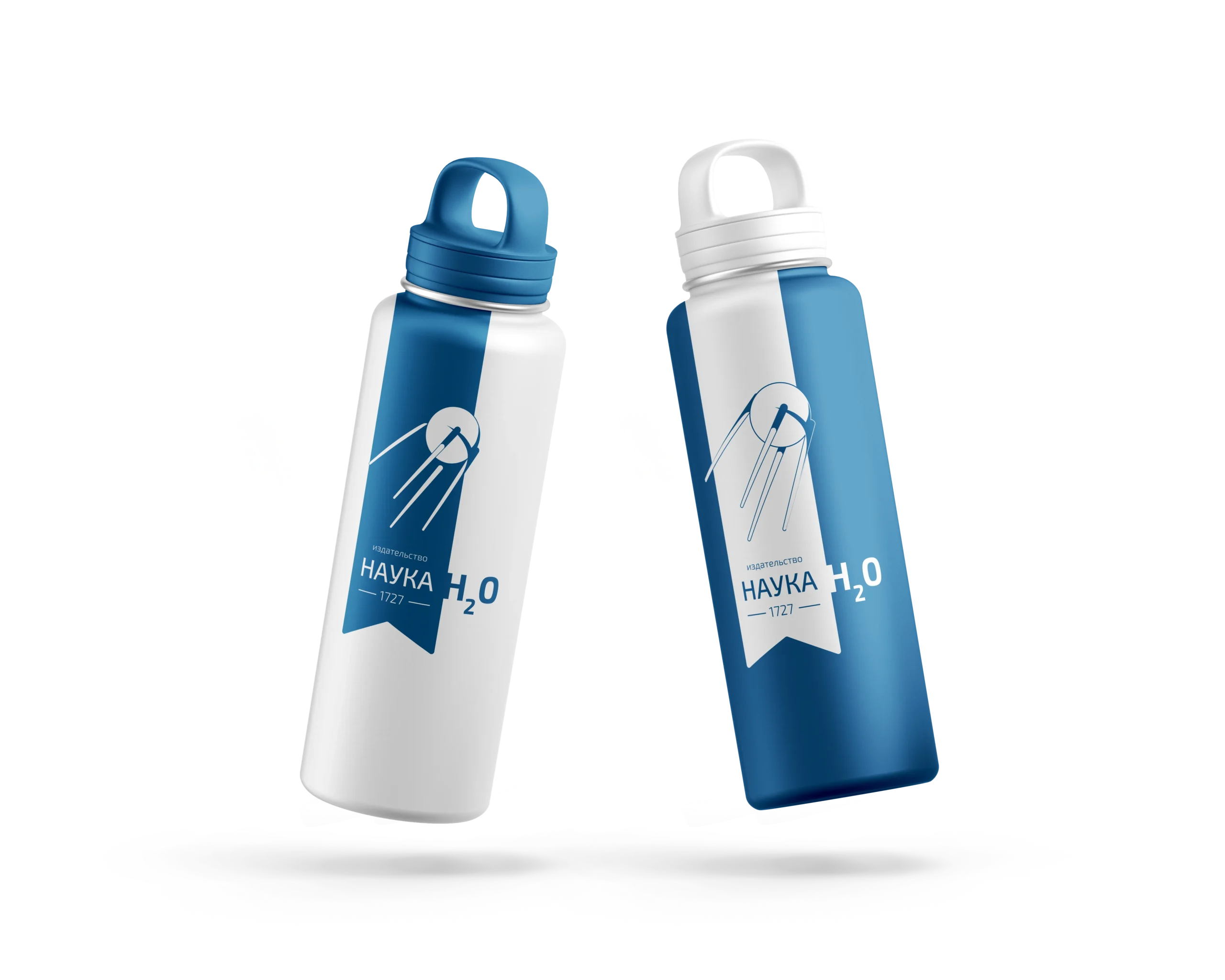
When applied to branded consumer goods, the open layout area to the right of the ribbon is intentionally reserved for content-specific formulas.
Brand Mark
The Bookmark Ribbon
The ribbon can transform depending on the composition and the size of the placement area.
Brand Mark
The Bookmark Ribbon
White color
Brand Mark
The Bookmark Ribbon
Logo mark variations where the ribbon extends beyond the edges. There are also two possible types of logo layout on the ribbon: 1. Vertical, for a small area 2. Horizontal, for a large size
Pattern
Systematic Brand Pattern
An intricate graphic pattern designed to infuse visual backgrounds with deeper academic and intellectual meaning.
-
The brand pattern functions as a balancing design asset, adding structural depth while reinforcing the corporate identity.
-
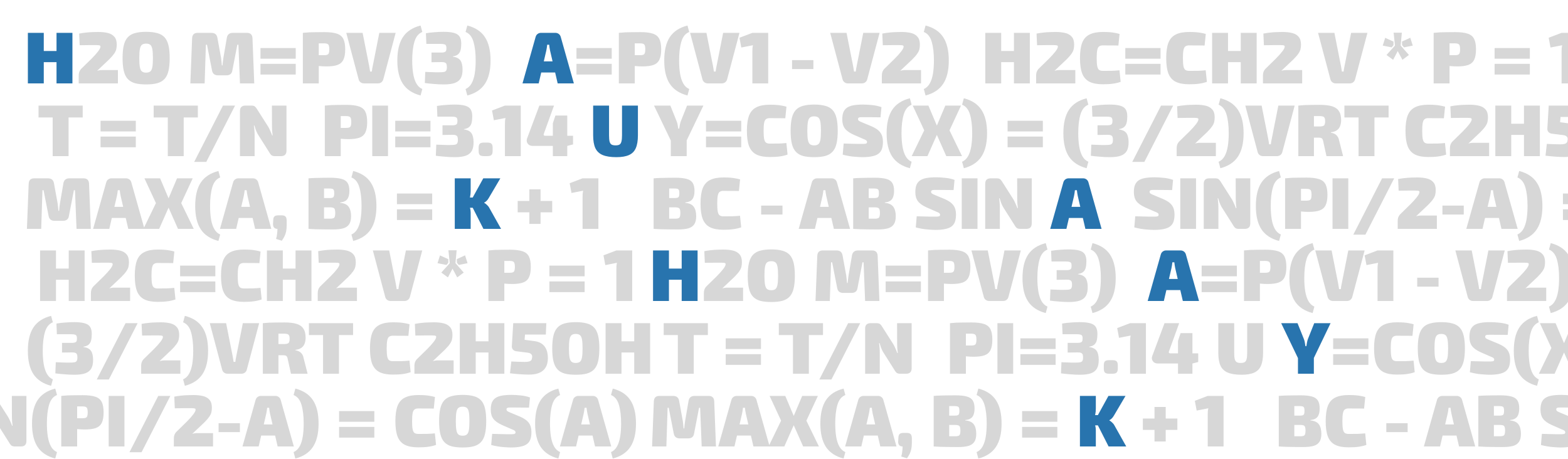
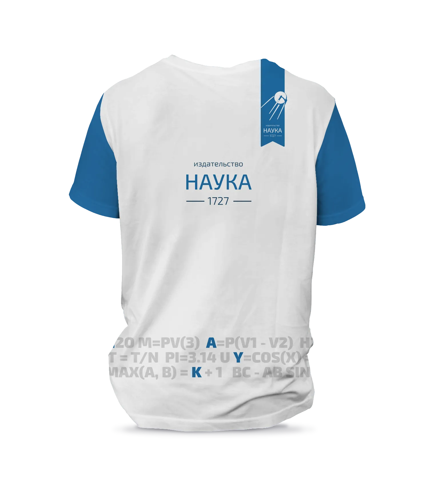
The pattern consists of typographic letters symbolizing reading, which gracefully intertwine to assemble authentic scientific formulas.
-
The official title of the publishing house is organically embedded and hidden directly within these scientific and mathematical equations.
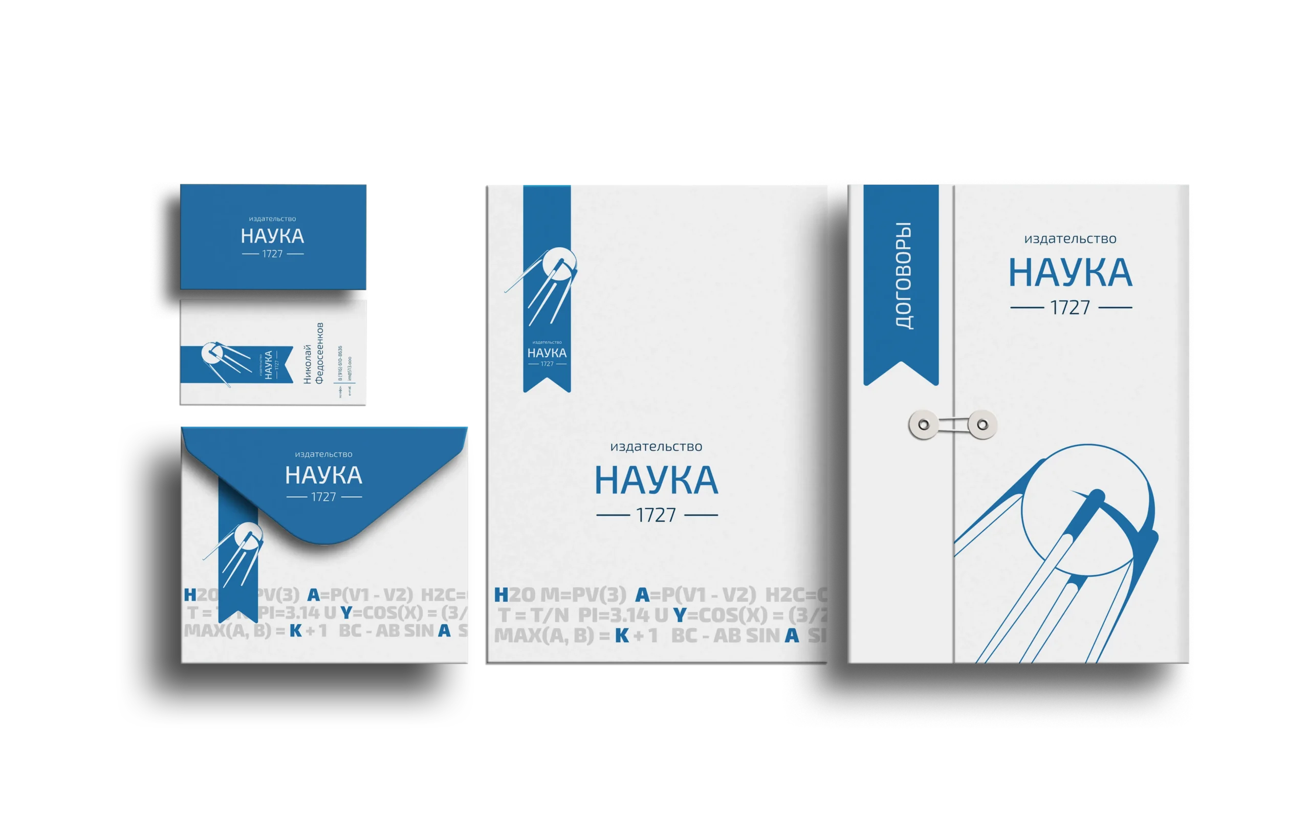
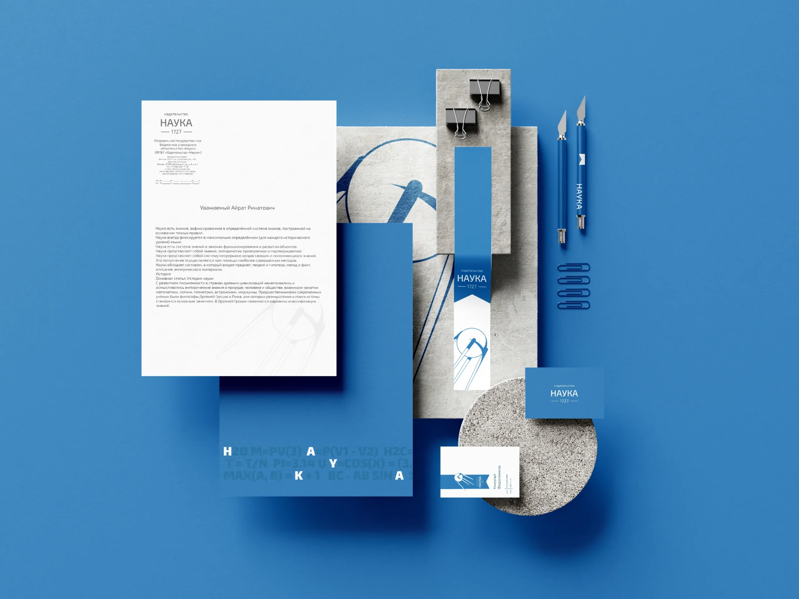
( Stationery & Corporate Documentation )
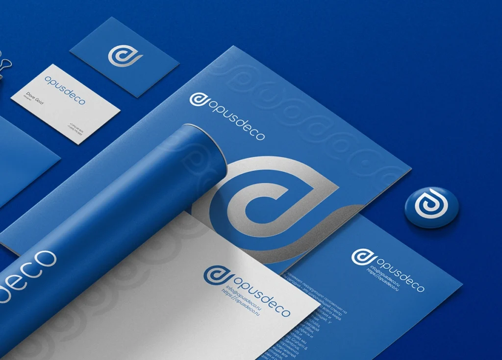
An authoritative and uniform suite of internal assets developed for executive communication, formal contracts, and professional networking.
-
Official corporate letterheads introduce structured typographic layouts that reinforce the rigorous, precise nature of scientific truth.
-
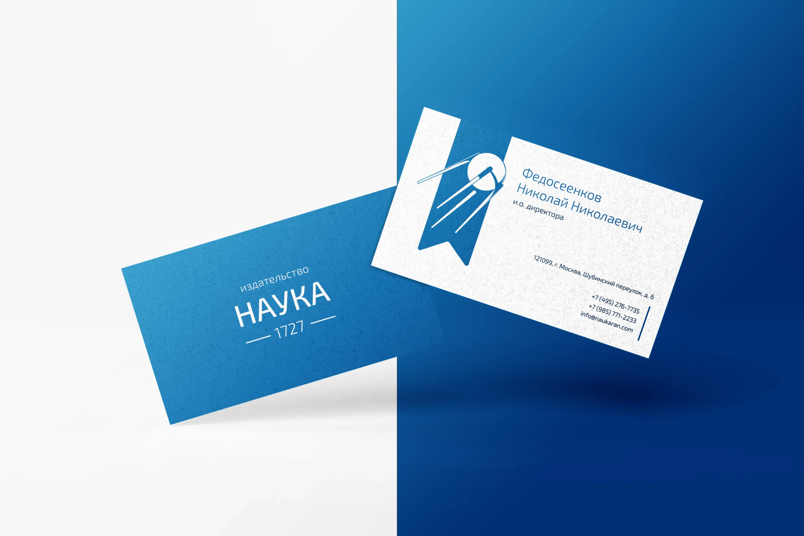
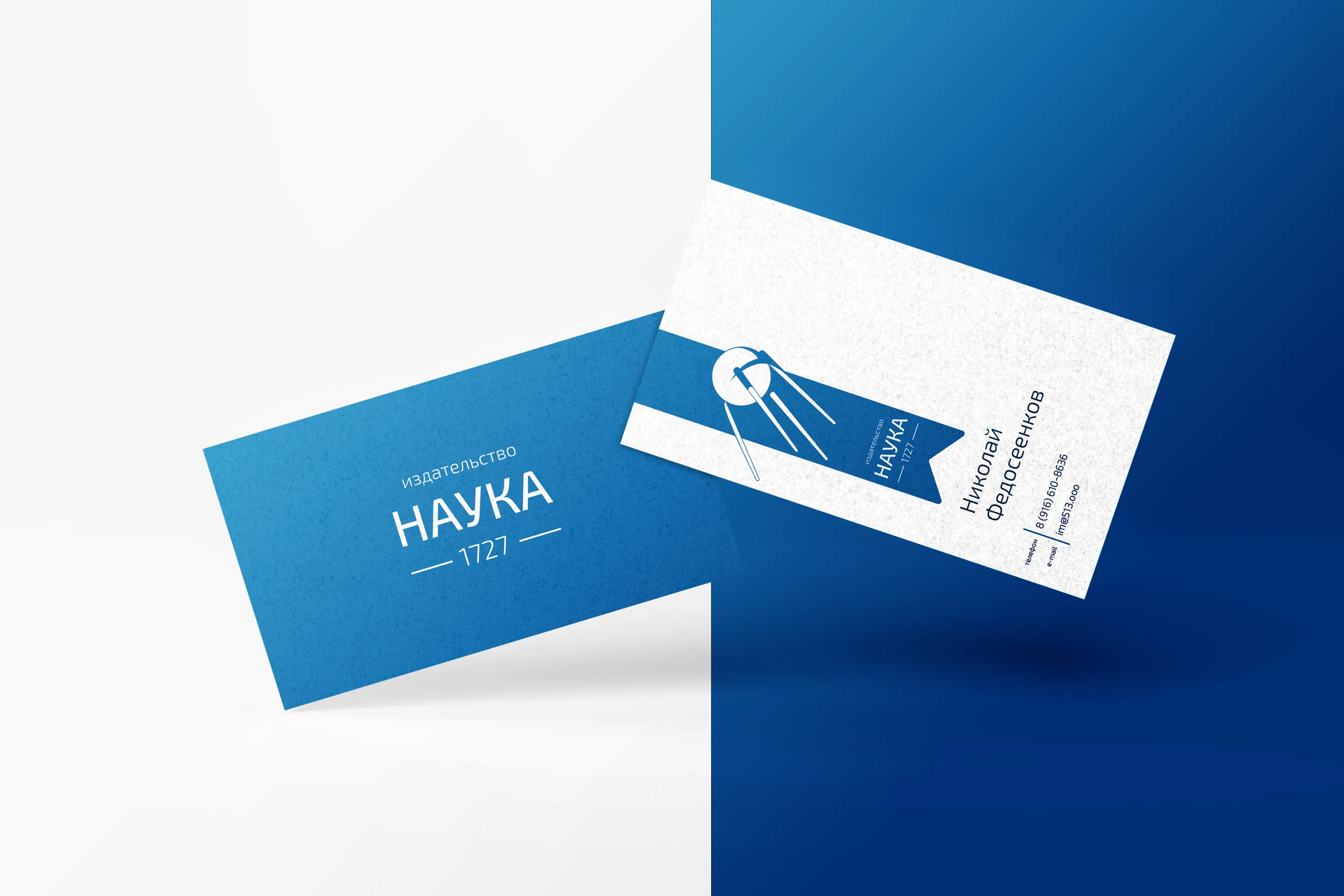
The corporate business card suite provides distinct options for single-sided minimalism or comprehensive double-sided information hierarchies.
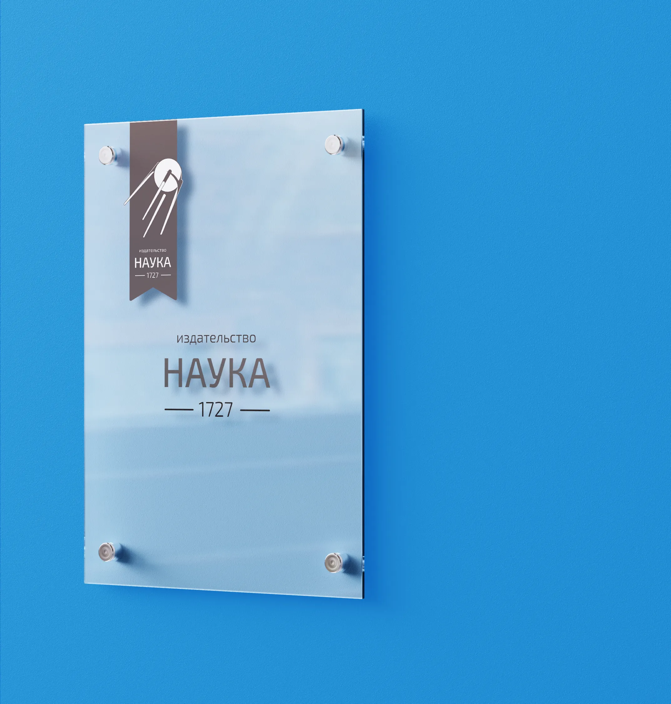
-
The identity includes specialized corporate folders designed for legal contracts, utilizing the integrated scientific formula pattern.
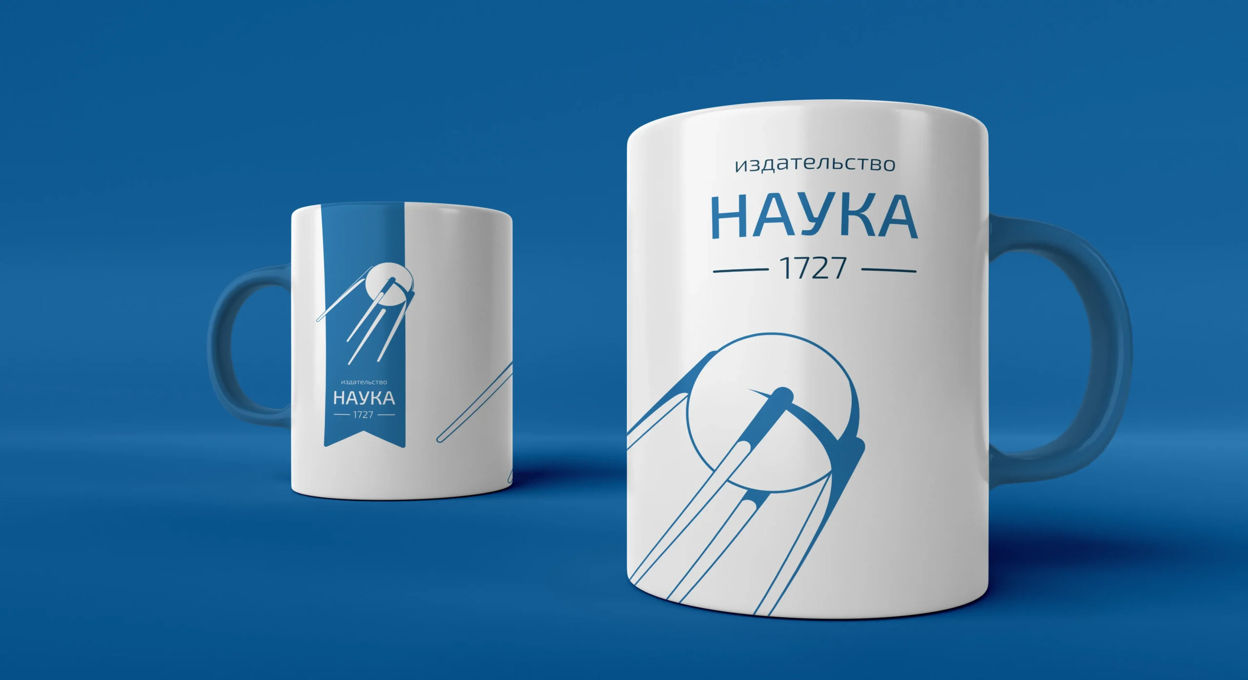
A diverse collection of promotional items and corporate gifts that emphasize the brand's absolute commitment to empirical science.
-
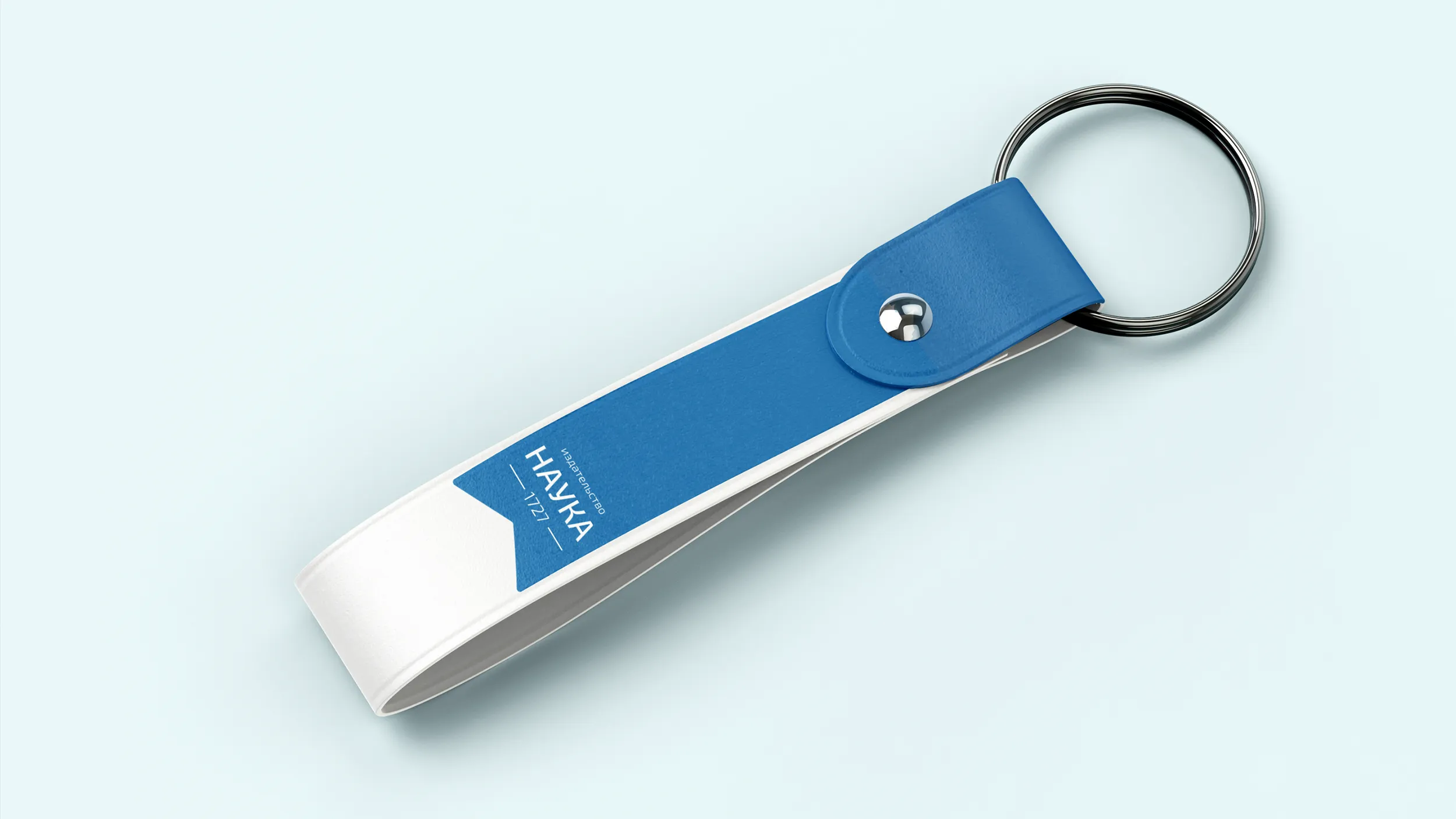
1Daily utility accessories—including keychains, tote bags, flash drives, and lanyards—utilize the clean ribbon mark for immediate visual identification.
-
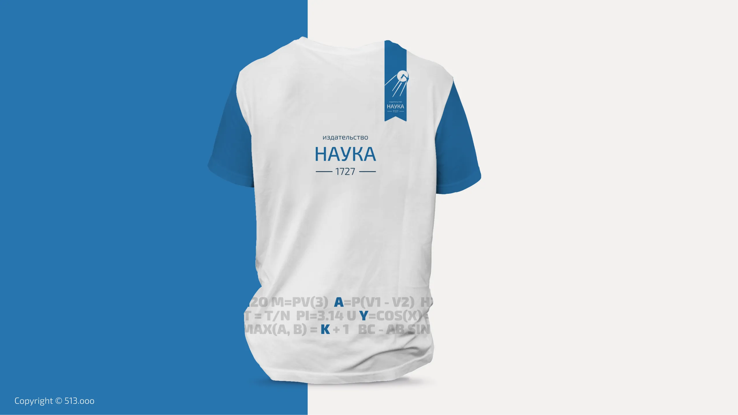
2Branded apparel assets like the corporate T-shirt make bold use of large typographic compositions, merging the equation pattern with logo variants.
-
2Everyday food and beverage containers, such as water bottles and coffee cups, feature the exact chemical formula of their contents printed next to the logo.