( Loading, please wait.. )

513.ooo ©2026

pepe.team brand

3DBrandingFinanceMo-GraphUX/UI

Welcome to the next generation of digital poker. This project represents a complete, ground-up reimagining of a free-to-play poker ecosystem specifically tailored for Gen Z. Breaking away from the outdated, dark, and serious aesthetics of traditional casino games, this platform introduces a high-energy, vibrant digital playground where community socialization meets competitive casual gaming.

AgencyClient Side

/Year

2022

/Client

Dubai

Tools Used

RoleCreative Lead

StatusCompleted

Launch Date2022

LocationDubai

pepe.team brand

RoleCreative Lead

StatusCompleted

Launch Date2022

LocationDubai

3DBrandingFinanceMo-GraphUX/UI

AgencyClient Side

/Year

2022

/Client

Dubai

Tools Used

Welcome to the next generation of digital poker. This project represents a complete, ground-up reimagining of a free-to-play poker ecosystem specifically tailored for Gen Z. Breaking away from the outdated, dark, and serious aesthetics of traditional casino games, this platform introduces a high-energy, vibrant digital playground where community socialization meets competitive casual gaming.

Brandbook and visual strategy

The Pepe.team Brandbook establishes a comprehensive visual framework designed to make decentralized finance feel accessible, friendly, and stress-free. It defines the core design language, combining a vibrant emerald color palette, clean typography, and glassmorphic UI guidelines with precise usage rules for the ecosystem logo. Central to the brandbook is a unified 3D art direction guide outlining standards, rigging parameters, and expression rules for both masked low-poly animal personas and unmasked human team avatars. Furthermore, it details the tone of voice and social media layout grids, ensuring a consistently lighthearted, transparent, and approachable brand presence across all digital touchpoints.

pepe.team — Brand Identity & DeFi Ecosystem Design

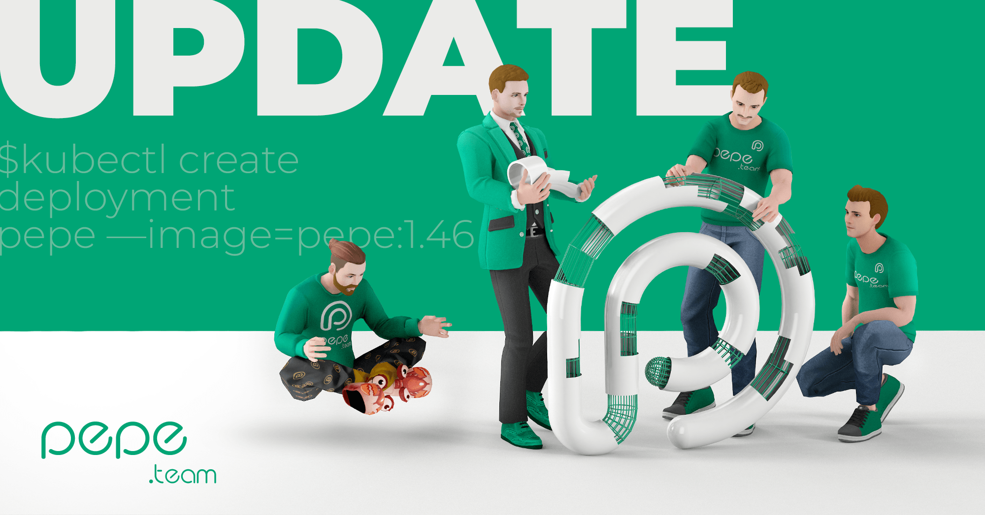
I executed the complete 360° brand and product design cycle for the project, delivering a full brandbook, user-centric Web3 UX/UI supported by a scalable design system, custom 3D character modeling and rigging, 2D/3D motion graphics, engaging SMM creatives, investor presentations, and branded corporate documentation.

Logomark

Logomark Concept & Geometry

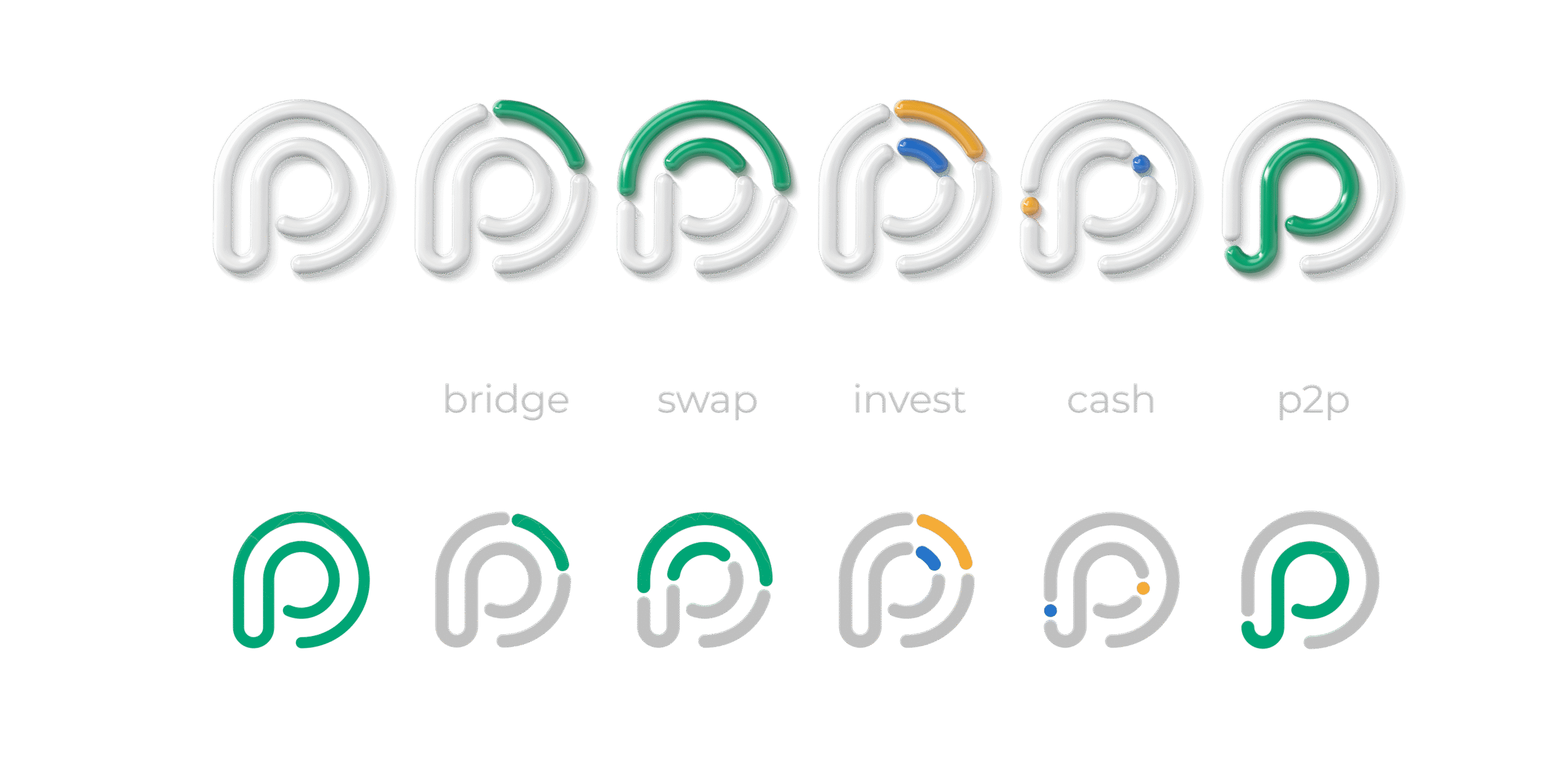
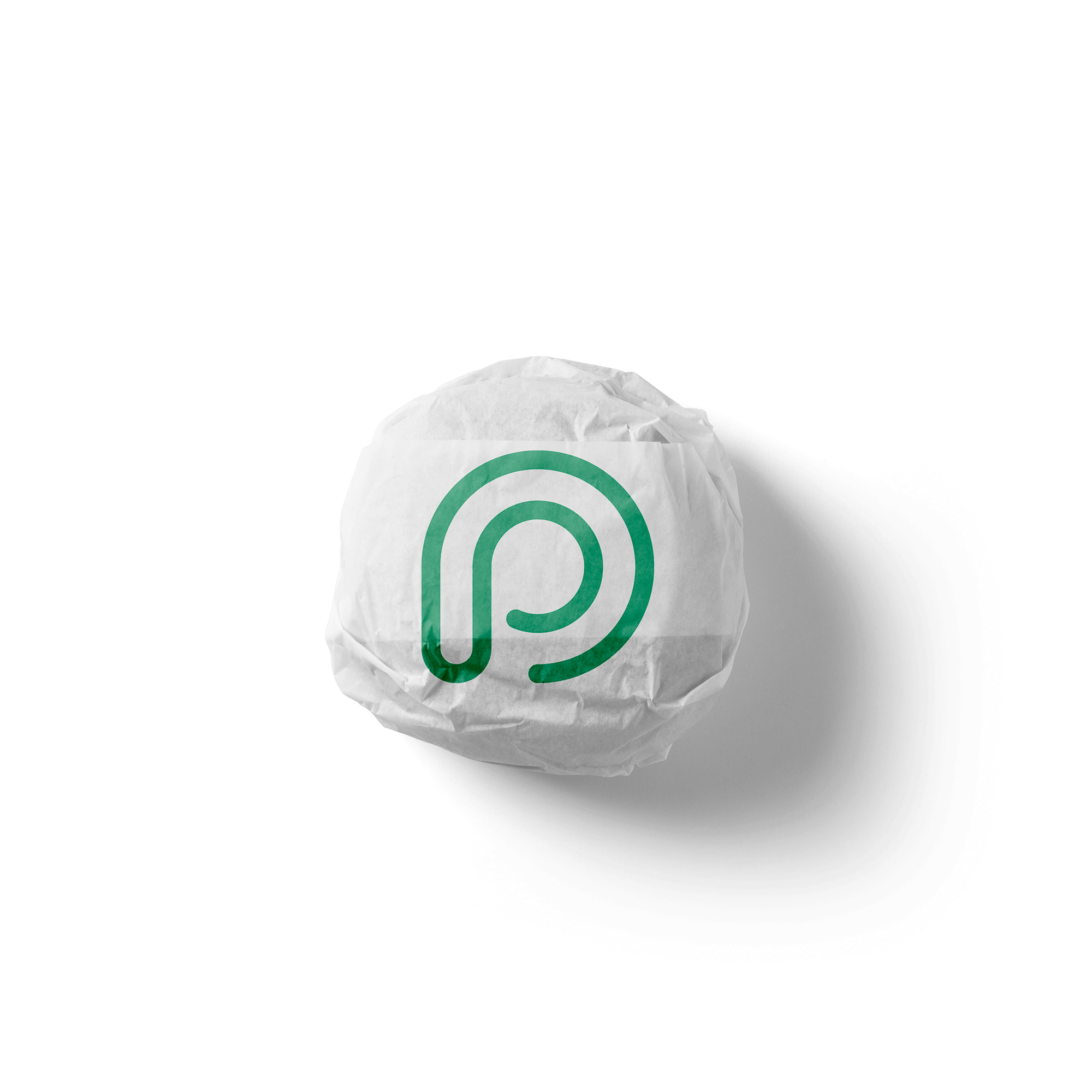
The Pepe.team logomark is a streamlined geometric emblem designed to anchor the visual identity across digital interfaces, product branding, and Web3 environments.

  • Dual "P" Monogram A continuous, fluid line organically weaves together two "P" letters to represent the Pepe brand, forming a clean and memorable monogram that works effortlessly at any scale.
  • Crypto Coin Visual Synergy The mark’s balanced, rounded circular silhouette intentionally mimics the shape of a coin, serving as a natural foundation for crypto token visuals, UI icons, and financial badges.
  • Frictionless & Friendly Aesthetic Softened loops and seamless curvature reflect the brand's core philosophy—removing stress and complexity from decentralized finance to create an inviting user experience.

logotype

Brand Logotype & Custom Typeface

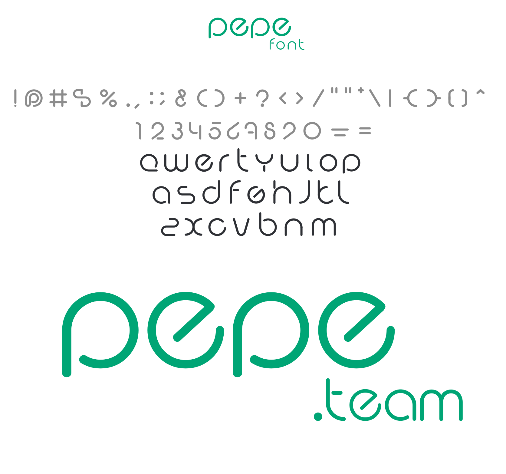
The pepe.team wordmark is built upon a fully bespoke typographic system. Rather than designing isolated lettering solely for the logo, the visual concept was expanded into a complete proprietary display typeface—Pepe Font.

  • Bespoke Typeface Design Derived from the smooth geometry and rounded strokes of the main logo, the font features a complete custom character set, including lowercase alphabet, numerals, and special symbols.
  • Unified Visual Geometry The fluid lines, soft terminals, and consistent line weight directly mirror the friendly, low-stress philosophy of the Pepe.team ecosystem.
  • Scalable Brand Application Building a full font guarantees complete aesthetic harmony across UI headlines, sub-brand naming, marketing materials, and digital graphics.

color

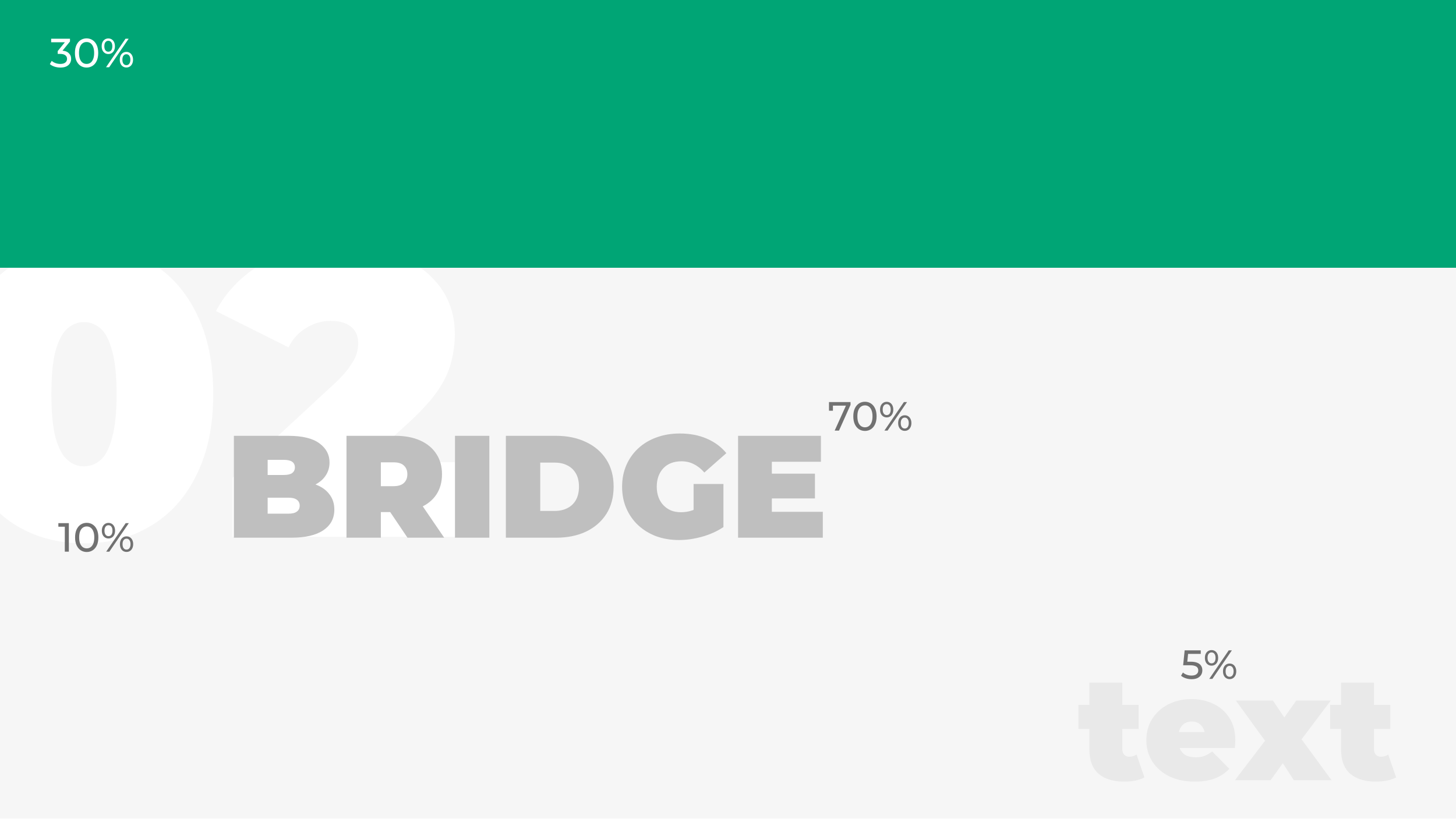
Color Palette & Functional System

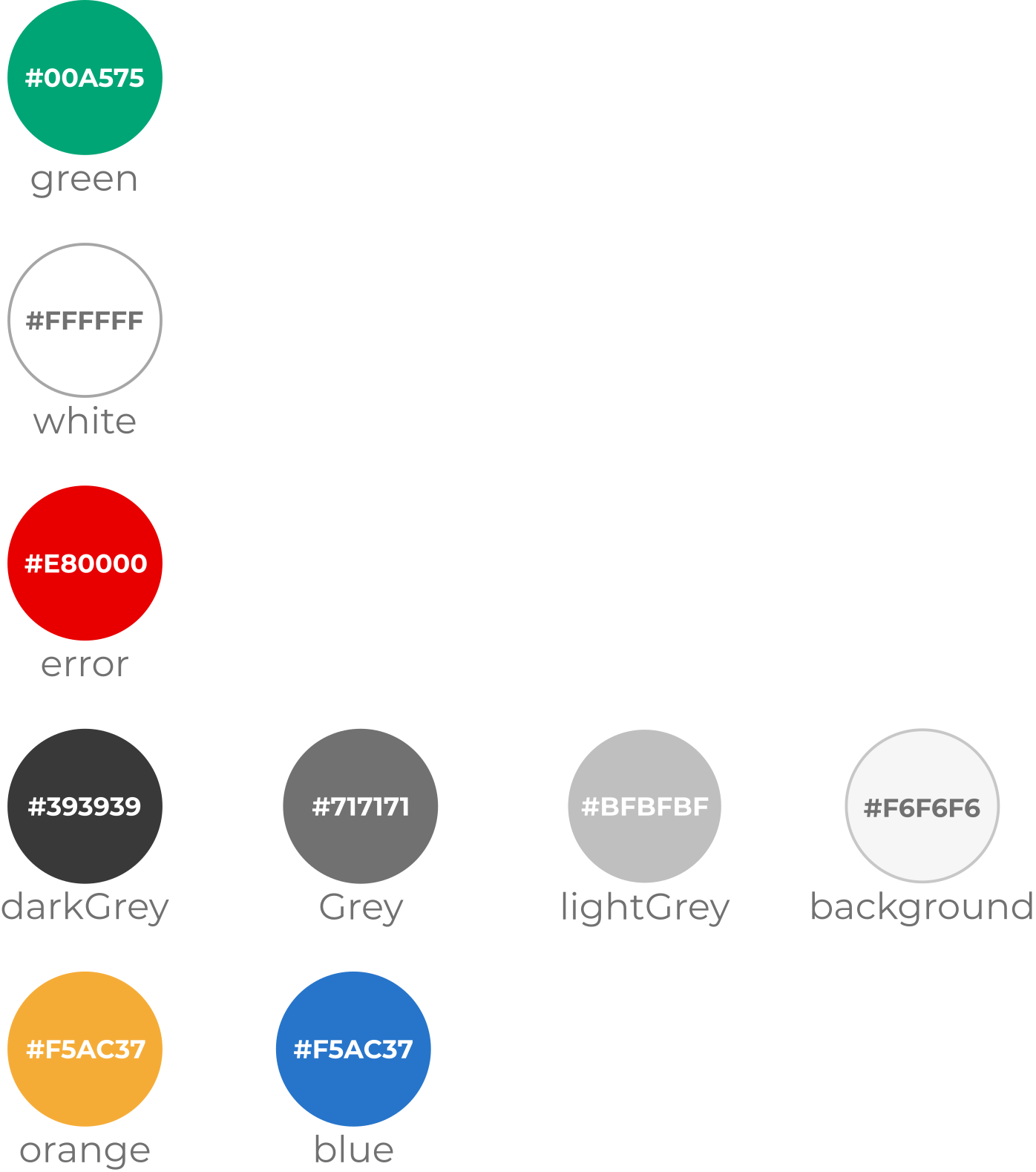
The Pepe.team color system balances high brand recognition with intuitive, stress-free UI navigation. Each shade is mapped to a specific functional purpose to ensure visual clarity and seamless user experience across all digital touchpoints.

  • Primary Brand Colors The signature Pepe Green (#00A575) acts as the core visual anchor across all products, paired with crisp White (#FFFFFF) to maintain a clean, airy, and friendly aesthetic.
  • Neutral Surface & Text Hierarchy A structured gray spectrum—from Dark Gray (#393939) for high-contrast typography down to soft Background Gray (#F6F6F6)—creates depth and maintains visual hierarchy across complex financial dashboards.
  • Functional & Service Accents High-impact Red (#E80000) is reserved for system errors and critical alerts, while secondary accent tones (Orange #F5AC37 and Blue) provide dedicated visual categorization for specific ecosystem features like Investment and Wallet services.

font

Primary Typography System

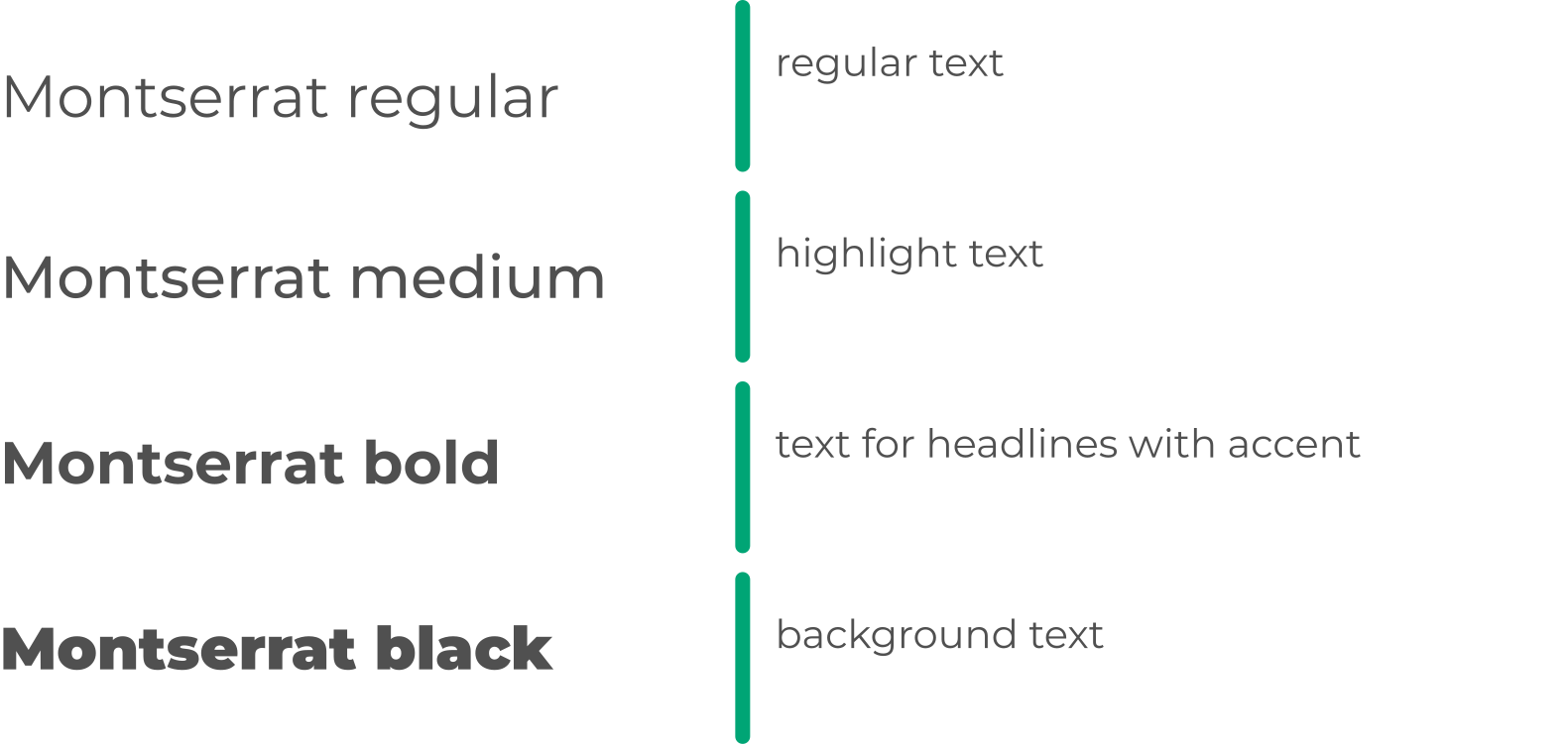
Montserrat is chosen as the official primary typeface for the Pepe.team ecosystem. Its geometric sans-serif design offers exceptional legibility across digital interfaces, ensuring a clean, modern, and highly readable hierarchy across all Web3 platforms and promotional materials.

  • Montserrat Regular Used for standard body copy, long-form descriptions, and default UI body text.
  • Montserrat Medium Applied to highlighted text, callouts, and key data points that require subtle emphasis.
  • Montserrat Bold Reserved for primary section headlines, high-impact titles, and featured callouts with color accents.
  • Montserrat Black Utilized for heavy decorative background text, large visual watermarks, and prominent marketing editorial overlays.

3D Avatars

The People of Pepe.team: Personal 3D Avatars

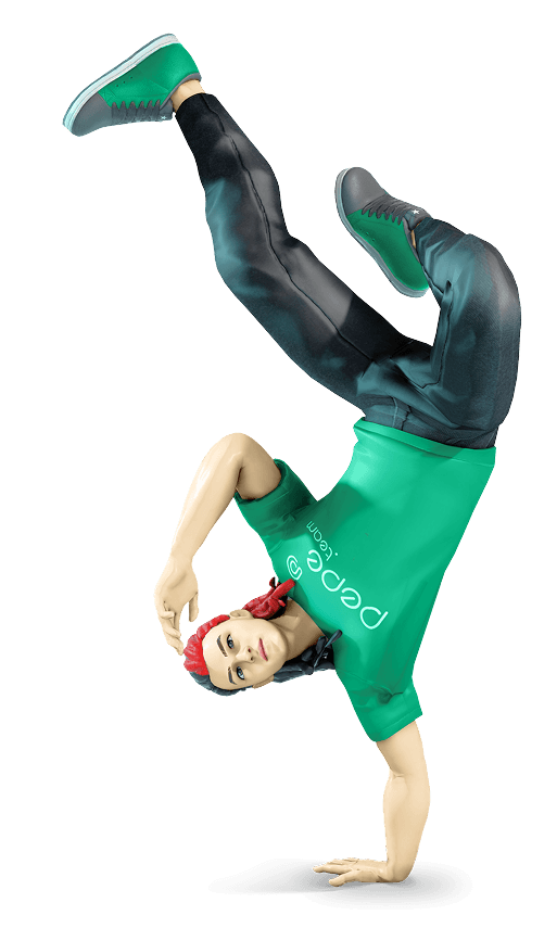
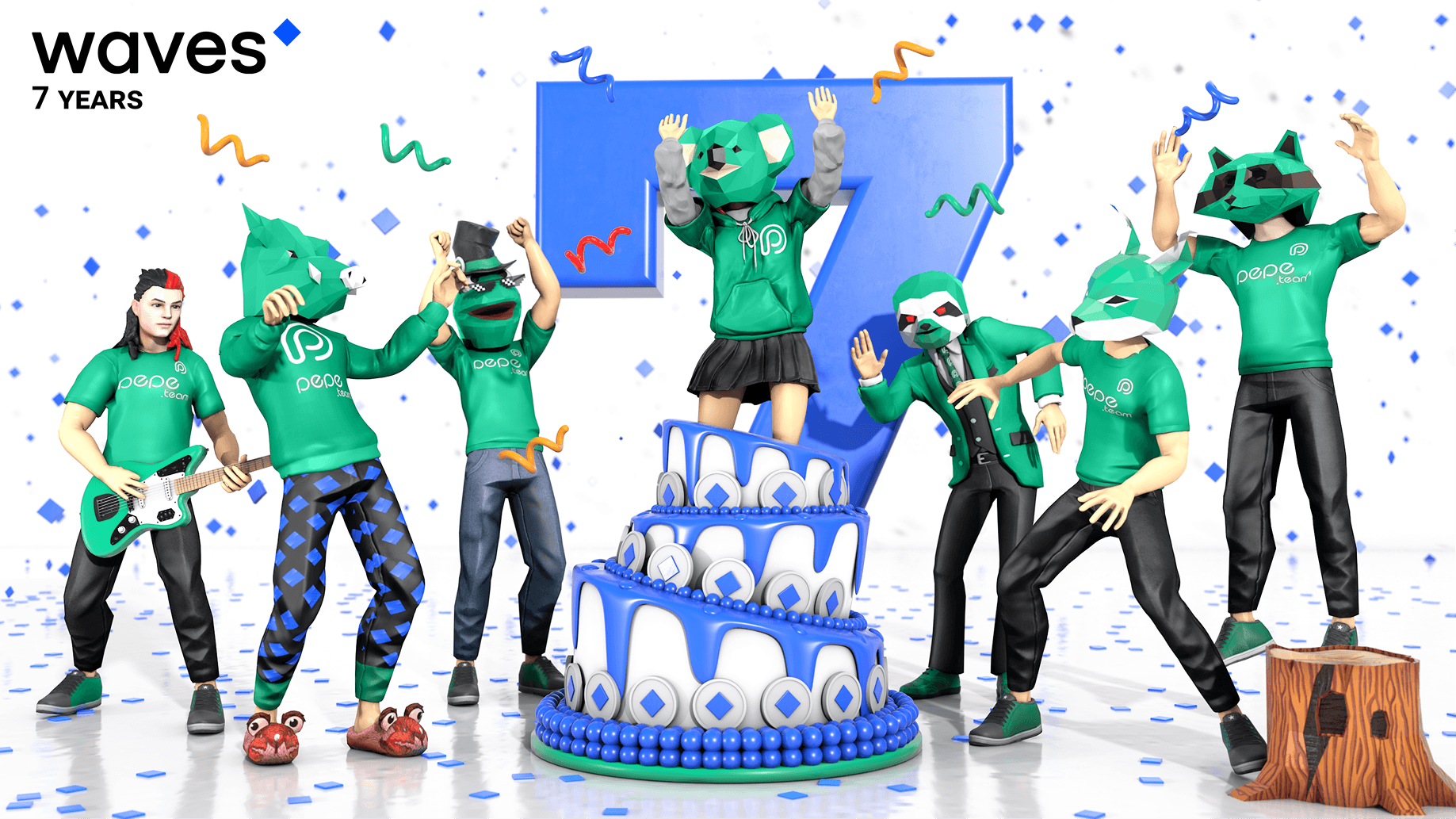
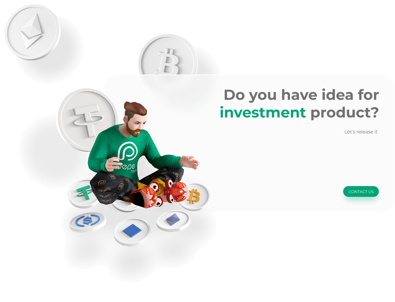
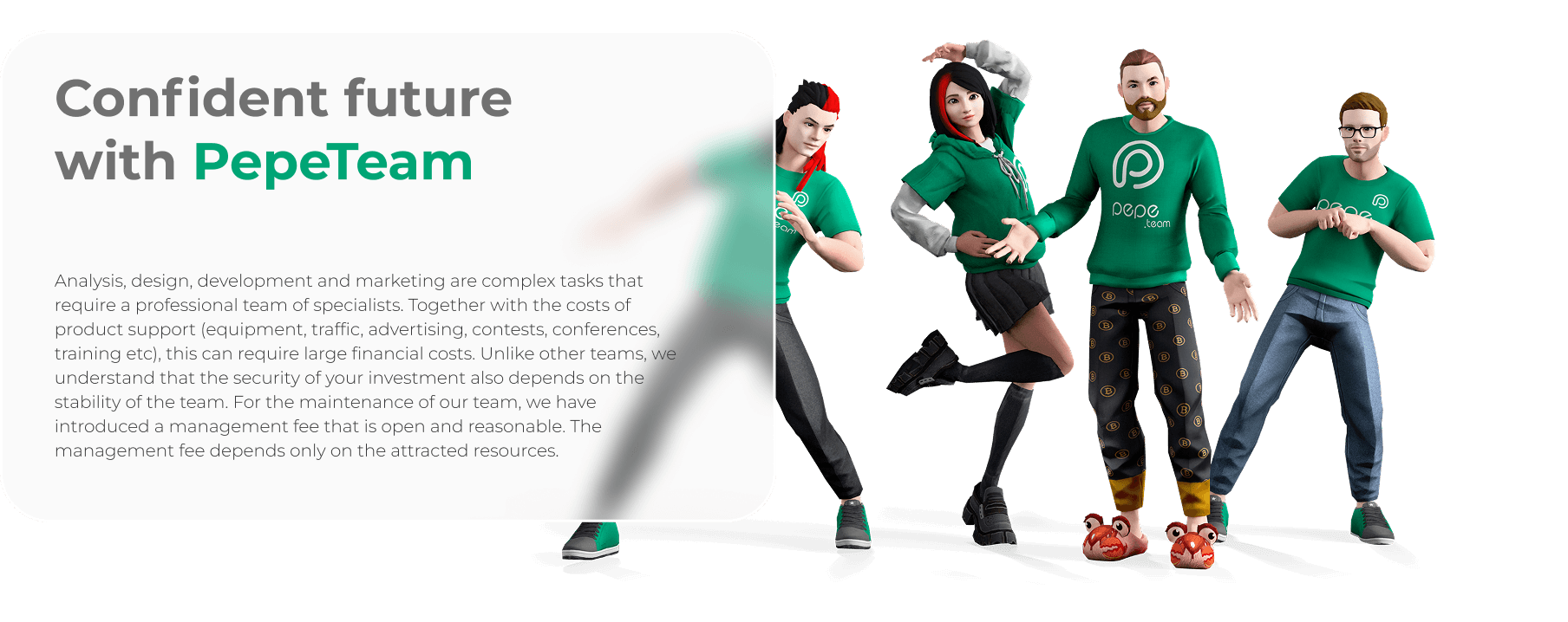
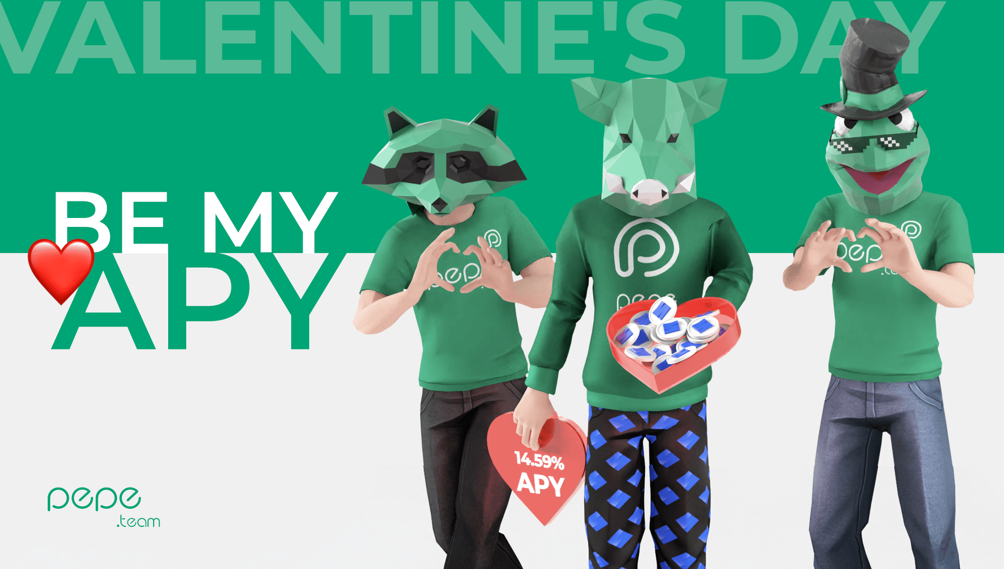
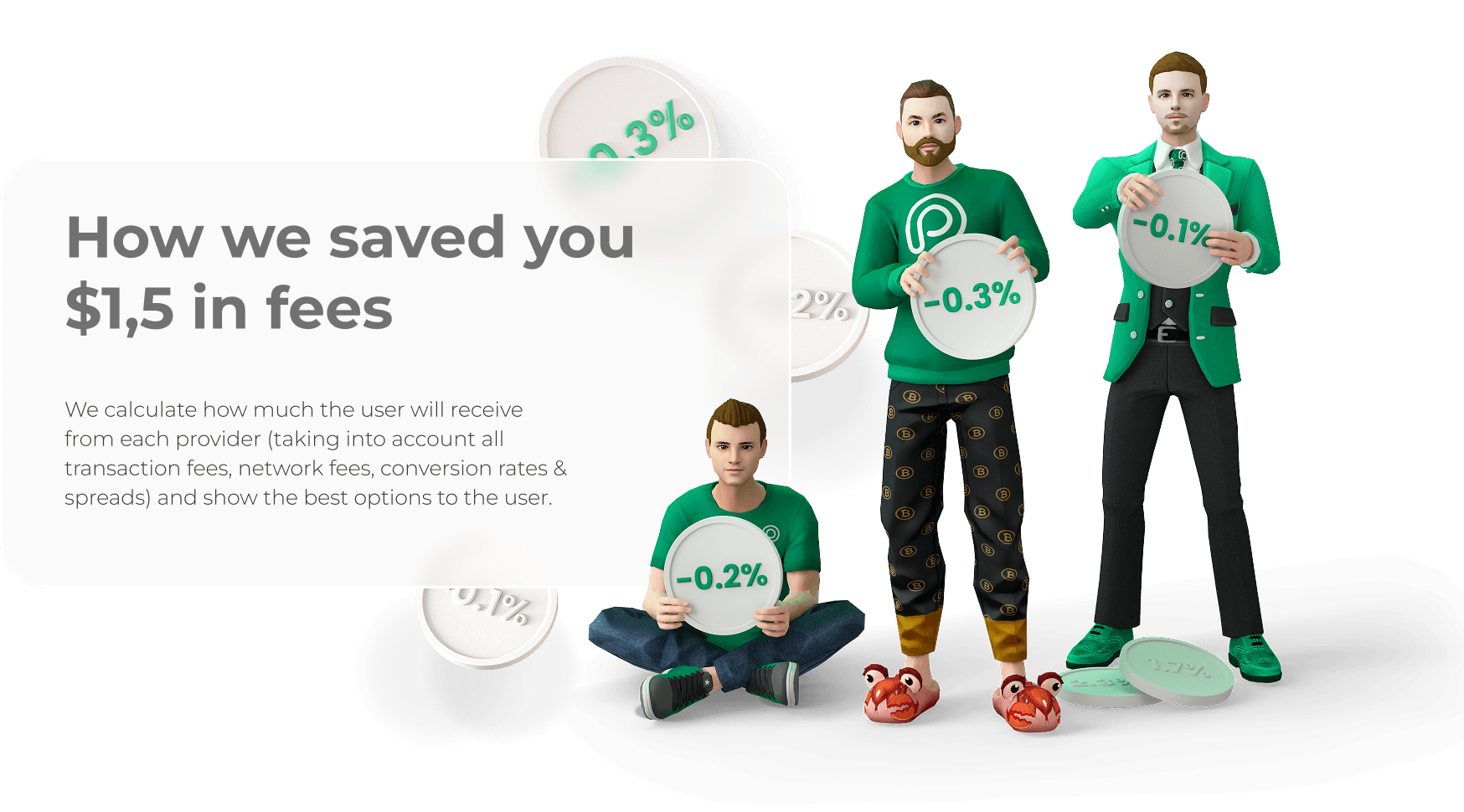
To imbue the digital environment with human personality and transparency, Pepe.team utilizes a comprehensive system of 15 fully unique, person-driven 3D characters. Each avatar is a specific representation of a core team member, designed to build trust and approachability within the user ecosystem.

  • AI-Driven Faces for Maximum Likeness Maximum authenticity is achieved through advanced AI face modeling. Each character's face was meticulously generated and sculpted based on actual team member photos, ensuring unmistakable personal recognition and likeness. This ensures each of the 15 avatars is a genuine digital portrait.
  • Manual Sculpting, Rigging, & Character-Driven Animation While faces are AI-driven, the entire character creation process was personality-driven. Every character's body shape, distinct hairstyle, and diverse wardrobe (from casual graphic tees and hoodies to tailored three-piece suits) were hand-sculpted. Every character is fully rigged and features custom, manually crafted idle animations—poses, stretches, and stances—that authentically mirror the real-life mannerisms and professional demeanor of the specific employee.
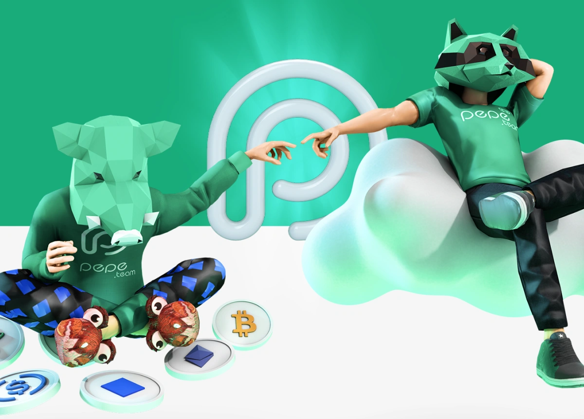
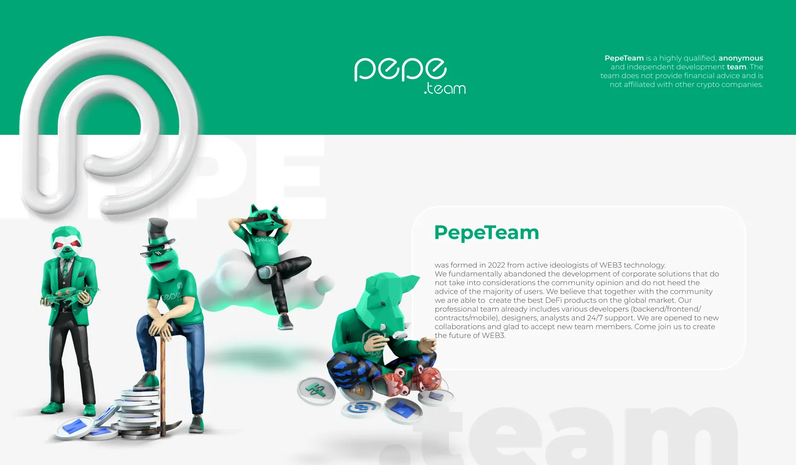
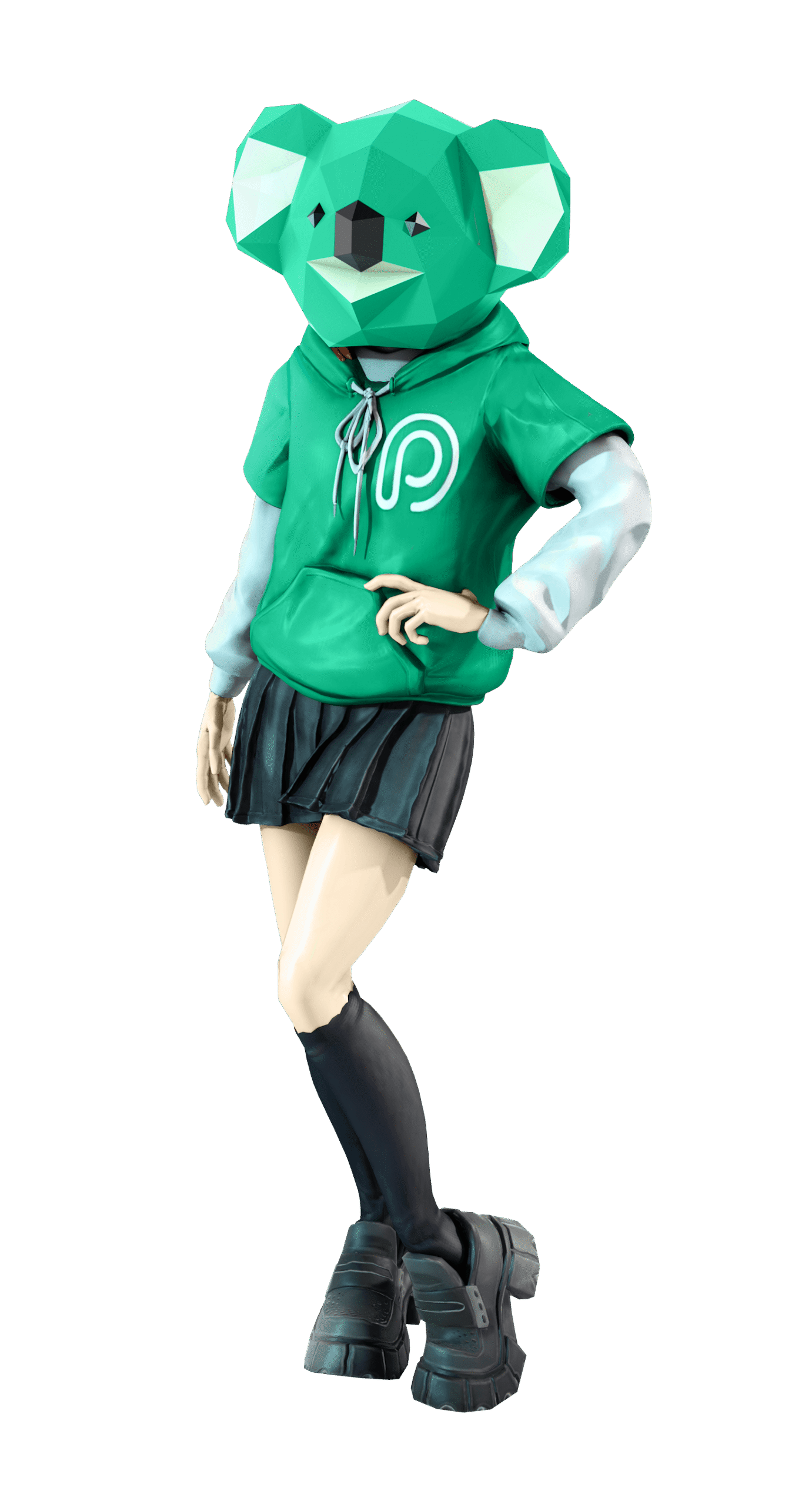
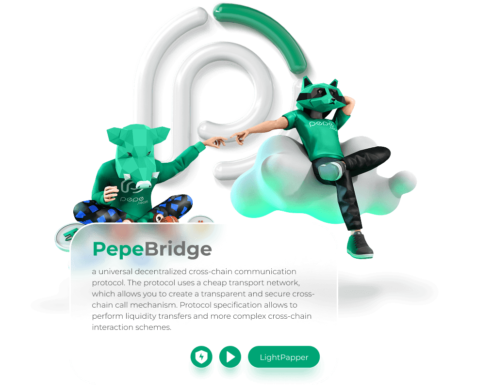
  • A Dual-Persona System This deep level of character personalization serves a strategic, dual-persona system. As visible representations, the unmasked human avatars (as seen here) are used across non-anonymous services and visible interactions. However, these same unique, personality-driven models form the secret base. For services where anonymity is paramount, these recognized human identities are overlaid with the specific, unique low-poly animal masks (boars, raccoons, etc., as detailed in previous sections) to maintain both security and visual consistency across the entire brand.

Anonymous Avatars

Anonymous Personas & Low-Poly Mask System

Respecting the Web3 community’s core value of privacy, the visual system includes a dedicated anonymous persona for every team member. This approach bridges trust and privacy, allowing the brand to maintain high engagement while honoring crypto culture.

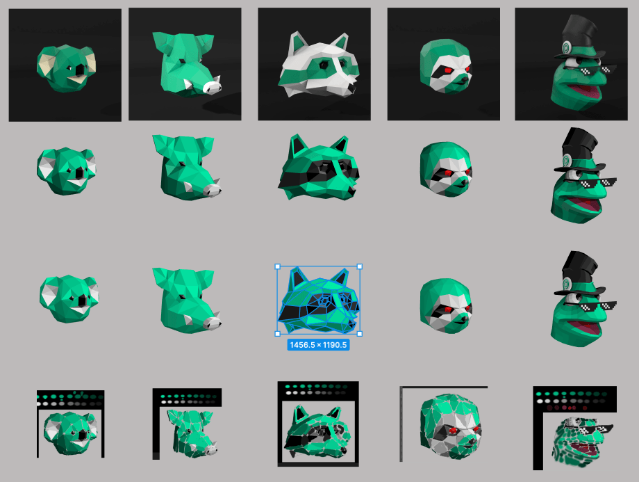
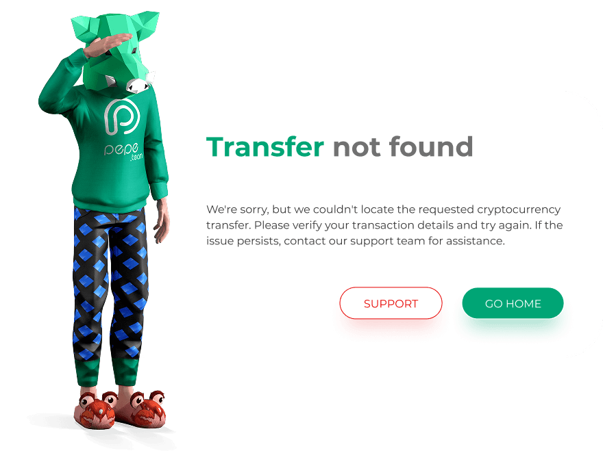
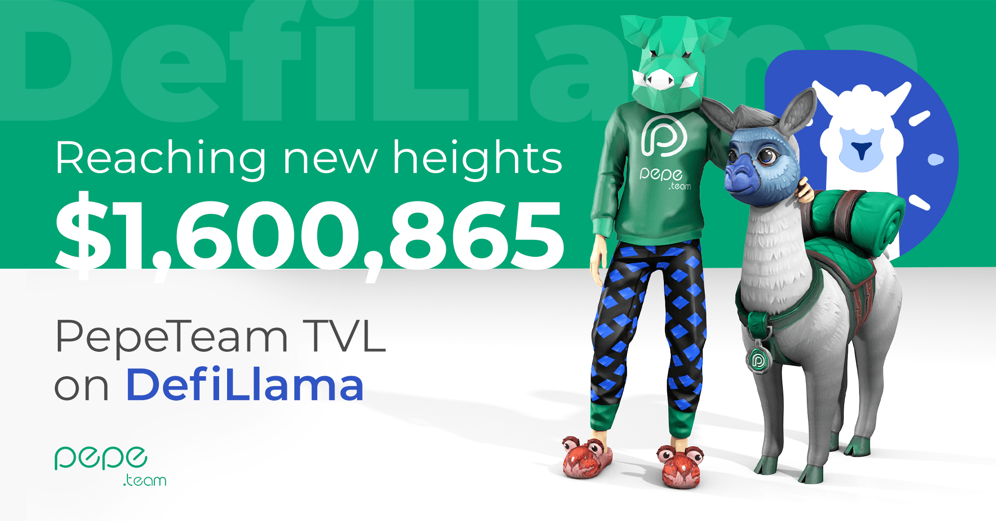
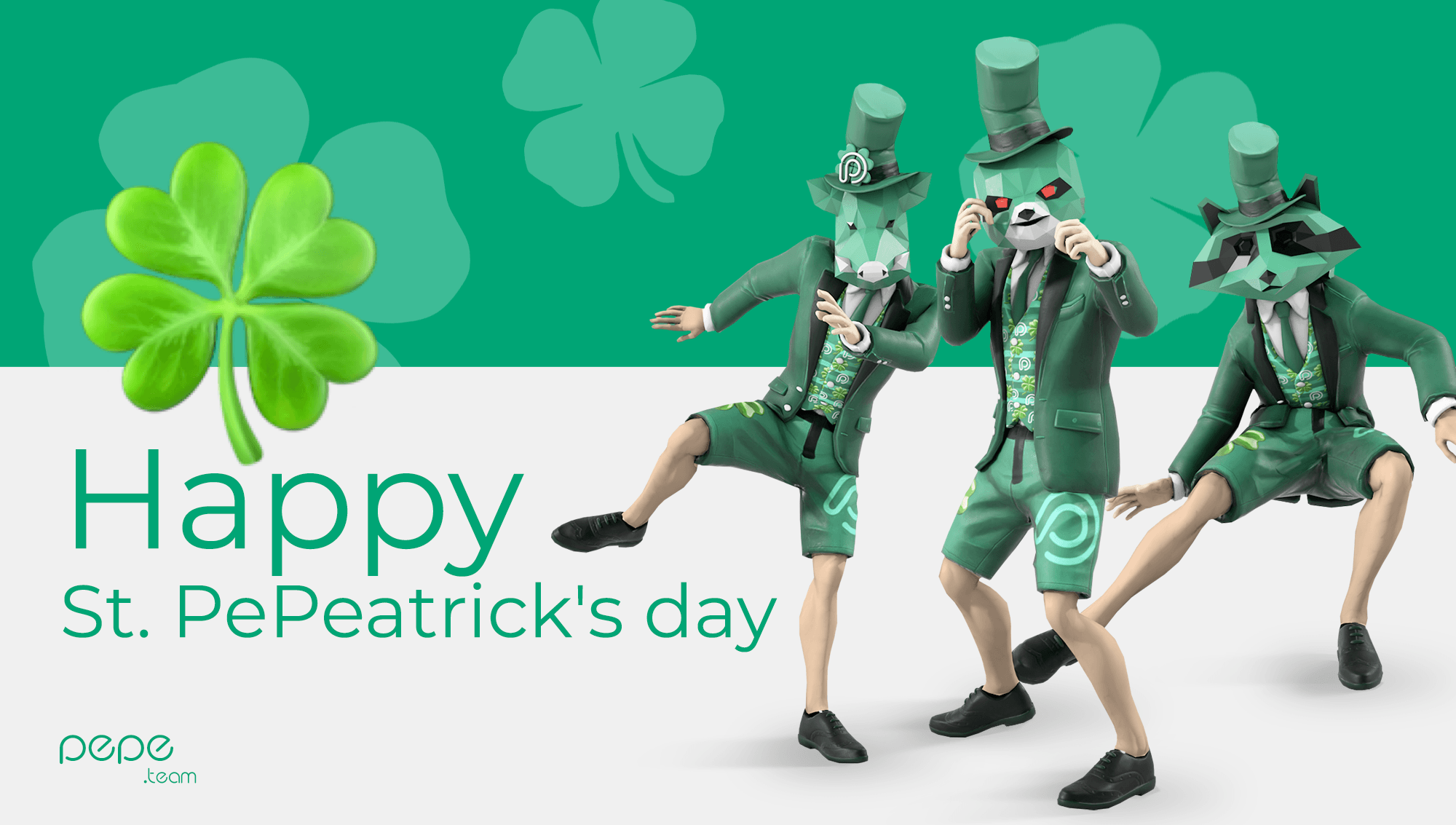
  • Trigonal 3D Mask Modeling Each character is equipped with a custom-built low-poly (trigonal) 3D animal mask—ranging from koalas and raccoons to boars—seamlessly integrated onto the personal character rigs while retaining individual poses, outfit styling, and body language.
  • Vector Asset Conversion To support 2D graphic environments, lightweight web interfaces, and high-contrast SMM content, every 3D mask was individually traced and adapted into a scalable vector illustration system.
  • Culturally Aligned Privacy Instead of cold, mysterious, or intimidating privacy tropes, the vibrant color scheme and playful animal disguises turn anonymity into a friendly, relatable brand feature.

( Web ecosystem and landing page design )

The web landing page serves as the primary acquisition funnel and desktop anchor for the brand ecosystem. Built as a high-conversion, long-scroll digital experience, the layout seamlessly transitions from expressive, high-energy brand storytelling into structural product feature breakdowns. The web interface maintains absolute visual fidelity with the mobile application, utilizing dark, high-contrast backgrounds layered with glowing container modules, hyper-saturated assets, and floating 3D typography elements.

  • Trendy poker gatherings: The main screen instantly establishes the social positioning of the app with the core headline "Trendy Poker Gatherings," supported by a full-width 3D living room environment visualization that showcases live video gameplay mechanics in a casual environment.
  • Gamified performance badges: A dedicated tracking module displays high-visibility performance proof anchors ("100% Real Players," "777% Fun," "168 Countries") rendered in bold, rounded containers to drive instant user validation.
  • Multi-platform conversion hub: Positioned directly below the primary focal area, the download layout features clean, standardized download buttons for the App Store, Google Play, and a direct APK package installer to minimize onboarding friction.

( Mobile Game )

This project represents a radical reconstruction of mobile poker tailored specifically for the iOS and Android platform. The game completely shatters outdated industry design tropes, transforming a comprehensive brandbook into a living, breathing digital product. It stands as a colossal mobile ecosystem where cutting-edge UI/UX architecture directly merges with next-generation youth culture.

  • 1
    Over 800 custom UI screens: A massive product design undertaking covering every single user flow in hyper-detail—from complex multi-tier game lobbies and secure onboarding paths to advanced, tool-rich club management dashboards.
  • 2
    A radical style departure: A complete rejection of traditional, rigid card game aesthetics. The user interface is built on ultra-saturated neon gradients, high-gloss finishes, and clean fluid geometry designed specifically to capture a younger target audience.
  • 3
    Complete brandbook integration: Every visual rule, layout grid, typographic hierarchy, and identity asset functions as a unified organism within the application, ensuring flawless design consistency across all user touchpoints.
RELATED WORKS

View more case studies that showcase my expertise in building high-impact integrated campaigns.