The Second — Brand Identity & Digital Ecosystem
This brandbook outlines the comprehensive design system for The Second, covering both digital interface architecture and physical brand touchpoints. It defines guidelines for 3D emblem rendering, color balance formulas, typography, photo post-processing, generative fluid graphics, iOS UI/UX design, and premium printed collateral (POSM).
The Visual Identity & Brandbook
LOGO
Monogrammatic Symbolism & Geometry
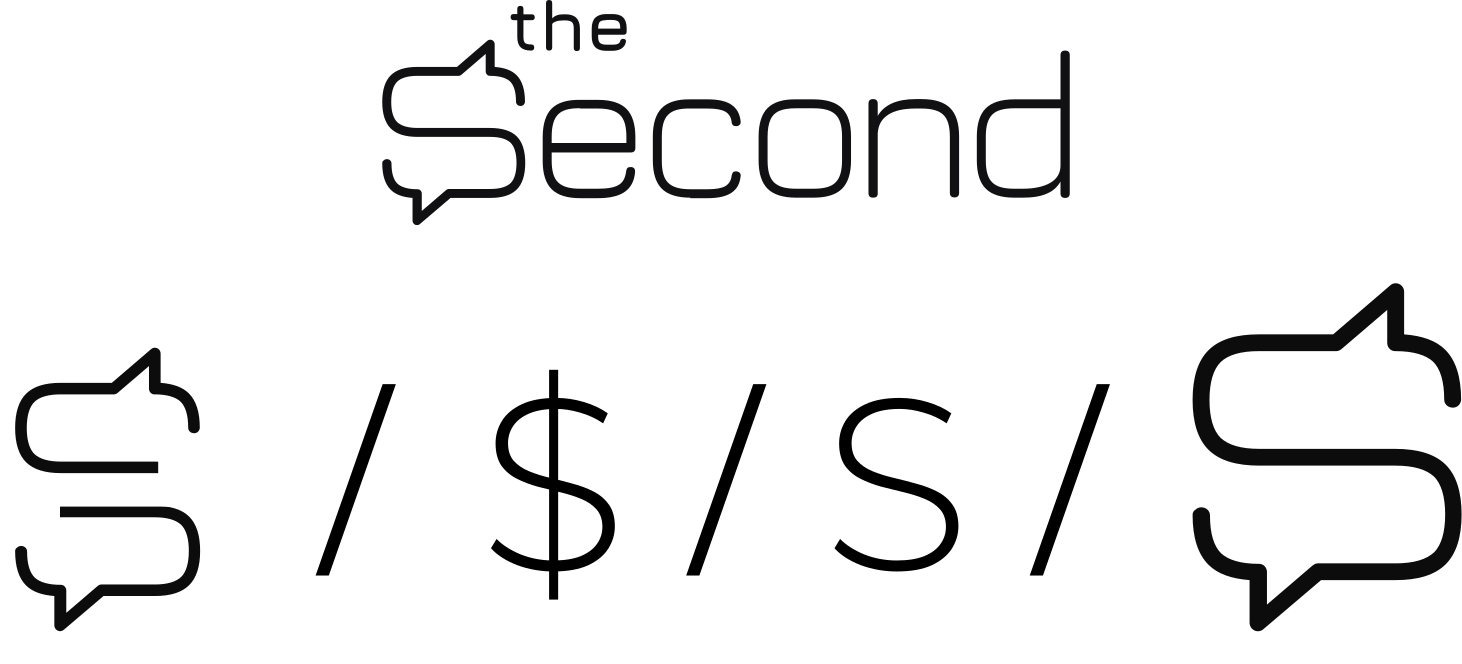
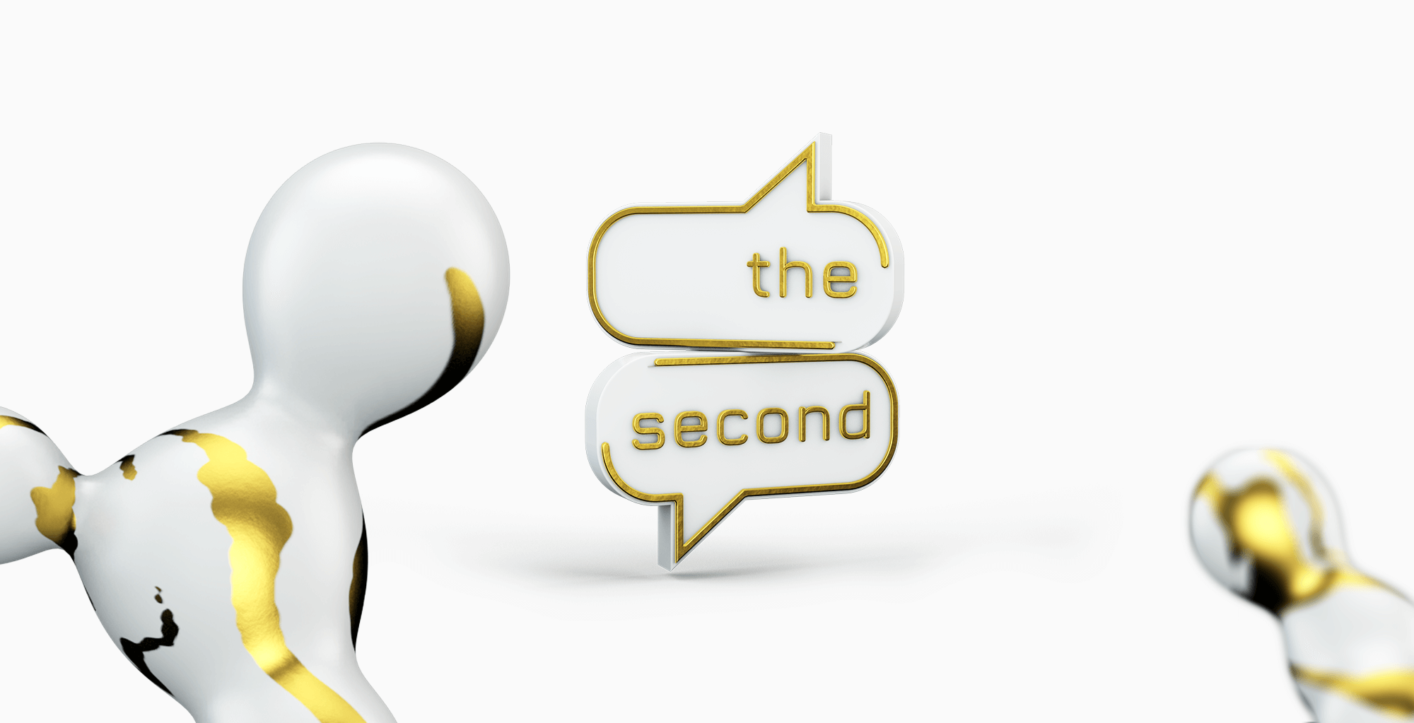
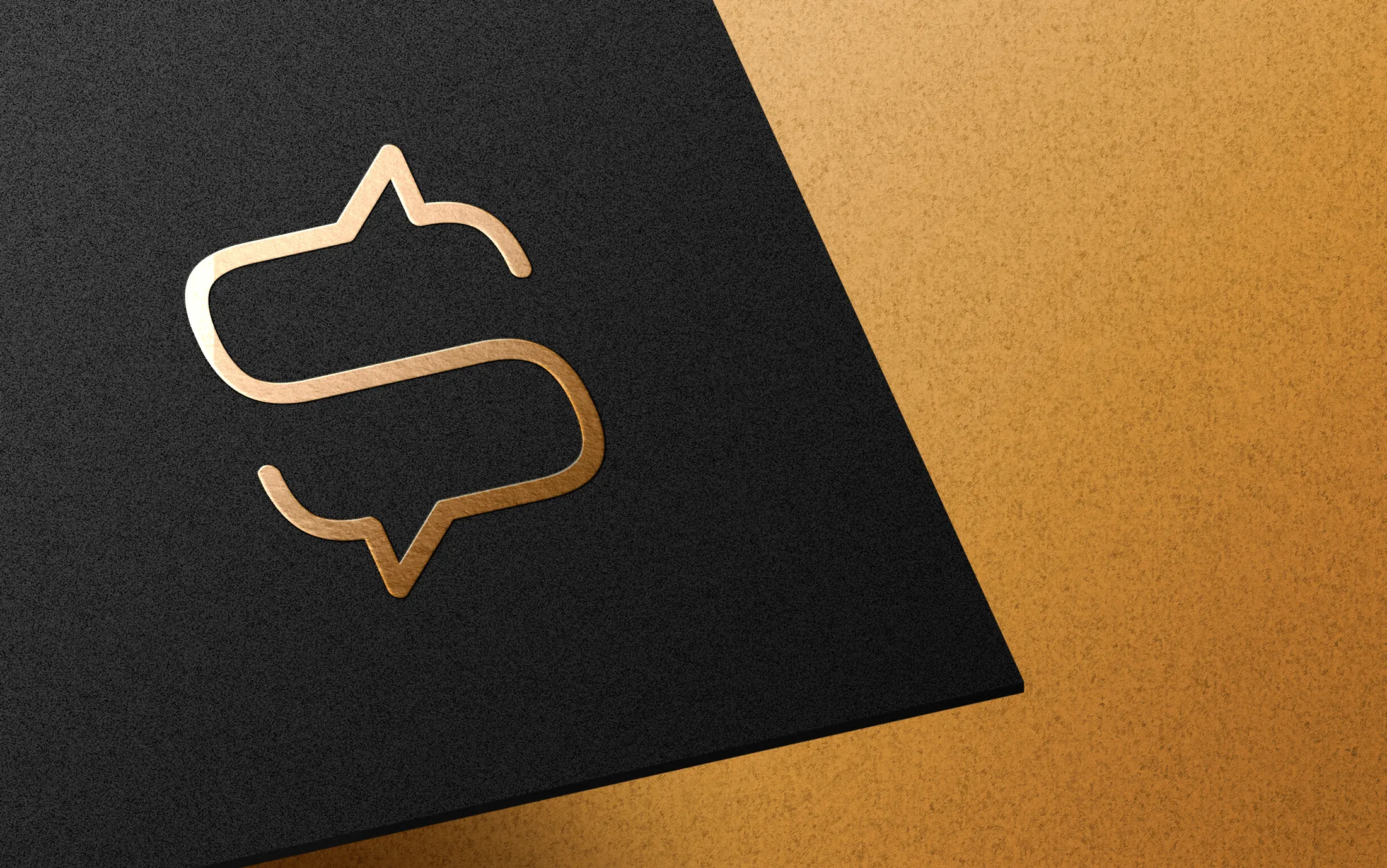
Deconstructs the core monogram, demonstrating how messaging speech bubbles form the silhouette of a dollar sign ($) before merging into the primary letter "S".
-
Visual Synthesis: Illustrates the geometric progression from dual chat bubbles into a dollar sign ($) and the letter "S" for Second.
-
Strategic Metaphor: Expresses that meaningful communication directly generates capital power within the community.
-
Target Audience Alignment: Explicitly anchors the graphic mark to an exclusive social network built for wealthy and successful leaders.
colors
Palette & Color Specifications
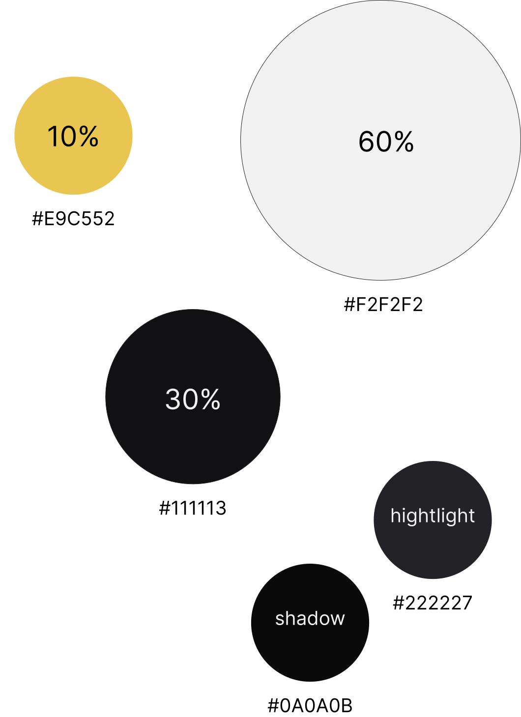
The 60/30/10 Chromatic Hierarchy Formula Enforces a compositional balance rule to ensure digital interfaces and printed materials remain clean and sophisticated.
-
60% Dominant Canvas: Allocates off-white (or deep charcoal in dark mode) to the primary background space.
-
30% Structural Secondary: Reserves dark gray tones for UI containers, cards, sidebars, and body typography.
-
10% Gold Focus: Restricts champagne gold strictly to focal interaction points, action buttons, and accent elements.
font
Typography & Ecosystem Architecture
Details the selection of Montserrat as the primary typeface while outlining the platform's vision to eliminate app fragmentation.
-
Typeface Selection: Selects Montserrat for its soft geometric curves that echo the rounded lines of the logotype.
-
Problem-Solving Vision: Solves platform fragmentation by unifying blogging, networking, calendars, dating, podcasts, discussions, and investments into one app.
-
Interface Adaptability: Highlights the interface's ability to customize modules according to individual user goals.
photo
Photographic Style & Layering Pipeline
Establishes a signature photographic post-processing pipeline that transforms standard portraiture into branded gold-infused artwork.
-
Atmospheric Styling: Applies a golden glow over monochrome photography to evoke prestige and privacy.
-
3-Layer Compositing: Breaks grading down into three layers: monochrome base filter, gold color fill, and shadow contrast adjustment.
-
Visual Cohesion: Guarantees that user-generated or editorial photography seamlessly blends into the overall app color system.
Liquid
Generative "Liquid Gold" Key Art
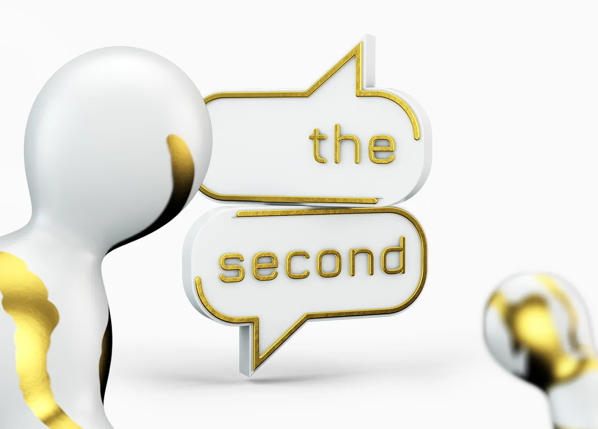
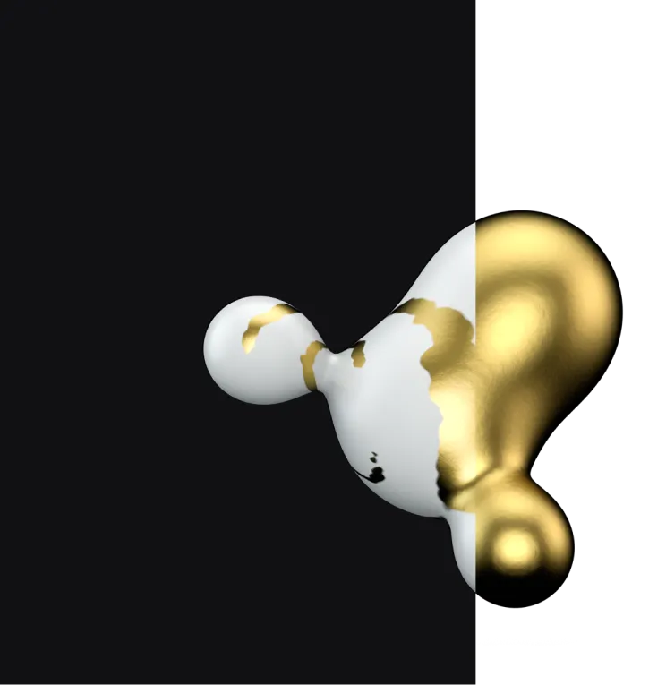
Introduces fluid, morphing 3D "liquid gold" droplets as dynamic background elements and animated key art.
-
Symbolic Interactions: Uses merging liquid shapes as a visual representation of members connecting and collaborating within the network.
-
Dynamic Key Art: Applied across app splash screens, onboarding sequences, profile setups, and video teasers.
-
Material Contrast: Blends glossy liquid metal textures with soft matte white surfaces for visual depth.
Mobile Application UI/UX
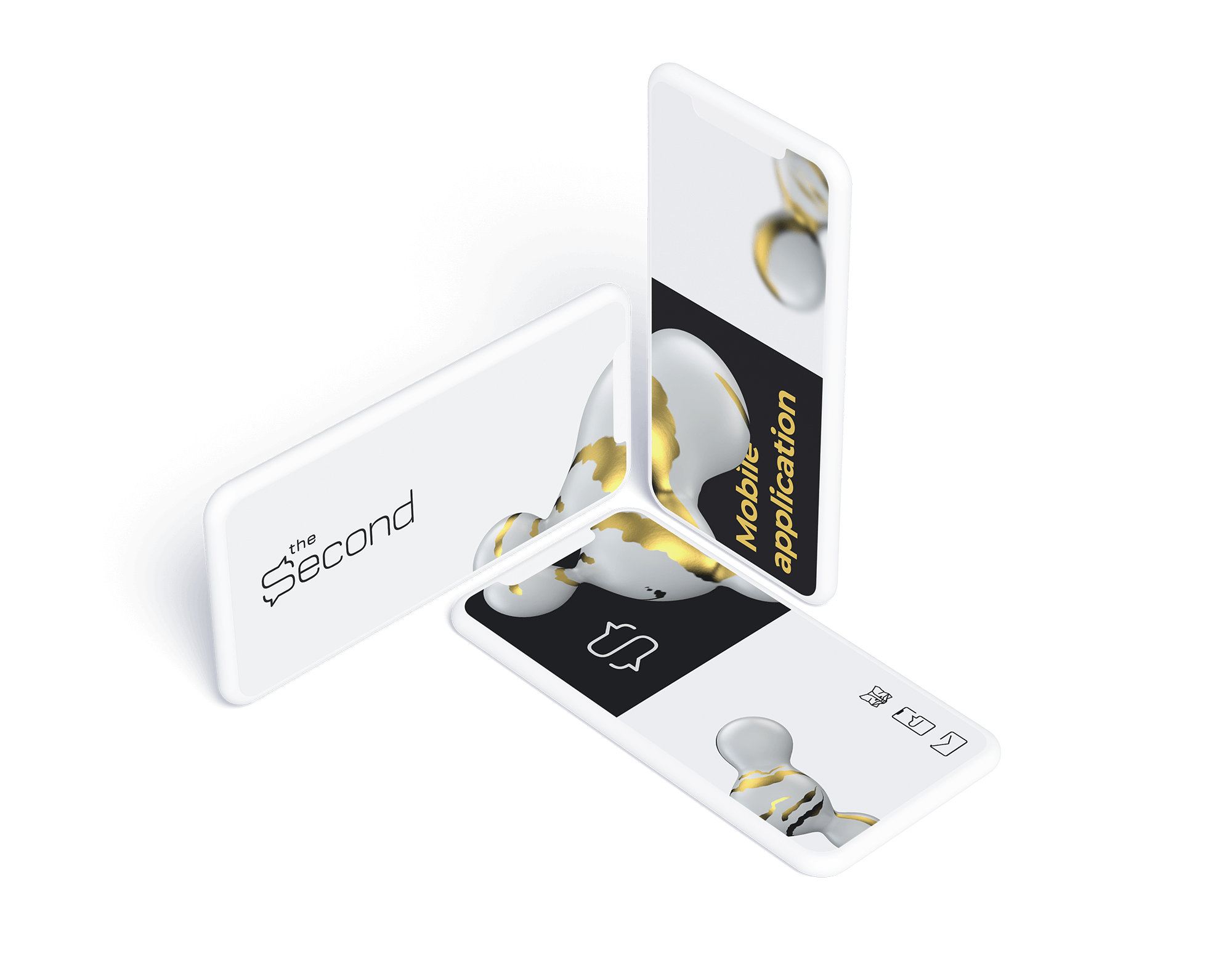
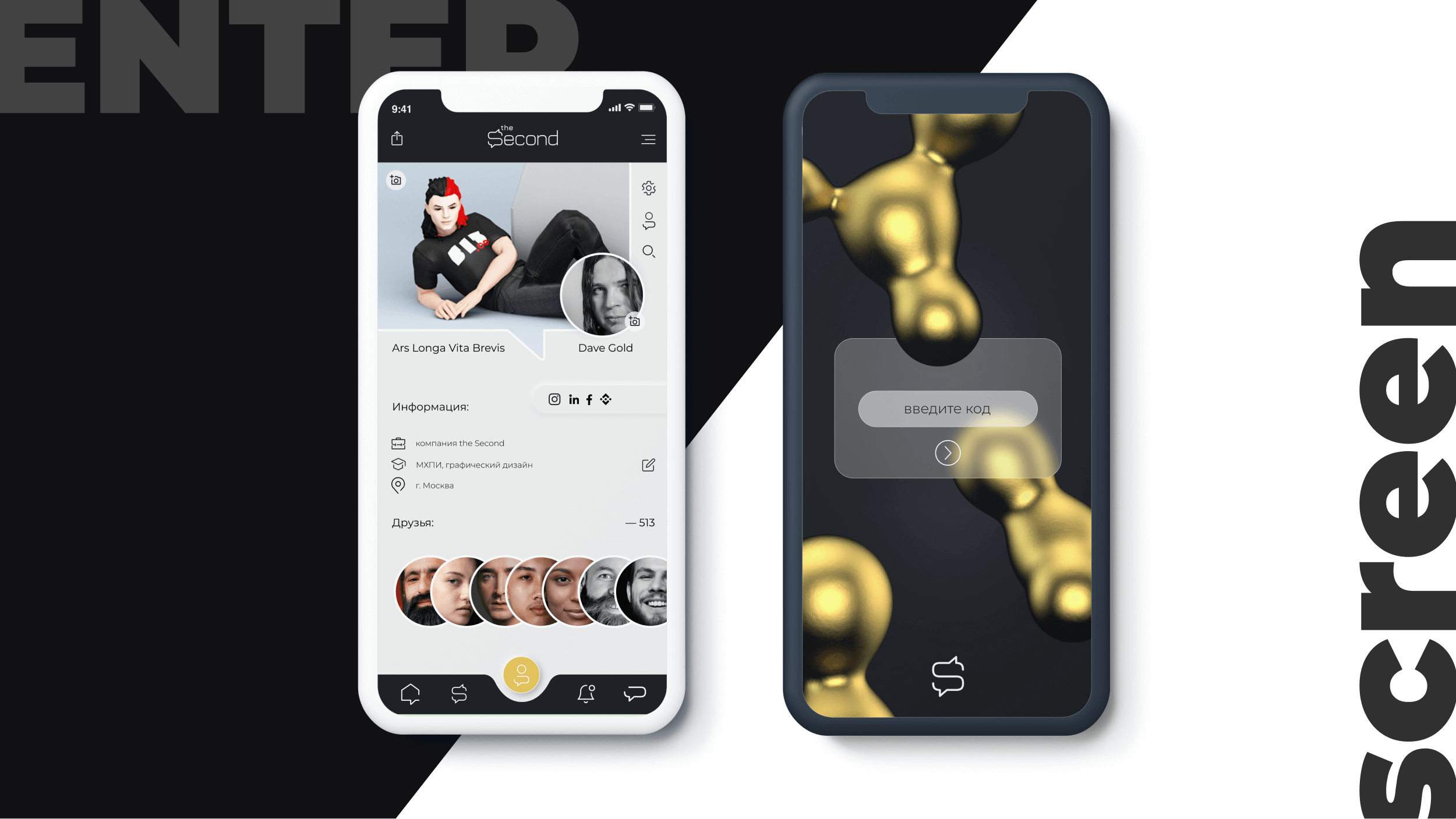
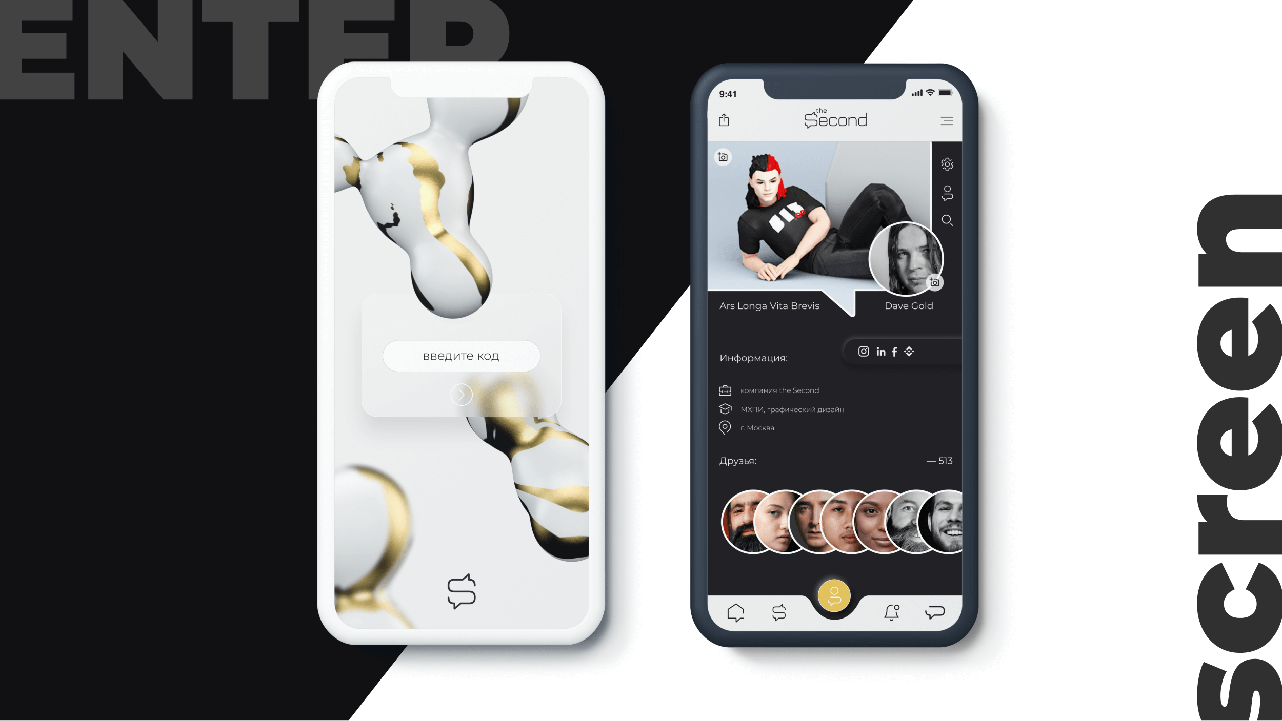
Demonstrates the practical integration of the visual identity system across native iOS interface screens.
-
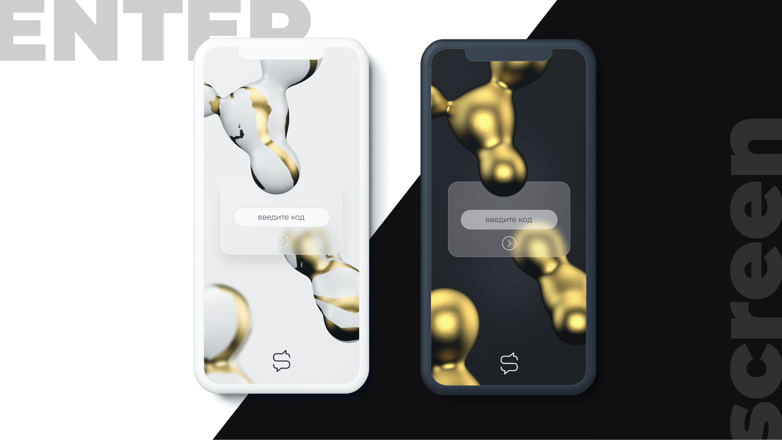
Onboarding Experience: Shows secure authentication screens utilizing clean typography and subtle gold input accents.
-
Profile Architecture: Displays member profiles structured with clear information hierarchy and connection badges.
-
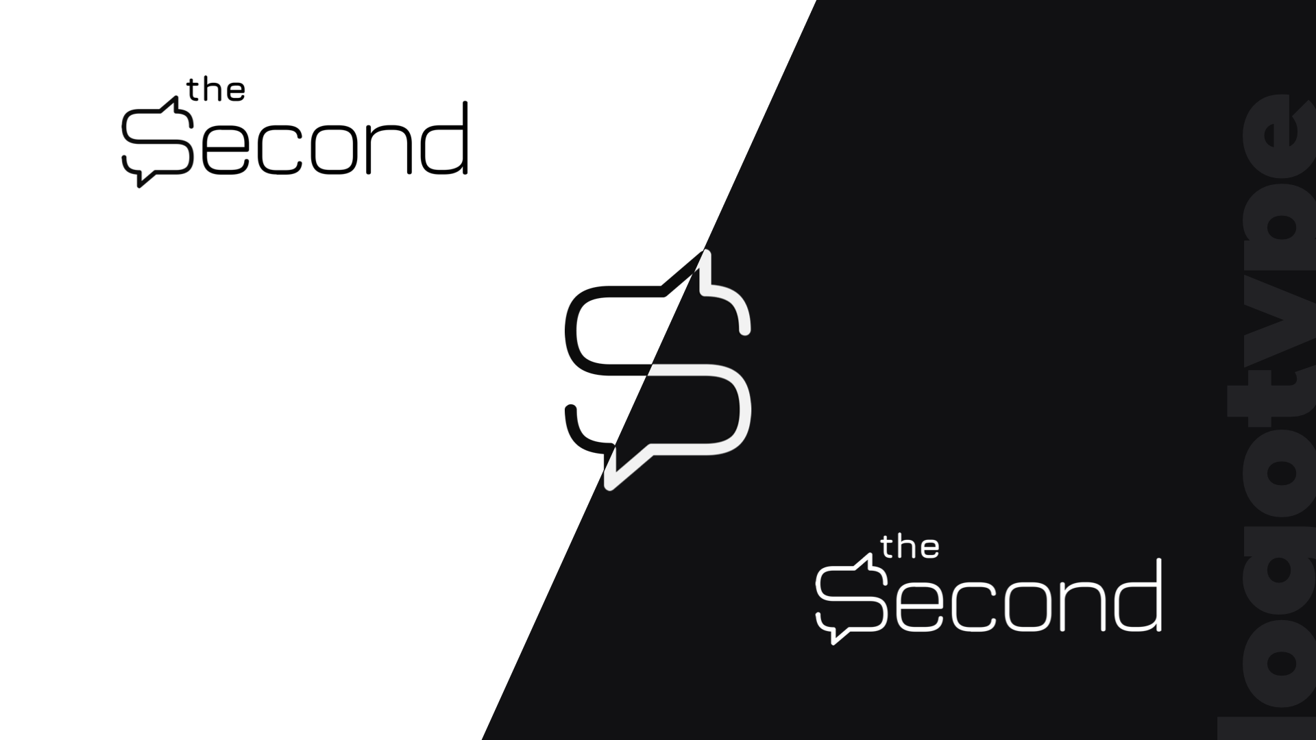
Theme Versatility: Validates seamless UI transitions between high-contrast light canvas and dark charcoal modes.
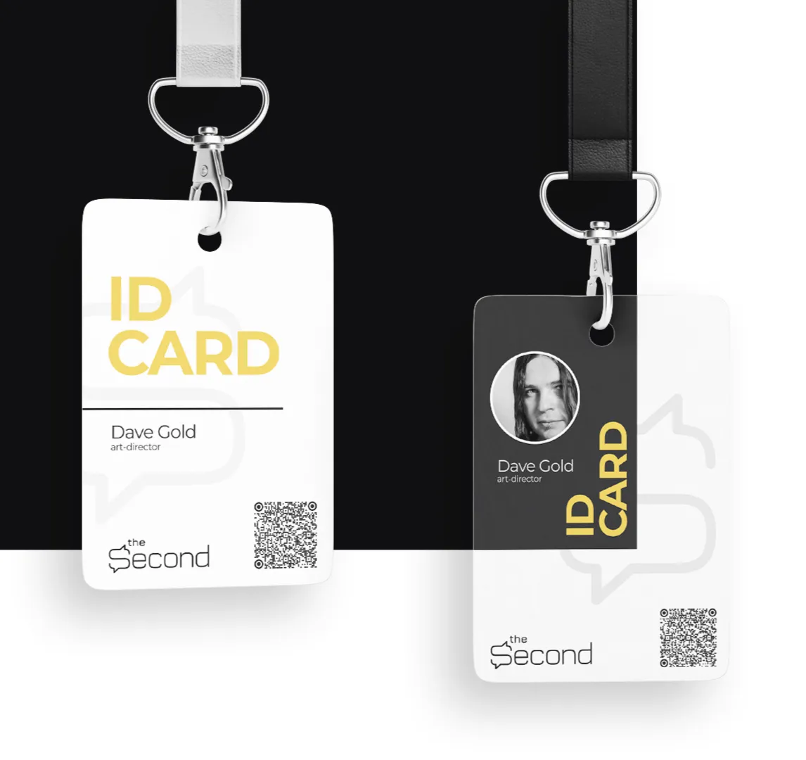
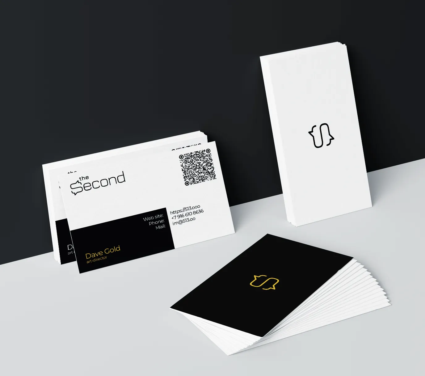
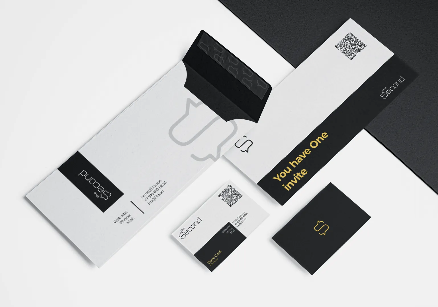
Print Collateral & POSM Applications. Translates digital brand guidelines into physical luxury assets using premium materials and strict layout formulas.
-

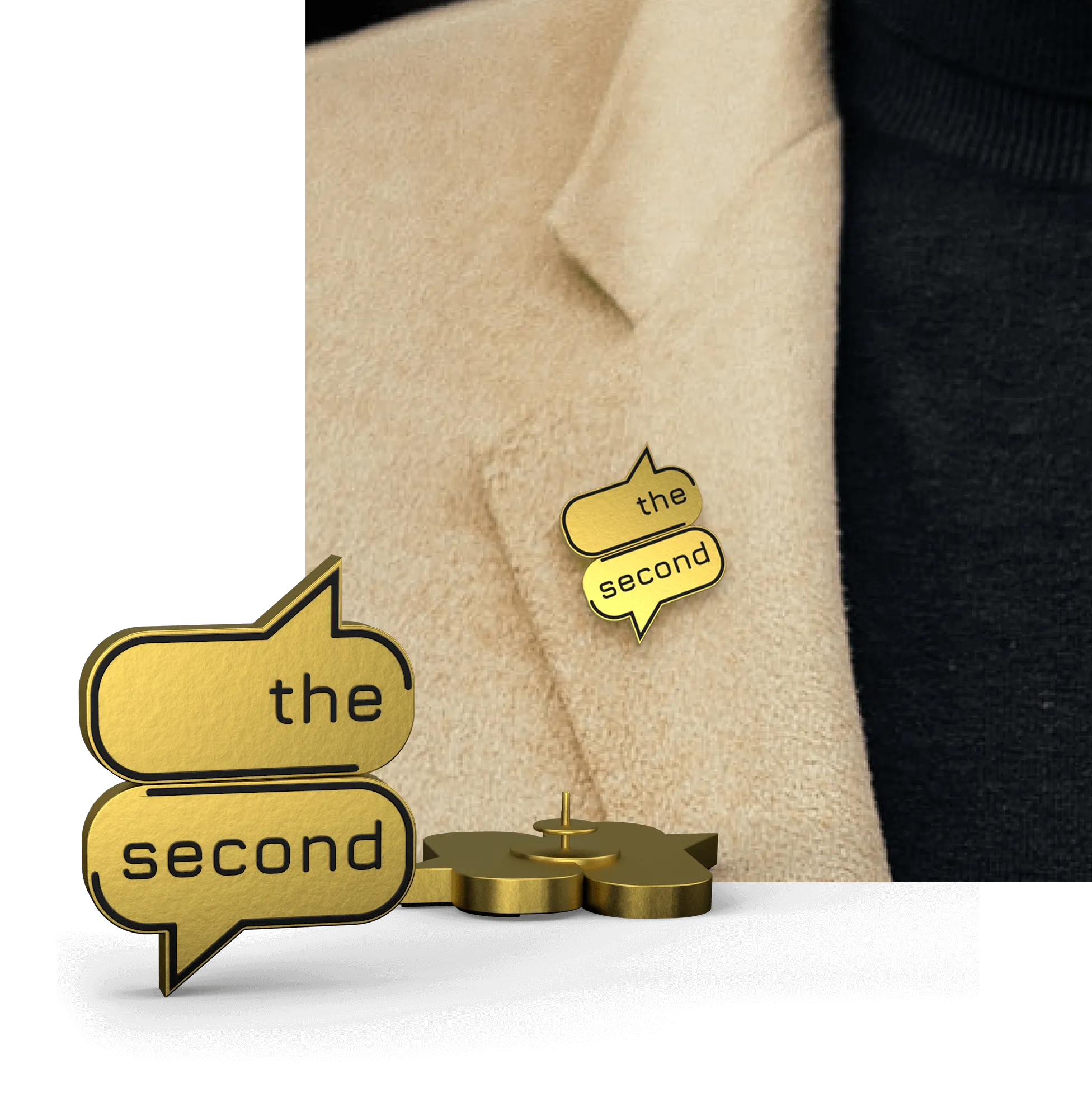
1Tactile Merchandising: Extends branding to business cards, VIP invitations, ID passes, and solid metal lapel pins.
-
2Formula Enforcement: Strictly applies the 60/30/10 color rule to print typography and paper stock combinations.
-
2Exclusivity Symbols: Incorporates physical invitation passes and solid metal "S" pins as real-world status badges for club members.