Tang Town — Brand Identity & Design System
A full-scale design and media execution for Tang Town, a Michelin-starred Neo-Chinese restaurant in Dubai Mall. This project encompasses the core brand identity, premium website development, dramatic chiaroscuro photography, video production, and curated SMM materials—seamlessly unified into a single, luxurious dark-mode ecosystem.
Tang Town — Complete Brand Integration
This comprehensive brandbook establishes the absolute design standards for Tang Town, detailing architectural logo typography, strict clear-space constraints, and a bespoke Arabic emblem adaptation for the UAE market. It systematically defines the 60-30-10 color hierarchy across Deep Carbon and Dynasty Crimson alongside tactile guidelines for raw inkstone, imperial hardwoods, and patinated metals. Additionally, the manual outlines the digital ecosystem with interactive UI tiers, a mathematical checkerboard matrix for premium Instagram feed curation, and precise production rules for cinematic chiaroscuro culinary photography and mandatory video packshot sequences.
Logo
Overview
Logo Design & Identity System
-
Architectural Synthesis: A precision 3D emblem fusing traditional Chinese roof silhouettes and classical logograms with sharp, contemporary typography.
-
Modular Ecosystem: Engineered into versatile standalone symbols, horizontal logotypes, and a calligraphically balanced Arabic adaptation for the UAE market.
-
Premium Execution: Optimized for absolute visual integrity on dark luxury surfaces using stark monochrome variants, dimensional crimson gradients, and imperial gold.
Logo colors
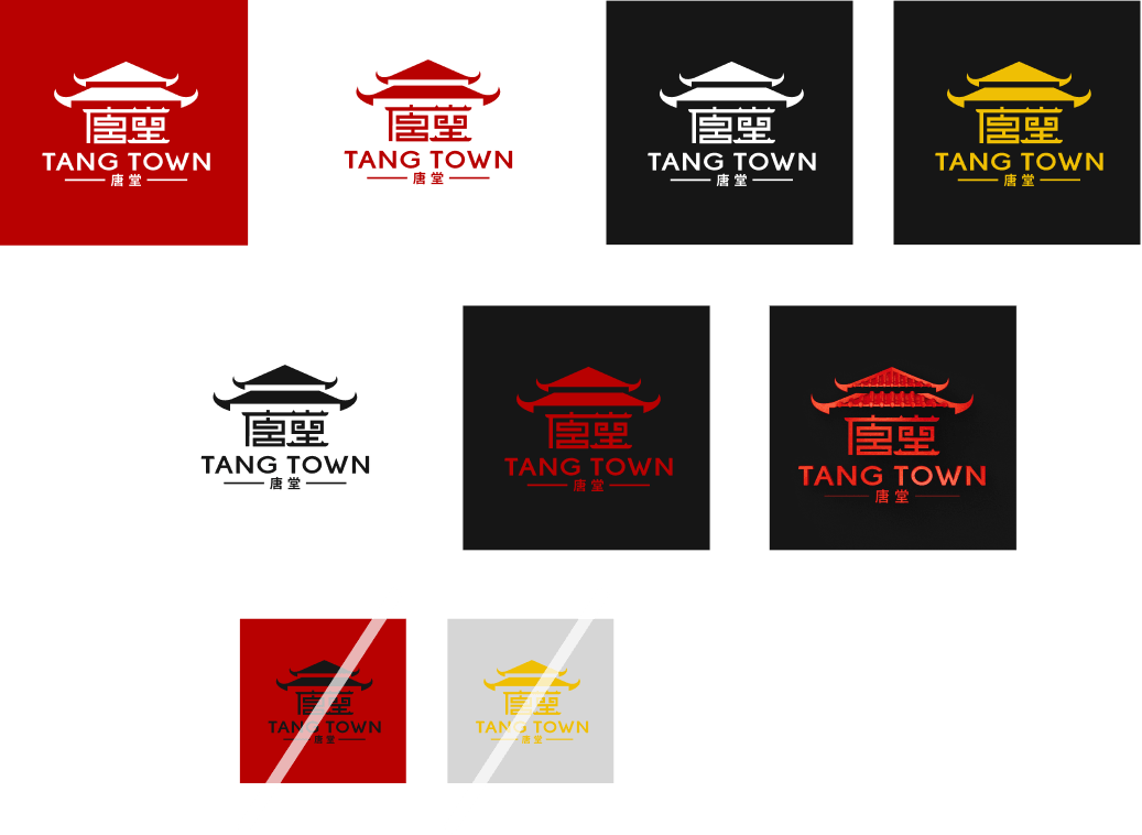
Logo Color Applications
Approved color combinations engineered to preserve high contrast, legibility, and premium brand integrity across diverse backdrops.
-
Monochrome & Inverted Utilize solid white, black, or crimson executions on starkly contrasting backgrounds (black, white, or primary red) to ensure pristine readability and clean minimalist balance.
-
Premium Gold & Dimensional Accents Reserve metallic gold and dimensional 3D red variants exclusively for dark, high-end surfaces to amplify the restaurant’s luxurious, intimate atmosphere.
-
Incorrect Usage Never deploy low-contrast or unauthorized combinations, such as dark elements over primary red backgrounds, or gold elements over light surfaces. Always maintain absolute visual clarity.
Logo
3D logo
-
Monochrome & Inverted Utilize solid white, black, or crimson executions on starkly contrasting backgrounds (black, white, or primary red) to ensure pristine readability and clean minimalist balance.
-
Premium Gold & Dimensional Accents Reserve metallic gold and dimensional 3D red variants exclusively for dark, high-end surfaces to amplify the restaurant’s luxurious, intimate atmosphere.
-
Incorrect Usage Never deploy low-contrast or unauthorized combinations, such as dark elements over primary red backgrounds, or gold elements over light surfaces. Always maintain absolute visual clarity.
Logo stamp
The Ink Stamp & Seal System
-
Primary Imperial Stamp (Crimson Red)
-
Typographic Text Stamp (Alabaster Light)
-
Minimalist Emblem Stamp (Alabaster Light)
-
Traditional Chinese Chop Seal (Solid Red)
Logo vertical
Vertical Logo Systems & Strategic Deployment
-
Engineered for narrow dimensions and tall structural layouts where horizontal marks cannot be deployed.
-
Heritage vertical mark (Imperial red) Designed for authentic, traditional touchpoints like chopstick sleeves, wine tags, and custom packaging. Directly references classical Chinese calligraphic alignment.
-
Structural Latin mark (Alabaster light) Optimized for tall architectural environments, including menu spines, banners, building pillars, and vertical digital screens. Guarantees maximum legibility in tight vertical spaces.
colors
The Crimson Palette
-
Red is the ultimate symbol of Chinese heritage, refined here into a sophisticated, deep spectrum that embodies imperial luxury and culinary artistry.
-
A sophisticated neutral spectrum that forms 60% of the visual identity, creating a minimalist, high-end backdrop that amplifies the restaurant's premium atmosphere.
-
Supporting culinary accents (10%)
elements
LOGO SYNTHESIS
-
A precise emblem of refined heritage. The flagship 3D brand mark is synthesized from individual, modular units of the core architectural structures. This precise integration creates a cohesive, single-form symbol that anchors the entire visual identity in Chinese traditional craftsmanship and modern luxury.
elements
The core brand icon
The definitive centerpiece of the visual identity, featuring a surreal, monumental composition of floating traditional Chinese structures.
-
Imperial elevation Traditional red wood pagodas are suspended in a weightless, symmetrical formation, bridging historic majesty with avant-garde luxury.
-
Visual anchor A commanding, cross-axial emblem designed for flagship touchpoints, embodying a transcendent, Michelin-starred culinary journey.
( Photography )
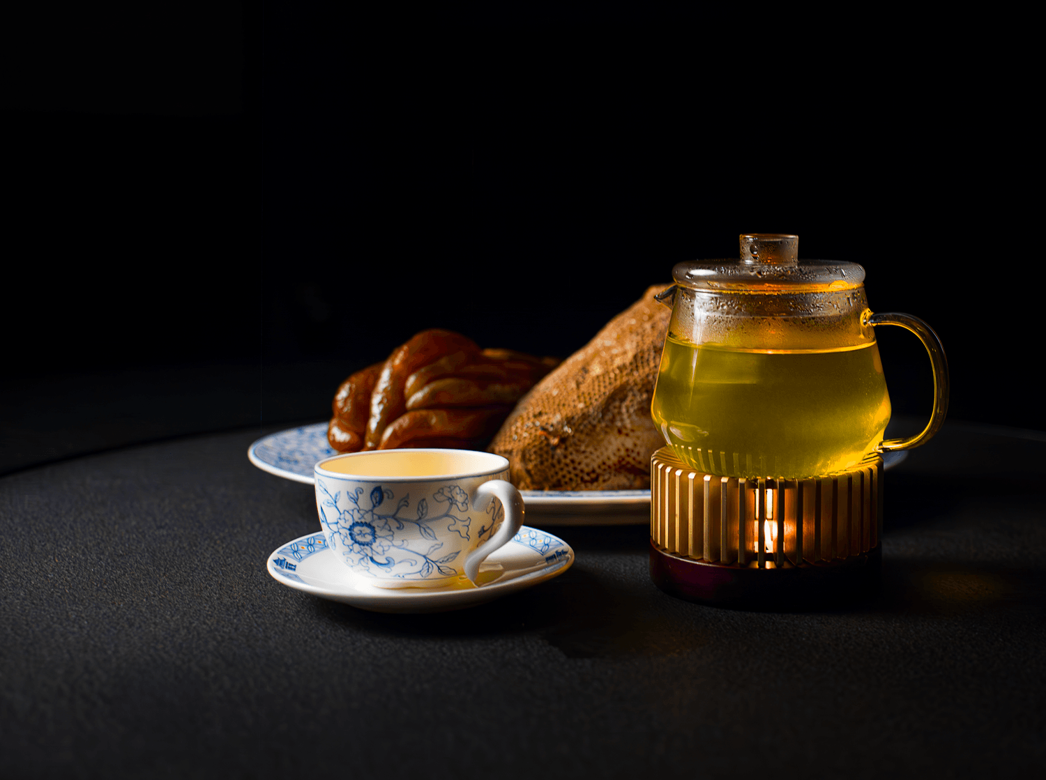
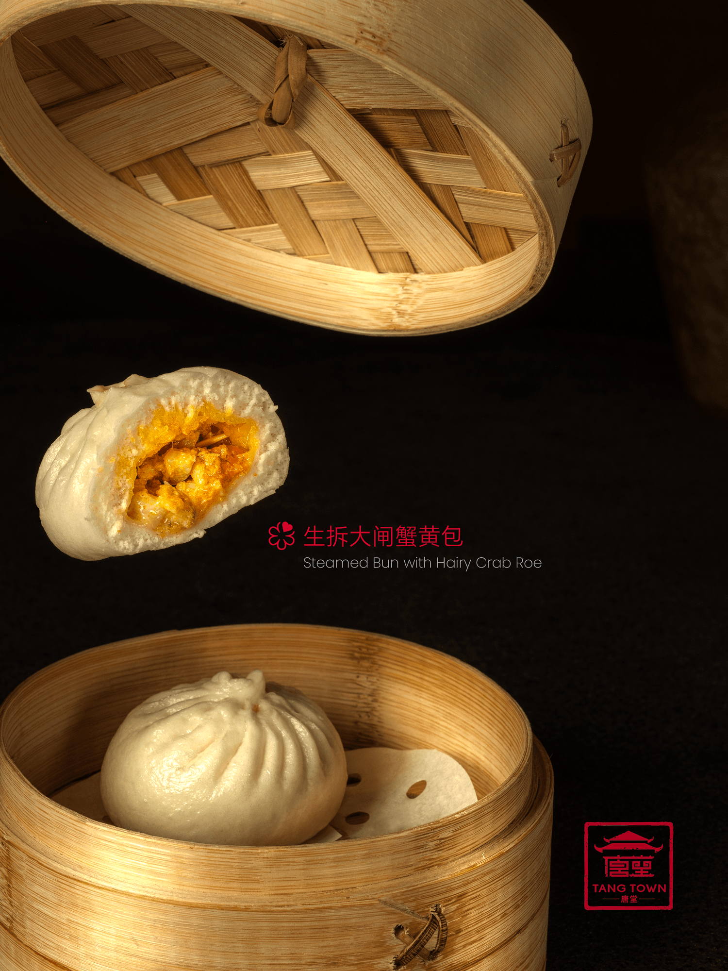
This photographic style is defined by a deep, dark palette and a dramatic lighting technique that creates an intimate, exclusive atmosphere. The primary objective is to make the food the undisputed hero of the composition, with zero competing visual elements.
-
Dramatic Lighting Hierarchy (Chiaroscuro) • Food Isolation: Strong, localized, precise directional light (like a surgical spotlight) is focused solely on the food arrangement. This lighting makes the crispy textures, rich colors, and glistening juices (like the sauce on the duck) stand out with visceral intensity. • Shadow Management: The surrounding environment, including the table surface and background elements, falls rapidly into deep shadow (a "dark sink"). This high contrast makes the dish appear luminous within the blackness.
-
Muted Propping and Desaturation • Minimalist Anchoring: While brand-book materials (patinated metal vessel, dark textile, weathered table) are present, they are positioned in soft focus or near-darkness. Their function is to provide a subtle, authentic context of heritage and luxury, not to draw the eye. • Color-Block Cadence: The entire scene, outside of the food, is monochromatic and desaturated. Dark grays, deep blacks, and desaturated, aged metal tones dominate. The only rich, saturated colors are limited to the food (e.g., golden browns, vibrant greens of garnishes), making them vibrate with delicious focus.
-
Composition & Texture • Tight Focus: Compositions are tight close-ups, centering the dish and using a shallow depth of field. This minimizes background clutter and forces the viewer into a direct, visceral experience with the plating details. • Texture Over Detail: The focus on texture—the crispness of skin, the weaving of a napkin, the weathering of a metal surface—is more important than clear visibility. The textures create a tactile dimension to the visual experience.
( Instagram Video & Advertising )
-
1Strict Compliance: Every promotional video asset was produced strictly adhering to the brandbook’s production rules, ensuring consistent cinematic lighting, warm color grading, and the mandatory signature packshot sequence.
-
2Performance Driven: The targeted social media ad campaign delivered high-impact reach, generating an exceptional 70% growth in both restaurant traffic and overall profitability.
-
3Targeted Engagement: Tailored high-fidelity video advertisements seamlessly paired brand heritage with high-conversion metrics to successfully capture Dubai's premium luxury audience.