Colors
Colors are used according to the 60, 30, 10% scheme. The main color is white, symbolizing a clean sheet of paper.

Font
The optimal font style used is Exo 2.

Logo
The logo can be used without the symbol (ribbon with satellite) depending on the composition and materials used.
Sign
The satellite redesign in 2023 is an image that visualizes the flow of time, the dynamism of science, brand refreshment, and deepening of knowledge.


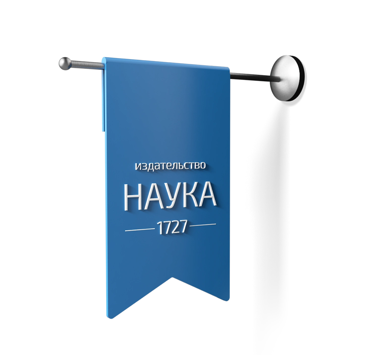
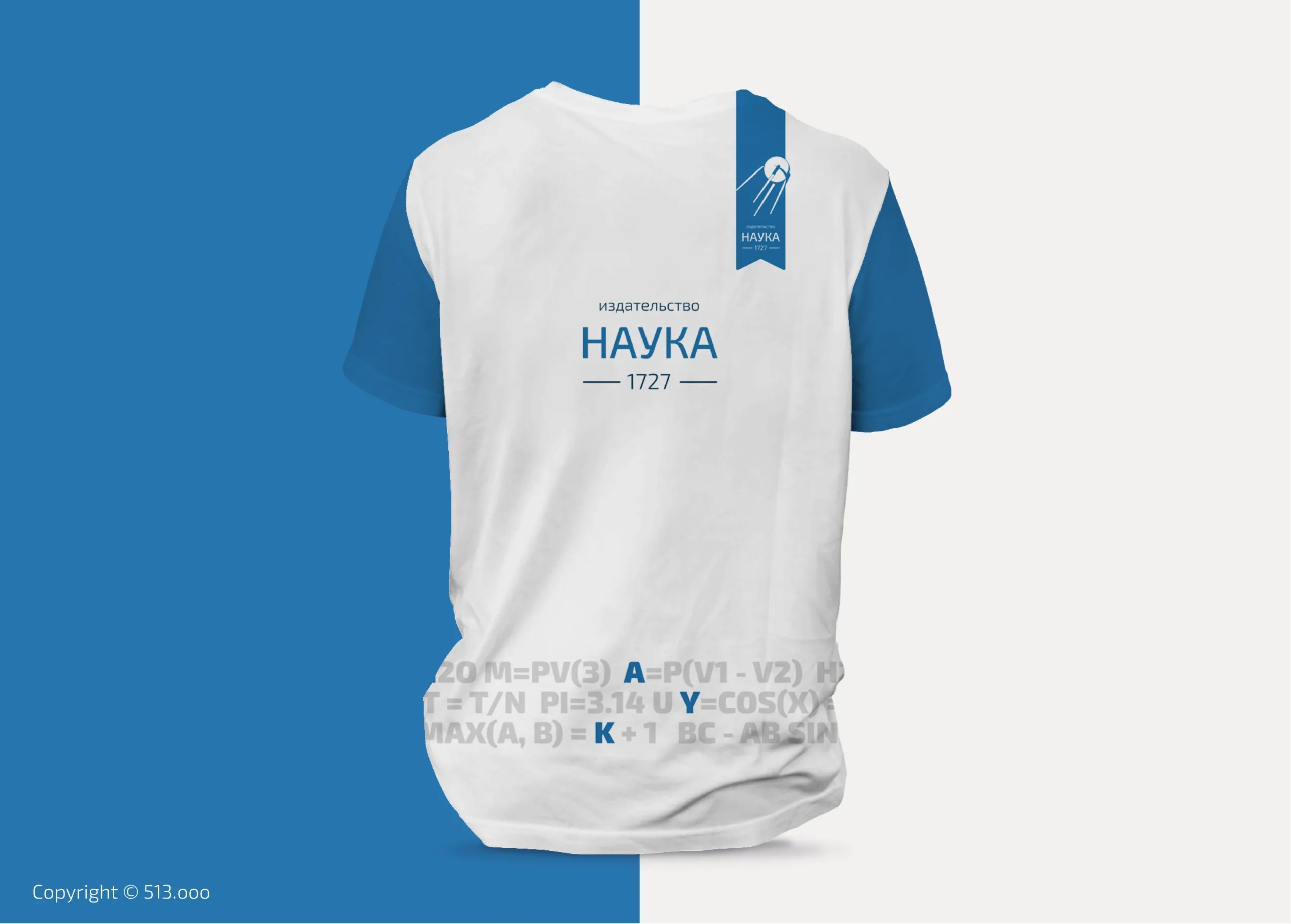
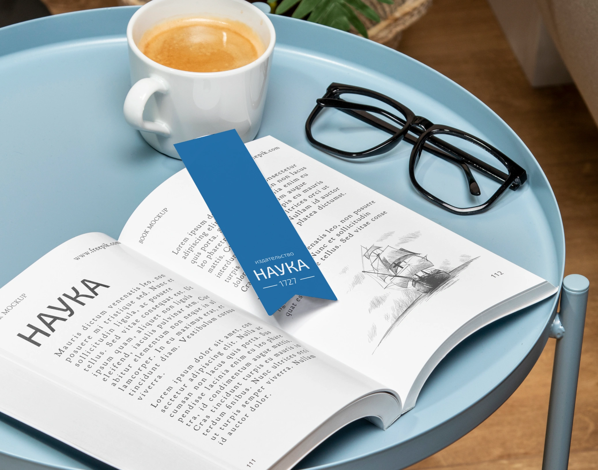
Bookmark
Adding a bookmark element that has always been recognizable and undeniably associated with books, magazines, and knowledge. A prominent and memorable element.

Pattern
The pattern, as an additional element, provides balance to the composition and emphasizes the overall identity. The pattern consists of letters (representing reading) that form scientific formulas (representing science), among which the name of the publishing house is composed.
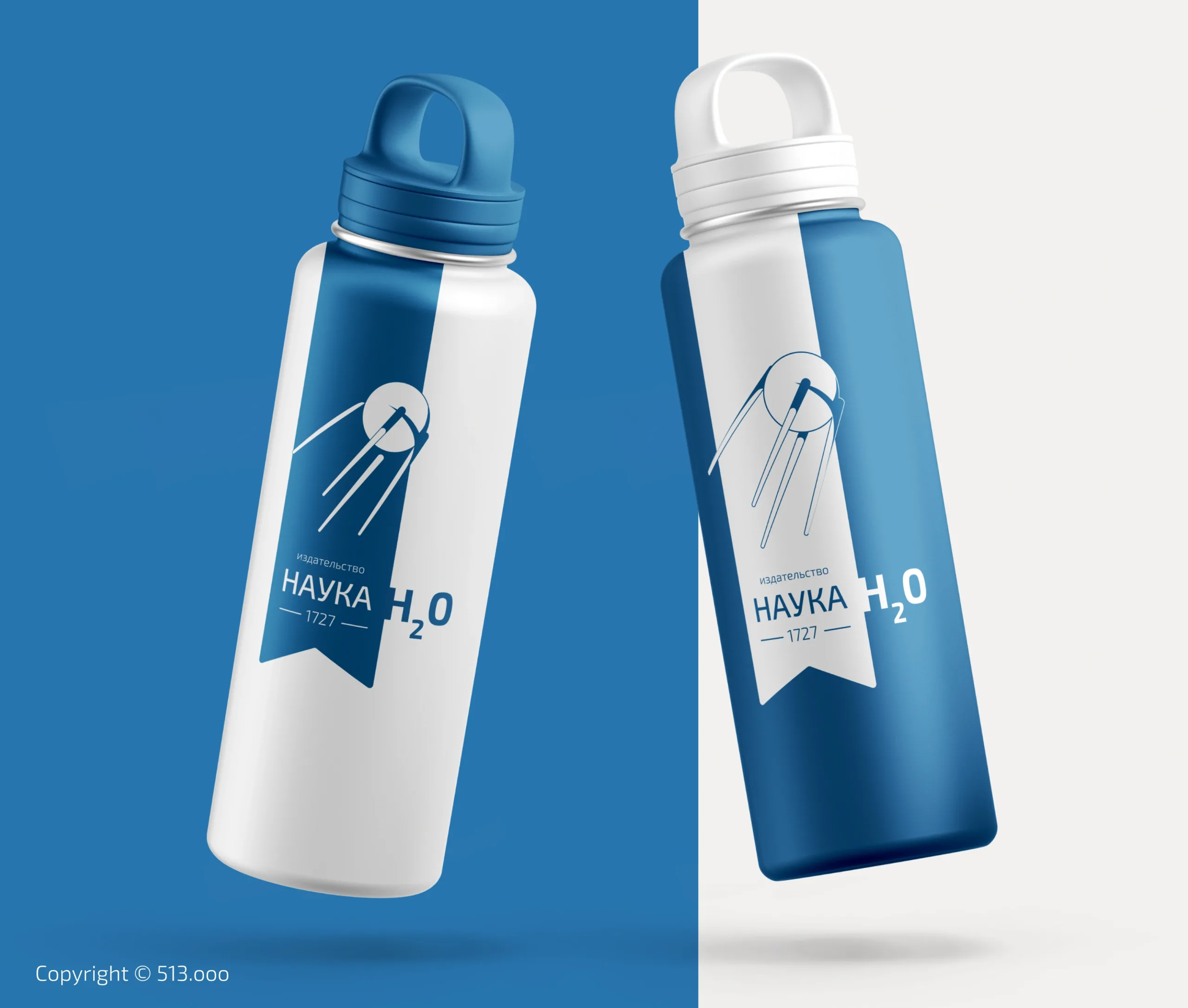
Branding
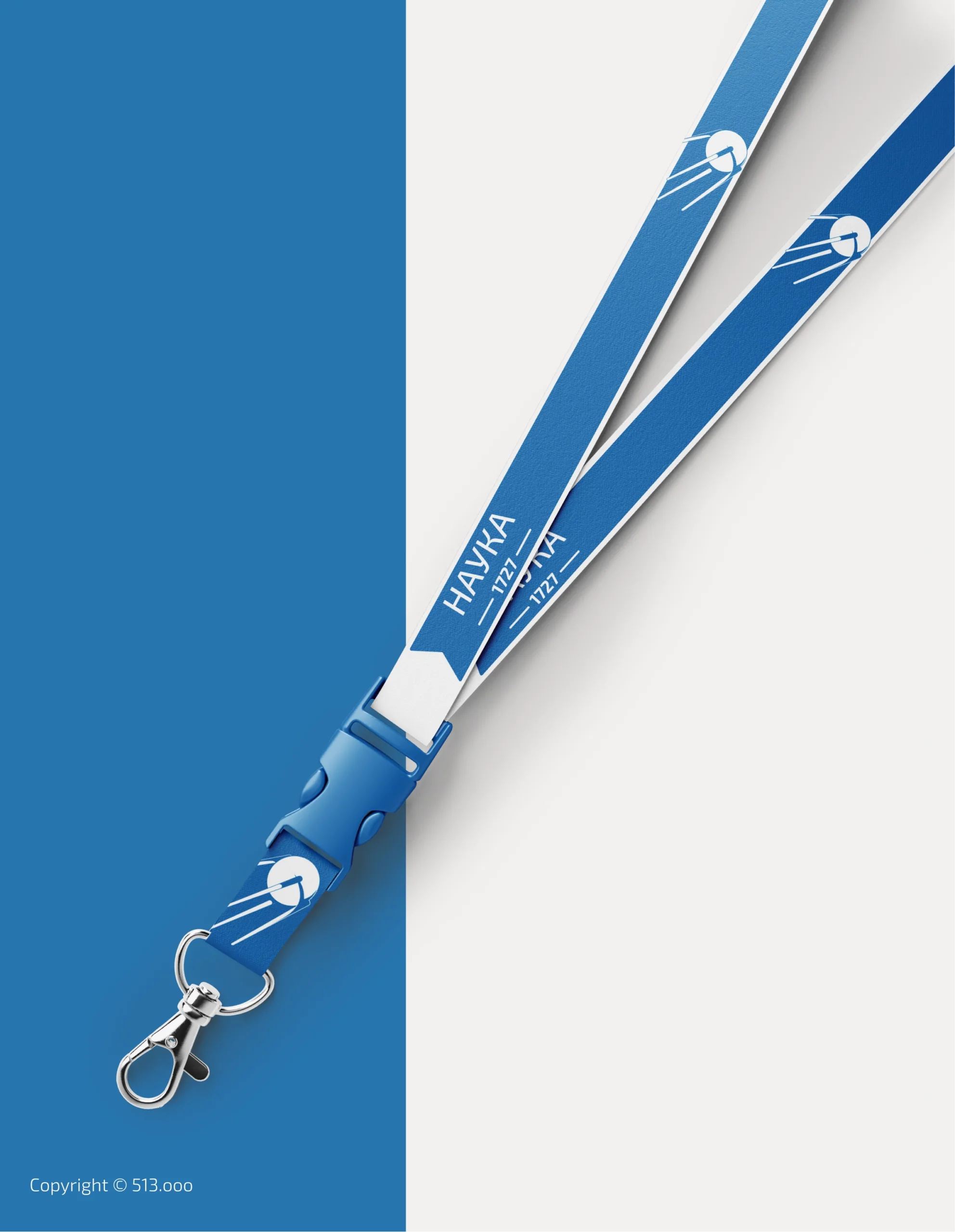
Logo and Brand Identity Applied to Merchandise: Explore my portfolio to see how I bring logos and brand elements to life on merchandise, creating cohesive and impactful experiences.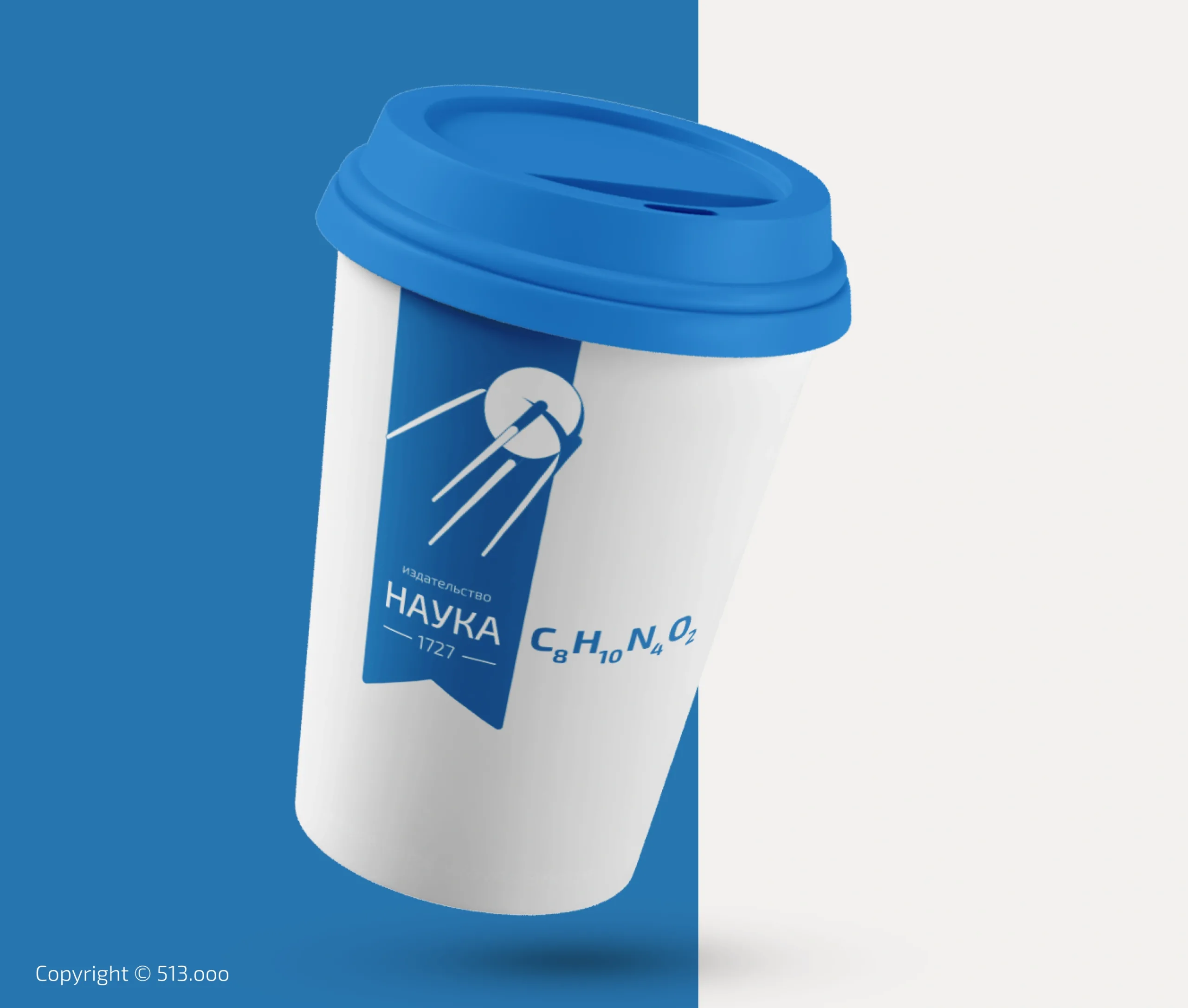
Application Example of a Brand Mark on Building Facade
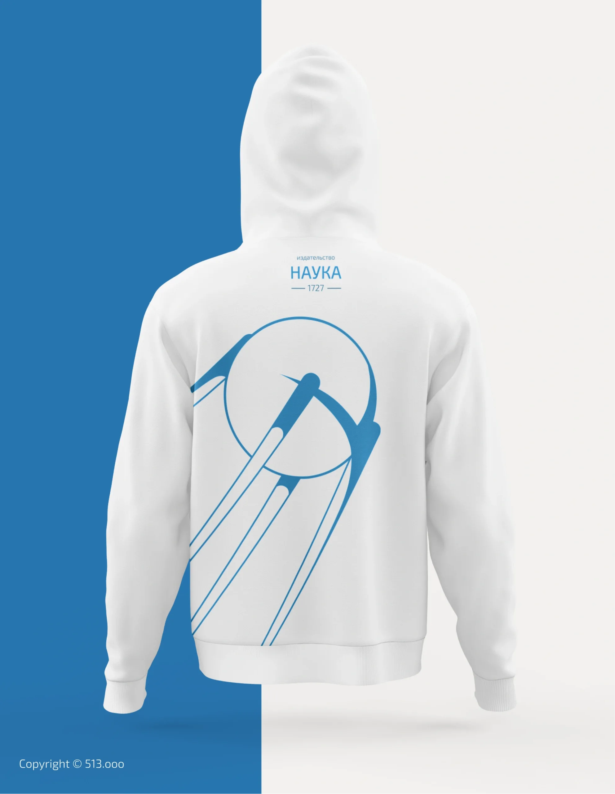
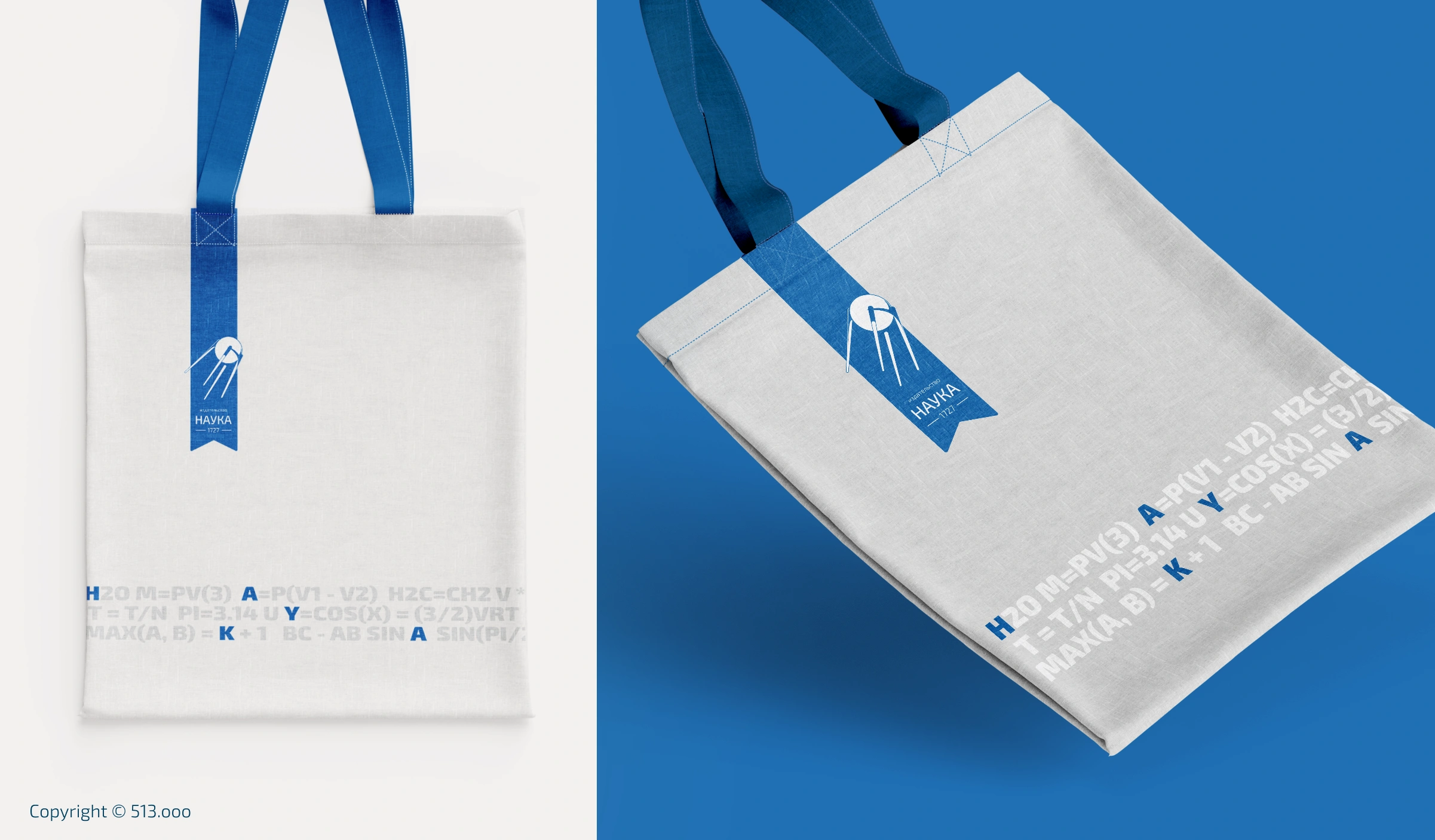
Merchandise
These examples demonstrate how all identity elements can be successfully applied to merchandise, creating a consistent and compelling brand experience.
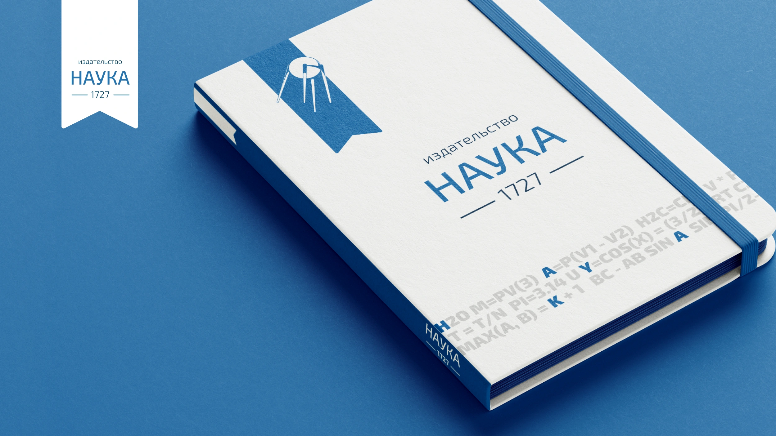
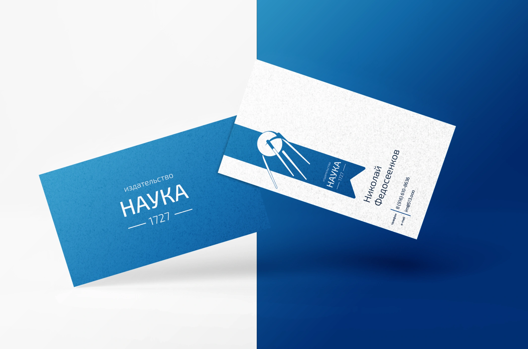
Docs
A few examples of applying a style to documents